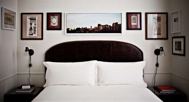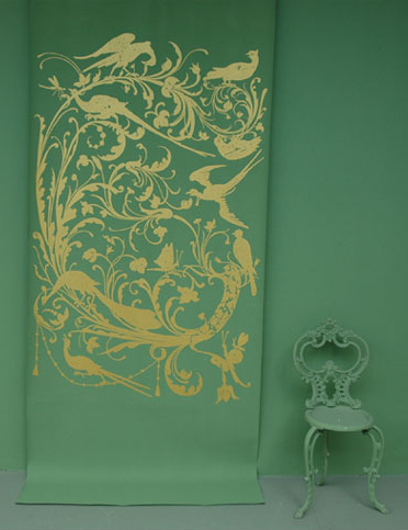
Some paint brands whisper. Emery et Cie walks into the room wearing velvet slippers, carrying a tray of Moroccan tea, and somehow convinces your walls to develop a personality. Known officially as EMERY&Cie, the Belgian-born world of architect and designer Agnès Emery has long stood for color with depth, handmade surfaces, old-world craft, and interiors that feel collected rather than decorated. This is not the land of “safe beige because resale value said so.” This is where ochre, smoky green, clay red, faded blue, and shadowy neutrals gather like interesting dinner guests.
The phrase “Palette & Paints: Emery et Cie” captures more than a color card. It describes a full design language: richly pigmented paint, handmade tiles, patterned fabrics, wallpapers, wrought iron, hardware, and decorative objects that all seem to belong to the same dreamy house somewhere between Brussels, Paris, Marrakesh, and a very stylish antique trunk. For homeowners, designers, and color lovers, Emery et Cie offers a valuable lesson: a room does not become memorable because everything matches. It becomes memorable because everything has a conversation.
The Story Behind Emery et Cie
EMERY&Cie was founded by Brussels architect and designer Agnès Emery in 1993. From the beginning, the brand was built around a devotion to tiles, color, handwork, and custom interiors. Instead of chasing shiny perfection, Emery embraced the small irregularities that make handmade objects feel alive. A tile might not be identical to its neighbor. A color may shift with the light. A painted surface might have the mood of a fresco rather than the flatness of a showroom wall. In other words, the brand understood something many interiors forget: humans do not actually live inside catalog pages.
For decades, EMERY&Cie operated through stores in design-forward cities such as Brussels, Paris, and London, while its influence traveled far beyond Europe. American design readers often discovered the brand through features on interiors, tiles, wallpapers, and paint palettes that felt both eccentric and elegant. Remodelista memorably described Agnès Emery’s universe as one filled with wallpapers, fabrics, ceramic and cement tiles, iron furniture, paint, tableware, rugs, and housewares. That breadth is important because Emery et Cie is not simply a paint company. It is a complete decorative ecosystem.
In 2024, the original EMERY&Cie company entered liquidation, marking the end of a 31-year chapter. But the story did not simply close its shutters and vanish into a dramatic Belgian fog. A rebuilt online presence continues to sell selected saved items, including paint and hardware, while preserving as much of the creative heritage as possible. The newer paint formulation is manufactured by ARGILE in France and uses bio-sourced materials, including vegetable oils recovered from agriculture. That shift gives the palette a contemporary environmental angle without abandoning the soulful Emery character.
Why the Emery et Cie Palette Feels Different
The Emery et Cie palette is not built around quick trends or cheerful paint names designed to make you buy a gallon because it sounds like a smoothie. Its colors feel historical, mineral, botanical, and emotional. Think murky greens, ochres, yellows, smoky blues, warm whites, dusty pinks, clay browns, and deep garden tones. These are shades that behave differently at 8 a.m., 2 p.m., and candlelight o’clock.
1. Depth Over Brightness
A common mistake in choosing interior paint is assuming that “more color” means “brighter color.” Emery et Cie shows the opposite. A color can be intense without being loud. A muddy olive can be more interesting than neon green. A tobacco yellow can warm a hallway better than a squeaky lemon. A blue with gray and black undertones can feel more luxurious than a clean coastal blue that looks like it escaped from a beach towel.
This matters because modern interiors are increasingly moving toward richer, moodier, more layered palettes. Designers now often use deep greens, dusty jewel tones, browns, muted reds, and warm neutrals to create rooms that feel grounded. Emery et Cie was exploring that territory long before “moody interiors” became a social media caption.
2. Color That Belongs to Materials
In the Emery world, paint does not sit alone. It connects to tile glaze, textile pattern, wrought iron, wood, plaster, stone, and hardware. That is why its colors feel so usable in real rooms. A smoky green wall can echo a zellige tile. A chalky ochre can warm dark iron furniture. A faded blue can soften handmade ceramic. Instead of asking, “What color is trendy?” the better Emery-style question is, “What color makes these materials sing without grabbing the microphone?”
3. Imperfection as a Design Feature
The brand’s hand-painted tiles are a perfect symbol of the Emery et Cie philosophy. Agnès Emery has described tile painting as a practice between art and craft, almost like calligraphy. The patterns are painted freely, without a rigid outline, so the result has movement and individuality. This is the opposite of mass-produced sameness. In an Emery-inspired room, imperfection is not a flaw hiding behind the sofa. It is the charm sitting confidently in the best chair.
How to Use Emery et Cie Paint Ideas in Your Own Home
You do not need a Brussels townhouse, a Moroccan blacksmith, or a suspiciously photogenic cat to use the Emery et Cie approach. The secret is not copying a showroom. The secret is learning how the palette thinks.
Start With One Atmospheric Color
Choose one color with depth: an olive green, earthy ochre, smoky blue, warm clay, dusky rose, or deep brown. Use it as the emotional anchor of the room. This could be the wall color, a ceiling color, cabinetry, or even a painted door. If you are nervous, start with a powder room, pantry, reading corner, or entryway. Small rooms can handle drama surprisingly well. In fact, they often become more memorable when they stop pretending to be large white boxes.
Test Paint in Real Light
Every serious paint decision deserves a test swatch. Paint colors shift depending on daylight, artificial lighting, nearby trees, flooring, and even the reflection from furniture. A green that looks refined in the morning can turn swamp-monster theatrical under the wrong bulb. Paint large samples on different walls and watch them through the day. This simple step can save you from repainting while muttering things your walls should not have to hear.
Use Sheen Carefully
A matte finish creates softness and depth, making it ideal for walls where you want a velvety, plaster-like feeling. Eggshell or satin can work in higher-traffic areas where cleaning matters. Semi-gloss and gloss are useful for trim, doors, and architectural details, especially when you want light to catch the edges. The Emery et Cie spirit often favors surfaces that feel tactile and quiet, but durability still matters. A romantic wall is lovely; a romantic wall covered in fingerprints is just a household diary.
Pair Paint With Handmade Texture
Emery et Cie interiors often come alive through the relationship between color and texture. Pair a deep green wall with glazed tiles. Combine ochre paint with dark metal hardware. Use a muted blue beside natural linen. Bring in terracotta, aged brass, weathered wood, or woven rugs. The goal is to make the room feel layered, as if it has been assembled over time by someone with taste, patience, and possibly excellent coffee.
Emery et Cie and the Beauty of Zellige
One of the strongest associations with Emery et Cie is the use of zellige, the traditional Moroccan handmade tile known for its irregular surface, luminous glaze, and jewel-like color. Zellige works beautifully with Emery-style paints because both celebrate variation. A flat industrial tile may demand a crisp, controlled palette. Zellige prefers a little poetry. Its surface catches light unevenly, giving walls, backsplashes, fireplaces, and bathrooms a sense of movement.
If you are planning a kitchen or bath inspired by Emery et Cie, consider using tile as your starting point. Pull the wall color from one of the tile’s undertones rather than matching it exactly. A green tile might suggest a gray-green wall. A cream zellige might pair with a warm chalky white. A blue tile could lead to a smoky ceiling or dark painted vanity. Matching too perfectly can flatten the room. Related colors, on the other hand, create depth.
Why American Homes Can Learn From Emery et Cie
Many American homes are designed around resale-safe choices: white walls, gray floors, neutral cabinets, and the occasional “bold” navy island bravely standing in the kitchen like it read one design blog and got promoted. There is nothing wrong with restraint, but Emery et Cie reminds us that a home can be both livable and expressive.
The lesson is not to paint every room dark green and call it European. The lesson is to design with intention. A strong color works when it relates to the architecture, furniture, light, and materials. A handmade tile works when it has room to breathe. A patterned fabric works when the surrounding colors support it. Emery et Cie is maximal in spirit but not careless. Its interiors may feel layered, but they are rarely random.
Palette Ideas Inspired by Emery et Cie
The Belgian Garden Palette
Combine moss green, faded celadon, warm ivory, blackened iron, and aged terracotta. This palette works beautifully in sunrooms, kitchens, and garden-facing rooms. Add linen curtains, wood furniture, and handmade ceramics for a quiet, organic look.
The Moroccan Shadow Palette
Use deep indigo, smoky turquoise, clay red, ochre, and dark bronze. This is ideal for powder rooms, tiled bathrooms, or dramatic entries. Keep the lighting warm and the hardware simple so the colors feel rich rather than theatrical.
The Old Library Palette
Try tobacco brown, olive black, muted gold, parchment, and oxblood. This palette loves books, leather, antique rugs, dark wood, and lamps with soft shades. It is perfect for studies, dining rooms, and corners where people say, “I’ll just check one email,” then disappear for three hours.
The Soft Fresco Palette
Blend chalky rose, dusty peach, warm white, gray-green, and pale ochre. This palette suits bedrooms and living rooms where the goal is calm but not bland. It pairs well with plaster textures, curved furniture, and vintage textiles.
Practical Tips Before Painting the Emery Way
First, prepare your walls properly. Rich, matte colors can reveal uneven patches if the surface is neglected. Clean the walls, repair holes, sand rough spots, and use primer when necessary, especially if you are covering a dark color or painting over a glossy finish.
Second, think about indoor air quality. Paints and related products can release volatile organic compounds, often called VOCs. Choose low-VOC or suitable modern formulas when possible, ventilate during painting, and follow label instructions. Beautiful walls should not require you to open every window like you are trying to signal a rescue helicopter.
Third, do not forget the ceiling. Emery-style rooms often feel immersive because color is not restricted to four vertical walls. A ceiling in a softer shade of the wall color can make the space feel complete. A darker ceiling can create intimacy. A pale ceiling can keep a rich wall color from becoming too heavy.
Finally, edit your accessories. Once the paint is strong, the room may need fewer decorative objects. Let the color do some of the work. A bold wall, handmade tile, iron lamp, and textured textile can be enough. Not every surface needs a decorative bowl. The bowls are tired. Let them rest.
Conclusion: The Lasting Appeal of Emery et Cie
Palette & Paints: Emery et Cie is really a story about courage: the courage to use color with feeling, to value craft over uniformity, and to let rooms look personal rather than algorithm-approved. Agnès Emery’s design universe proves that paint is not merely a background choice. It is atmosphere, memory, mood, and material intelligence in liquid form.
Whether you are repainting a hallway, planning a tiled kitchen, or simply tired of interiors that look as if they were afraid to offend a beige envelope, Emery et Cie offers a better path. Choose colors with depth. Pair them with honest materials. Let handmade surfaces show their tiny variations. Trust shadow, warmth, and patina. Your home may not become a Belgian design landmark overnight, but it can become more alive. And frankly, the walls have been waiting.
Experience Notes: Living With an Emery et Cie-Inspired Palette
The most useful experience with an Emery et Cie-inspired palette is learning that color behaves less like a fixed object and more like a houseguest with moods. A smoky green sample may look calm in the morning, sophisticated at noon, and unexpectedly dramatic at night. At first, this can feel alarming. You may stand in the hallway holding a paint brush and wonder whether you have chosen “European elegance” or “haunted vegetable.” Give it time. Deep colors often need a few days before your eye understands them.
In one practical approach, start with a small room that can handle personality: a powder room, reading nook, pantry, or entry. These spaces are perfect laboratories because people do not spend all day in them, yet they create memorable moments. A powder room painted in a dark olive or clay shade can feel jewel-box intimate, especially with a small brass mirror, warm bulbs, and handmade tile around the sink. Guests may emerge saying, “I love that color,” which is socially acceptable code for “I did not expect your bathroom to have a plot.”
Another experience worth noting is that Emery-style colors look best when paired with texture. A flat green wall beside shiny new plastic accessories may feel awkward. The same wall beside linen, aged wood, ceramic, iron, or stone suddenly makes sense. The palette wants companions with history. Even affordable pieces can work if they have tactile quality: a woven basket, a vintage frame, a terracotta pot, a rough ceramic lamp, or cotton curtains that move in the breeze.
It also helps to avoid perfection. Handmade tiles, brushy finishes, and layered textiles create a relaxed beauty that does not collapse when life happens. A room inspired by Emery et Cie should not feel like a museum where everyone whispers and avoids sitting down. It should feel usable, warm, and slightly mysterious. Books can stack on the table. A chair can show age. A tile can vary in tone. That is not failure; that is atmosphere doing its job.
Finally, the biggest lesson is restraint within richness. The Emery et Cie look is colorful, but it is not a circus wearing wallpaper. Choose two or three dominant tones, repeat them in different materials, and let neutrals create breathing room. For example, an ochre wall, green tile, dark iron fixture, and warm white trim can feel abundant without becoming chaotic. The magic is in the balance: enough color to stir emotion, enough quiet to let the room exhale.
Note: This article is written as original, web-ready content based on real design information about EMERY&Cie, Agnès Emery, interior paint selection, handmade tile traditions, and practical home-painting guidance.