There are easier hobbies than designing a deck of cards. Gardening, for example. You put seeds in dirt, water them, and only occasionally wonder whether you have accidentally created a kingdom for slugs. Designing a custom playing card deck, on the other hand, asks you to invent an entire tiny universe that must fit inside 52 rectangles, shuffle gracefully, and still let someone identify the Queen of Hearts before their snack break ends.
That challenge was exactly what made me want to do it.
I wanted to create a nature-inspired playing card deck that felt like it had been discovered in the bottom drawer of an old forest ranger’s deskright beside a mossy compass, a handwritten spell book, and one suspiciously enchanted acorn. The result became a project where plants, animals, weather, folklore, and a generous amount of artistic chaos all had a seat at the table.
This was not a tarot deck, although it borrowed some of tarot’s sense of symbolism and atmosphere. Tarot developed as a card game in fifteenth-century Italy before its much later association with fortune-telling and occult practice. That history reminded me that cards can be practical game tools and expressive artworks at the same time.
Why I Wanted To Design a Custom Card Deck
A deck of cards is one of the most familiar objects in the world. Most people can recognize it instantly: four suits, numbered cards, face cards, a pair of jokers, and at least one card that disappears under the couch during game night.
But a deck also has a secret advantage for artists: it gives creativity a framework. Instead of staring at a blank canvas and asking, “What should I make?” I had 52 little prompts waiting for me. Each card needed a rank, a suit, a purpose, and a personality.
That structure made the project feel less like trying to paint the entire universe and more like organizing a particularly whimsical cabinet of curiosities. I could make a single card about a fox under moonlight, then make the next one about a thunderstorm trapped inside a glass bottle. Somehow, because they all belonged to the same deck, they started to feel connected.
Playing cards have carried culture, strategy, imagery, and storytelling for centuries. The Library of Congress notes that playing cards appeared in China as early as the ninth century, while later European card traditions developed the systems and symbols many players recognize today.
That long history gave me permission to treat the deck with respect without treating it like a museum artifact. I wanted it to be beautiful, yes, but also playable. A card deck should not require a magnifying glass, a ceremonial robe, and a minor in cryptography just to play rummy.
Finding the Theme: Nature Meets Magic
The starting point was simple: I wanted the deck to feel alive.
Nature provided the raw material. Magic provided the mood. Together, they gave me a visual language full of change, surprise, growth, decay, and transformation. A seed becomes a tree. A caterpillar becomes a moth. A cloudy afternoon becomes a dramatic excuse to light candles and pretend you live in a castle.
I began collecting small observations instead of hunting for one giant idea. I noticed the spiral inside a snail shell, the branching shape of winter trees, the soft geometry of mushroom caps, and the way moonlight turns ordinary leaves into something theatrical. Nature does not need much help being strange. It has already invented glowing insects, flowers that look like tiny dragons, and birds dressed like they are attending an awards show.
Patterns in nature became especially important. Repeating formssuch as fern fronds, branching trees, coastlines, and cloud formationsoften create the sense of rhythm that makes an illustration feel coherent rather than random. Researchers have explored why fractal-like natural patterns can be visually appealing, and that repeating complexity became a major influence on the borders and backgrounds in my deck.
Turning the Four Suits Into Four Natural Realms
Rather than treating hearts, diamonds, clubs, and spades as simple red-and-black symbols, I imagined each suit as a separate realm in the deck’s magical ecosystem.
Hearts: The Forest Realm
For hearts, I chose forests, flowering vines, berries, deer, foxes, and warm ember-like reds. Hearts became the emotional center of the deck: love, loyalty, courage, friendship, and the occasional bad decision made while following a mysterious glowing trail.
The heart pips were shaped like leaves with slightly pointed tips. On the number cards, they climbed like ivy across the composition. The Ace of Hearts became a giant scarlet leaf glowing in the center of a dark woodland, almost like the forest itself had signed a love letter.
Diamonds: The Crystal and Moonlight Realm
Diamonds belonged to the night sky. I used pale blue, silver, violet, and soft gold to create cards that felt cool, reflective, and slightly otherworldly. Crystals, stars, moon phases, frost patterns, and shimmering river stones appeared throughout this suit.
The Ace of Diamonds became a moonstone floating over a quiet lake. The Ten of Diamonds looked like a constellation chart that had decided to become fashionable. It was elegant, mysterious, and just dramatic enough to make a regular Tuesday feel suspiciously important.
Clubs: The Wild Garden Realm
Clubs became the unruly suit. Their world was full of herbs, mushrooms, beetles, tangled roots, seed pods, and plants that looked like they might offer advice but would probably charge you a favor in return.
I used deep greens, ochres, muted pinks, and earthy browns to create a feeling of growth and abundance. The club symbol became a three-leaf sprout, with each rounded lobe resembling a cluster of leaves. This suit was playful and busy, almost as if a magical greenhouse had been allowed to run the art department.
Spades: The Storm and Mountain Realm
Spades carried the deck’s moodier energy. These cards featured ravens, storm clouds, mountains, lightning, black pines, and dark blue night skies. I did not want them to feel gloomy so much as powerfullike standing outside just before rain when the whole world seems to be holding its breath.
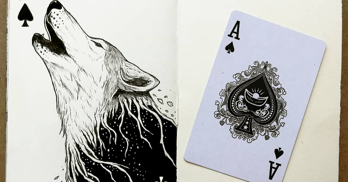
The Ace of Spades became the most dramatic card in the deck: a black mountain rising from a field of silver stars, framed by lightning and a crescent moon. It was the card that said, “Yes, something important is about to happen,” even when the important thing was only someone forgetting how to play poker.
Designing the Court Cards as Characters
The court cards were where the project really became a story.
Instead of traditional kings, queens, and jacks wearing crowns and looking mildly disappointed in everyone, I created characters that belonged to each natural realm. The goal was not to erase the familiar hierarchy of a playing card deck, but to reinterpret it.
The King of Hearts became the Stag Keeper, wearing a cloak made of autumn leaves and carrying a lantern shaped like a seed pod. The Queen of Hearts became the Rose Witch, a guardian of forest paths whose sleeves were covered in climbing vines.
The King of Diamonds became a celestial cartographer, mapping stars with a compass made from moonstone. The Queen of Diamonds became a winter sorceress surrounded by snowflakes and pale feathers. The Jack of Diamonds was a mischievous owl messenger who had clearly read everyone’s mail but refused to apologize.
For the Clubs court cards, I created herbalists, gardeners, beetle riders, and mushroom collectors. The Spades court cards became mountain guardians, storm callers, and ravens with the energy of employees who have seen far too much during a night shift.
Modern card decks often become stronger when every card supports a shared concept rather than functioning as an isolated illustration. AIGA has highlighted decks where artists use consistent themes, symbolism, and visual systems to turn familiar cards into a unified design object.
Building a Visual System Instead of Making 52 Random Drawings
The hardest lesson came early: a deck is not a gallery wall.
When you are designing a series, every card has to feel related to the others. That does not mean every card should look identical. It means they should feel like cousins who share a family resemblance, even though one cousin owns seven crystals and another communicates exclusively through bird noises.
I created a simple visual system before I finalized the illustrations:
- Each suit received its own main color palette.
- Each number card used repeated botanical or celestial motifs.
- Every court card had a matching decorative frame.
- The corners stayed clear and readable for actual gameplay.
- The card backs used one symmetrical design so players could not identify a card from the back.
I also made a sketch sheet showing all 52 cards at once. This was essential. A single card can look brilliant by itself and still look completely lost when placed beside 51 neighbors. Seeing the deck as a whole helped me spot repeated poses, overcrowded colors, and the alarming number of mushrooms I had accidentally included. Apparently, my subconscious had opened a very niche woodland gift shop.
Using Nature as a Real Reference, Not Just a Decorative Shortcut
I did not want to use “nature” as a vague pile of leaves pasted around everything. I wanted details that felt observed.
So I kept a small nature journal. I sketched bark, seed heads, feathers, clouds, stones, and the shape of branches against the sky. Nature journaling encourages artists and students to pay attention to patterns, seasonal changes, texture, and small visual differences that are easy to miss when we are in a hurry.
Bird feathers were one of my favorite references. Their colors are not always just pigments; some birds produce shimmering effects through feather structure and light refraction. That gave me ideas for the Diamond suit, especially for moonlit wings and iridescent accents.
Instead of copying a feather exactly, I translated its energy into a pattern: thin curved lines, layered shapes, and changing color bands. This made the art feel inspired by nature rather than borrowed from it.
Creating Magic Without Turning Every Card Into a Halloween Store
Magic can become visually noisy very quickly. Add a crystal, a moon, a raven, a glowing potion, a sword, twelve candles, a dragon, and suddenly the card looks like it is trying to sell you three different streaming subscriptions.
I kept the magical elements focused. Every card had one main idea. A card might feature a glowing mushroom ring, but not also a flying castle, a wizard duel, and a tax document. The viewer needs somewhere to rest their eyes.
I used magic mostly through atmosphere: unusual light, symbolic animals, floating leaves, mirrored water, and small hints that the natural world was slightly more aware than usual. A rabbit could wear a tiny crown. A tree could have stars growing in its branches. A storm cloud could curl into the shape of a sleeping dragon.
The trick was to make the magic feel possible inside the deck’s world. Once I had established the rules, even the strangest details felt believable.
From Digital Screen to Physical Cards
The first time I printed test cards, I learned a humbling truth: screens are excellent liars.
On my monitor, the blue tones looked luminous, the reds looked rich, and the gold accents practically sang opera. On paper, some of the colors became quieter, darker, or slightly muddier. This is normal because digital screens use RGB light, while most commercial printing relies on CMYK inks. Adobe explains that CMYK process printing combines cyan, magenta, yellow, and black to reproduce full-color images on print materials.
I adjusted the artwork after reviewing physical proofs. The darkest cards needed stronger contrast. Fine lines needed to become a little thicker. Some pale details needed to become bolder so they would not vanish after printing.
I also learned to respect practical design details:
- Leave enough space around the edges for trimming.
- Keep pips and card values easy to read.
- Test the deck in normal lighting, not only under dramatic desk-lamp conditions.
- Check whether the card backs are truly symmetrical.
- Shuffle the prototype before declaring victory.
A card deck should feel good in the hand, not only look good in an Instagram post. That means testing the balance between art and usability over and over again.
What Designing My Own Deck Taught Me
Making a custom deck of cards taught me that constraints can be creative fuel. I did not have infinite space, infinite colors, or infinite time. I had a set number of cards and a clear visual language. That limitation forced me to make choices.
It also taught me that inspiration is often hiding in ordinary things. A cracked stone wall became a border pattern. A wet leaf became a color palette. A crow outside my window became the King of Spades’ unofficial assistant. Nature kept offering material, as long as I slowed down enough to notice.
Most importantly, the project gave me a new appreciation for objects we handle without thinking. A deck of cards can be a game, a collectible, a storybook, a design challenge, and a little piece of portable art. It can sit on a coffee table looking innocent while quietly containing an entire invented world.
My Experience Designing a Nature-Inspired Magical Deck
The most surprising part of designing this deck was how personal it became.
At first, I thought I was simply making illustrations for cards. I made a mood board, chose a few colors, sketched some leaves, and congratulated myself for being extremely organized. This lasted roughly two days. Then every card began asking questions. Why does this bird belong to the Spades suit? What does the Queen of Clubs protect? Why are there three moons on the Nine of Diamonds? Why does the Jack of Hearts appear to have the confident expression of someone who definitely knows where the trail goes when he absolutely does not?
Those questions slowly turned the deck into a story.
I started taking walks with my phone camera and a notebook. I photographed tree bark, moss, puddles, fallen petals, cracked sidewalks with tiny weeds growing through them, and clouds that looked suspiciously like sea monsters. I stopped trying to find “perfect” nature. The half-eaten leaf, the crooked mushroom, and the branch that looked like a hand were often more interesting than the postcard view.
Some of my favorite ideas arrived at inconvenient times. The design for the Ace of Spades came while I was trying to sleep. The pattern for the card backs appeared while I was waiting for water to boil. A whole color palette emerged after I saw orange leaves floating in a rain puddle, which is the kind of moment that makes you feel poetic until you remember you are standing beside a parking lot.
I also had plenty of failed experiments. One early version of the King of Clubs looked less like a magical gardener and more like a man who had become emotionally overwhelmed in a produce aisle. The first Queen of Diamonds had so many stars around her head that she looked like she had walked into a door. My original joker design featured a frog wearing a crown, a cape, and tiny boots. It was adorable, but it had the visual volume of a marching band.
Each revision made the deck better. I learned to remove details that were fun but unnecessary. I learned that a strong silhouette can say more than twenty tiny decorations. I learned that color can carry emotion before the viewer even understands the illustration. And I learned that no matter how carefully you plan a project, at some point you will stare at a drawing of a magical owl and ask yourself whether its hat is too much.
In the end, I kept the owl’s hat.
The finished deck felt like a collection of small doorways. Every card had its own scene, but together they created a larger world of forests, storms, moonlight, roots, wings, and quiet spells. It reminded me that creativity does not always arrive with fireworks. Sometimes it appears as a leaf on the sidewalk, a shadow on the wall, or a strange little sketch that refuses to leave your notebook alone.
That is the magic I wanted the deck to hold: not the kind that demands a crystal ball or a thunderclap, but the kind that makes everyday nature feel a little more mysterious when you look at it twice.
Note: This article is written as a creative first-person design narrative. The deck’s characters, imagery, and project details are fictional and intended to inspire original artwork.