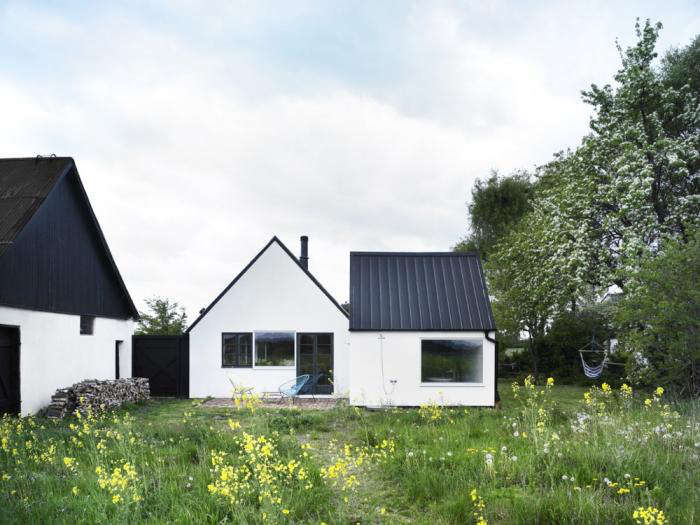
There is a moment in nearly every well-designed Swedish summer house when your eyes do a tiny double take. Maybe it is a cobalt-blue chair against pale pine floors. Maybe it is a sky-colored ceiling in a hallway that would have been perfectly respectable in white. Maybe it is a moss-green wall, a butter-yellow stool, or a pink-painted exterior that looks like it wandered in from a fairy tale and immediately improved the neighborhood. That moment of surprise is the entire charm.
For years, people have talked about Scandinavian interiors as if they arrived in the world wearing only white socks and sensible opinions. Clean lines, pale woods, natural light, minimal clutter, soft textiles, yes. All true. But that is only half the story. The more interesting half is that Swedish summer houses often use restraint as a setup, not a finish line. Once the room feels calm, airy, and connected to nature, one unexpected color can walk in like it owns the place. Frankly, sometimes it should.
That is what makes shocking color in a Swedish summer house so effective. It does not scream over the architecture. It sharpens it. It gives the softness of Scandinavian design a pulse. The result is still peaceful, still practical, still deeply tied to the landscape, but now it has personality, memory, and a little bit of swagger.
Why Swedish Summer Houses Are the Perfect Place for Bold Color
A Swedish summer house is not usually designed to impress a crowd with marble drama and a chandelier the size of a small moon. It is designed to be lived in. These homes tend to celebrate daylight, nature, fresh air, and rooms that feel useful rather than fussy. Large windows, light woods, woven textures, painted floors, linen upholstery, and easy indoor-outdoor flow all create an atmosphere that feels relaxed and restorative.
That calm backdrop is exactly why a vivid color works so well. In a room already grounded by white walls, pale oak, pine, stone, wool, and sea or garden views, one strong hue becomes a focal point instead of a fight. It is the design equivalent of adding a red lip to a bare face. Suddenly the whole thing looks intentional, confident, and oddly effortless, even though someone definitely obsessed over the shade for weeks.
Swedish summer homes also sit close to powerful natural palettes. Think sea blues, cloudy grays, meadow greens, weathered reds, butter yellows, wildflower pinks, and the deep earthy tones of bark, clay, and copper. The “shocking” part is not that color appears out of nowhere. It is that it appears in a room where you expected only restraint, then feels so right you cannot imagine the space without it.
The Scandinavian Base: Calm First, Color Second
To understand why bold color works in these homes, you have to appreciate the base layer. Scandinavian interiors are famous for a reason. They usually prioritize natural light, practical layouts, uncluttered styling, cozy materials, and a close relationship with nature. The most successful Swedish summer houses do not abandon that foundation when they bring in color. They build on it.
Natural Light Does Most of the Heavy Lifting
White walls, soft neutrals, and light woods are not just aesthetic habits. They help rooms reflect daylight and feel brighter through long dark seasons and shifting Nordic weather. In summer houses especially, daylight becomes part of the design. When a bold color enters that environment, it changes with the light. A sea-blue ceiling can look misty in the morning, crisp at noon, and romantic by evening. That changing quality keeps color from feeling flat or overly decorative.
Wood Grounds the Drama
Pale pine, ash, oak, and scrubbed plank floors create warmth without visual clutter. They also prevent bold color from feeling synthetic or cold. A vivid yellow lamp beside a raw wood table feels cheerful. The same lamp in a glossy black room might feel like it is applying for a different job entirely. In Swedish summer houses, wood is often the peacemaker. It allows color to be brave while the room stays believable.
Texture Softens Strong Shades
Linen curtains, wool throws, sheepskins, handwoven rugs, painted cabinetry, matte tiles, and brushed metals keep color from becoming too sharp. Scandinavian style has never been about sterile minimalism at its best. It is about softness with structure. That is why a moss-green wall, dusty-pink sofa, or cobalt-blue stair feels inviting rather than loud when surrounded by tactile, natural materials.
What “Shocking Color” Actually Looks Like in a Swedish Summer House
Let us retire the idea that bold color in Nordic design always means neon walls and furniture that looks caffeinated. In reality, the most effective colors are often surprising because of placement, contrast, or confidence rather than volume. They feel unexpected in the context of a Scandinavian home, not necessarily wild by global design standards.
Sky Blue on the Ceiling
One of the smartest ways to use color in a summer house is overhead. A pale or medium sky blue on a hallway or porch ceiling can mimic open air and bring a coastal softness indoors. It turns a transition space into a mood. Because the walls and floors remain neutral, the room still reads as calm. But now it has a point of view.
Moss Green Walls
Green is practically cheating in a Swedish summer house because it already belongs there. It connects immediately to gardens, pines, meadows, and mossy stone. A muted moss or olive on walls or cabinetry feels richer than beige but just as livable. It brings depth without stealing the tranquility that makes Scandinavian spaces so appealing.
Pink That Refuses to Apologize
Pink in a Swedish house works best when it is treated seriously. Not bubblegum. Not nursery. Think dusty blush, warm plaster pink, or a soft but confident exterior shade that plays beautifully against greenery and pale woods. In the right setting, pink becomes architectural rather than cute. It reads as cheerful, artistic, and unexpectedly grown-up.
Cobalt, Ochre, and Burnt Orange Accents
If your walls are neutral, your boldest move may be smaller. A single cobalt armchair, ochre pendant, burnt-orange cushion, or glossy painted stool can energize the entire room. These shades are especially effective in houses with a coastal or rural backdrop, where the surrounding landscape is soft and the architecture is simple.
Mint Kitchens and Colorful Cabinetry
Color in the kitchen is where modern Scandinavian style has become especially playful. Mint-green cabinets, blue-gray islands, warm copper surfaces, or even a flash of hot pink in accessories can pull a summer house kitchen away from showroom seriousness and toward lived-in charm. That matters because the kitchen in a summer house is rarely just a kitchen. It is the breakfast room, gossip station, coffee headquarters, and rainy-day refuge.
How to Add Bold Color Without Ruining the Scandinavian Mood
This is the section for anyone who loves the idea of color but fears waking up in a room that looks like a set from a children’s television reboot. The trick is not to use less personality. It is to use more control.
Start with One Hero Shade
Choose one color that will lead the room. Maybe it is ocean blue, berry pink, meadow green, mustard, or earthy rust. Then repeat it lightly in two or three places. A chair, a vase, a striped cushion, maybe a painted doorframe. This creates rhythm instead of randomness.
Use Nature as Your Color Consultant
If the house sits near the coast, lean into sea blues, weathered whites, sandy taupes, and sea-glass greens. If it is tucked into woods, richer greens, bark browns, ochres, and muted reds make more sense. Nature is annoyingly talented at color coordination, and frankly we should all steal from it more often.
Keep the Background Quiet
Bold color lands best when the background is restrained. Whitewashed walls, pale timber, simple textiles, and uncluttered shelves allow color to breathe. If every corner shouts, no one wins. Not the room, not the furniture, and definitely not your blood pressure.
Mix Old and New
Color often feels richer in a home that mixes vintage pieces with contemporary lines. A bright painted stool beside an old farmhouse table. A pastel cabinet next to antique ceramics. A modern cobalt sofa under a traditional beam ceiling. This contrast keeps a summer house from feeling theme-y and makes the color look collected rather than purchased all at once during one very emotional Saturday.
Let Utility Be Beautiful
Swedish homes tend to value function, and summer houses especially benefit from that mindset. A painted bench, colorful hooks, striped kitchen towels, glazed tile, or a practical lamp in a bold tone can all carry color without clutter. When the useful object is also the pretty object, the room stays crisp.
Rooms Where Shocking Color Works Best
The Entry
This is the perfect place for a brave choice: painted trim, a colorful ceiling, a bold runner, or a statement bench. The entry sets the tone. It tells people this house respects Scandinavian calm but is not emotionally unavailable.
The Kitchen
Cabinet fronts, stools, tile, pendant lights, and even open shelving are ideal places to experiment. Kitchens are social, hardworking spaces, and color can make them feel generous and alive without getting messy.
The Living Room
If the architecture is simple, one strong sofa, rug, or artwork can define the room. This is where cobalt, rust, ochre, and forest green look especially elegant against linen, wood, and white walls.
The Bedroom
Summer-house bedrooms do not need much. That is why color matters. A painted headboard wall, floral quilt, striped blanket, or one joyful bedside table can make a sparse room feel tender and memorable.
The Porch or Hallway
These transition zones are ideal for playful risk. A blue ceiling, green bench, painted floor, or unusual light fixture can create delight in the very spaces most people forget to style well.
Why This Look Feels So Current Right Now
Design has been drifting away from perfection for a while now. People still want calm homes, but they also want homes that feel personal. The new wave of Scandinavian-inspired interiors reflects that shift beautifully. The minimalist backbone remains, but color is returning in more expressive ways. Not chaos. Character.
That makes the Swedish summer house especially influential right now. It offers a model for how to live with color intelligently. You do not need to abandon simplicity to make a room memorable. You do not need to cover every surface in pattern to create warmth. You just need a strong foundation, a little nerve, and enough self-control to stop after the room says thank you.
The Real Secret: Color Feels Better When the House Already Feels Honest
The most beautiful Swedish summer houses are never only about palette. They are about mood. They feel open to the landscape, easy to move through, and genuinely useful. Meals can be cooked there. Wet towels can be draped somewhere sensible. Friends can wander in barefoot. Windows can be thrown open. Books can pile up. Flowers can end up in random jars and somehow look better than a professionally styled arrangement.
In that kind of house, a shocking color is not decoration for decoration’s sake. It is emotion made visible. It is the streak of playfulness in a disciplined home. It is proof that minimalism does not have to be timid and serenity does not have to be boring.
Extended Reflections: Living With Shocking Color in a Swedish Summer House
Imagine arriving at a Swedish summer house on a bright July afternoon. The gravel crunches under your shoes, the air smells faintly of pine and salt, and the exterior gives almost nothing away. Maybe the facade is weathered wood. Maybe it is a soft traditional red. Maybe it is pale and modest, the kind of house that looks as if it has mastered the art of minding its own business. Then the front door opens, and there it is: a flash of color that changes everything.
It might be a hallway ceiling painted the exact blue of a clear Nordic sky. It might be a glossy green bench with baskets tucked below it, or a pink lamp glowing against white paneling. Whatever the detail, the reaction is immediate. The house no longer feels like a design concept. It feels like a place with a pulse.
That is the emotional power of unexpected color. It creates memory. Long after you forget the throw pillows and the shape of the dining table, you remember the yellow chair by the window where you drank coffee while it rained. You remember the moss-green kitchen cabinets that made tomatoes on the counter look like still life paintings. You remember the blue stair rail that looked almost electric in the evening light. Good interiors are not always the ones with the most expensive materials or the most disciplined palettes. Often, they are the ones that leave behind a scene in your mind.
There is also something wonderfully human about color in a Swedish summer house. These homes are often associated with simplicity, routine, fresh air, and unhurried living. You cook more. You read more. You notice the weather. In that setting, color becomes less about trend and more about mood support. A warm rust cushion can make a cool room feel welcoming on a windy day. A soft pink bedroom can make early mornings gentler. A bright striped rug can make children feel that the house belongs to them too, not just to the adults protecting their perfect neutral scheme like museum guards.
The best part is that bold color does not demand a giant budget or a reckless personality. Sometimes the most memorable move is also the simplest: paint one piece of furniture, choose one wild lamp, tile one backsplash, or hang one artwork that refuses to whisper. In a house built on Scandinavian principles, that single choice often goes farther than a full renovation. The room already has light, texture, proportion, and calm. Color just gives it a story.
So yes, shocking color in a Swedish summer house can be beautiful. But more than that, it can be liberating. It proves that elegance and joy are not enemies. It reminds us that nature is not beige, memory is not beige, and summer is definitely not beige. A home can be quiet and still have a sense of humor. It can be restrained and still flirt a little. And sometimes all it takes is one glorious, unexpected color to make the whole house feel more alive.
Conclusion
Shocking color in a Swedish summer house works because it respects the rules before bending them. Start with everything that makes Scandinavian design so enduring: light, wood, texture, function, comfort, and connection to nature. Then add one color that feels a little daring and a lot right. That is the sweet spot. Not a chaos bomb. Not a timid beige retreat. Something brighter, braver, and much more memorable.
In other words, keep the pine floors, keep the linen curtains, keep the sea breeze, and let one extraordinary color have its moment. The house will thank you. Your guests will talk about it for years. And you will finally have proof that calm interiors do not have to behave all the time.