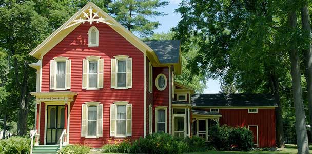
Choosing paint colors for ornate Victorian houses is a little like dressing a grand old theater actor: subtle can be elegant, dramatic can be glorious, and the wrong accessory can make the whole performance feel like community karaoke night. Victorian homes were built to show off. Brackets, spindles, fish-scale shingles, turned porch posts, bay windows, carved panels, gables, and trim-on-trim-on-trim all beg for color. The trick is not simply picking pretty shades; it is building a thoughtful exterior paint scheme that helps the architecture speak clearly.
The best Victorian house paint colors balance history, curb appeal, neighborhood character, personal style, and practical maintenance. Some homeowners dream of a classic “painted lady” with five or six colors. Others want a calmer Queen Anne, Italianate, or Second Empire home that looks polished rather than theatrical. Both approaches can work beautifully. The magic is in knowing where to place each color, how much contrast to use, and when to stop before your porch starts looking like it was sponsored by a candy store.
Why Victorian Houses Can Handle More Color
Victorian architecture flourished during a period when American homes became more decorative, more expressive, and increasingly colorful. Earlier exterior palettes were often limited by natural pigments, which produced earthy reds, browns, ochres, creams, and greens. As paint manufacturing advanced, homeowners had access to richer and more varied colors. That shift was perfect timing for Victorian architecture, because these homes were already busy in the best possible way.
An ornate Victorian exterior is usually divided into several visual parts: the body color, trim color, sash color, porch color, door color, and accent colors for decorative details. A plain modern box may look overwhelmed by four colors. A Queen Anne with patterned shingles, scrollwork, and a wraparound porch may look unfinished with only one. That does not mean every spindle deserves its own shade. It means color should be used like lighting on a stage: to guide the eye, reveal depth, and make the details worth noticing.
Start With the Architecture, Not the Paint Chip
Before falling in love with a color named something dramatic like “Midnight Plum Velvet Thunder,” study the house itself. Is it a Queen Anne with asymmetrical gables and multiple textures? An Italianate with tall windows, brackets, and a more formal shape? A Second Empire with a mansard roof? Each style can support a slightly different paint strategy.
Queen Anne Victorian Homes
Queen Anne houses are the natural extroverts of the Victorian family. They often have towers, porches, patterned shingles, and complex rooflines. These homes can handle three to five colors when the palette is coordinated. A strong body color such as sage green, deep olive, muted teal, warm taupe, or russet can be paired with cream trim, darker sash, and one or two accents in burgundy, gold, blue-gray, or chocolate brown.
Italianate Victorian Homes
Italianate houses tend to be more symmetrical and stately. They often look best with mature, grounded palettes: warm stone, olive gray, ochre, creamy beige, taupe, or deep green. Brackets and window crowns can be highlighted, but the overall effect should feel composed rather than circus-adjacent. Think “handsome professor with excellent shoes,” not “birthday cake in a windstorm.”
Second Empire Victorian Homes
Second Empire homes are known for mansard roofs, dormers, and a formal vertical presence. They often look stunning in sophisticated palettes: slate blue, charcoal green, warm gray, cream, deep burgundy, or dark bronze. Because the roof is visually dominant, choose body and trim colors that complement the roofing material rather than fight it.
The Classic Three-Color Victorian Paint Scheme
If you want a historically respectful and manageable starting point, use a three-color scheme: body, trim, and sash or accent. This is the little black dress of Victorian exterior paint ideasexcept it may be olive, cream, and burgundy.
Body color covers the largest wall areas, including clapboard, shingles, or siding. It sets the mood from the street. Trim color frames windows, doors, porches, cornices, and decorative woodwork. Sash or accent color is used on window sashes, doors, shutters, brackets, panels, or selected details.
A simple example: use muted sage green for the body, warm ivory for the trim, and deep oxblood red for the front door and window sash. Another classic option is ochre body, cream trim, and forest green accents. For a cooler palette, try slate blue body, soft white trim, and charcoal or plum accents. These combinations feel rich without yelling at passing pedestrians.
Earthy Victorian Paint Colors for a Historic Look
Earth tones are among the safest and most beautiful paint-color ideas for ornate Victorian houses. They connect well with the natural pigments that influenced many nineteenth-century palettes and tend to age gracefully. They also make elaborate trim look intentional instead of fussy.
Olive, Sage, and Moss Green
Green is practically a Victorian exterior superpower. Olive, sage, moss, and gray-green shades work well on houses surrounded by mature trees, gardens, stone walls, or brick walkways. Pair green body colors with cream, straw, bronze, burgundy, or dark brown trim. For a bolder “painted lady” interpretation, add a small amount of dusty rose or muted gold on decorative shingles or brackets.
Ochre, Mustard, and Warm Gold
Ochre and mustard shades can make a Victorian house feel cheerful without becoming cartoonish. The secret is choosing a muted, earthy yellow instead of a bright school-bus yellow. Warm gold body colors look especially handsome with ivory trim, reddish-brown sash, and deep green doors. This palette is sunny, historic, and friendlylike the house baked cookies and also knows Latin.
Russet, Brick Red, and Deep Brown
Reddish browns and brick-inspired colors are excellent for Victorian homes with stone foundations, dark roofs, or wooded settings. A russet body with tan trim and deep green accents can feel warm and grounded. Chocolate brown trim can also add depth, especially when used sparingly on porch floors, railings, or window sash.
Vivid Victorian Color Schemes That Still Look Elegant
Not every Victorian house needs to whisper. Some were born to sing from the gable. If you prefer a more energetic exterior paint palette, the key is controlling saturation. Choose colors with depth, gray undertones, or earthy roots. Bright purple, neon turquoise, and electric pink may look fun on a tiny swatch, but on a three-story façade they can become a neighborhood weather event.
Teal, Cream, and Burgundy
A muted teal body color can be gorgeous on a Queen Anne, especially with cream trim and burgundy accents. This palette feels lively but not chaotic. Use the burgundy on the front door, sash, or small decorative panels. Keep porch ceilings or soffits lighter to avoid making the house feel too heavy.
Plum, Taupe, and Soft Gold
Plum is a dramatic Victorian accent color when treated carefully. Use it on doors, window sash, or small gable details rather than across the entire body unless the house and neighborhood can support a moody statement. Pair plum with taupe siding and soft gold highlights for a rich, elegant effect.
Navy, Stone, and Ivory
Navy works beautifully on Victorian homes when it leans classic rather than electric. A deep blue body with ivory trim and stone-gray secondary trim can highlight ornate details while remaining timeless. Add a stained wood door or dark bronze hardware for warmth.
How to Place Accent Colors on Ornate Details
The biggest mistake in Victorian exterior painting is treating every decorative detail as a separate coloring-book zone. Yes, the house has brackets. Yes, the brackets are adorable. No, each bracket does not need three stripes and a personal theme song.
Use accent colors to clarify the architecture. Highlight details that create rhythm, depth, or craftsmanship: window sash, gable shingles, porch brackets, turned posts, panels, and doors. Avoid accenting random surfaces just because they are there. If everything is emphasized, nothing is emphasized.
A good rule is to assign one purpose to each color. The body color provides mass. The trim color outlines structure. The sash color adds depth. Accent colors create sparkle in limited places. For example, on a Queen Anne, you might use the body color on clapboard, a slightly darker related shade on fish-scale shingles, cream on main trim, dark green on sash, and a muted red on the front door. That is colorful, but it has logic.
Paint Ideas Based on House Features
For Fish-Scale Shingles
Fish-scale shingles are perfect for a secondary body color. Instead of painting them the same shade as the clapboard, try a related color that is one or two steps lighter or darker. Sage clapboard with deeper olive shingles looks layered. Taupe clapboard with warm gray shingles feels refined. Blue-gray clapboard with slate shingles adds quiet drama.
For Porches and Railings
Porches take abuse from sun, rain, shoes, furniture, pets, and the occasional dropped lemonade. Choose durable finishes and practical colors. Porch floors often look best in deep gray, brown, green-black, or muted blue-gray. Railings can match trim, while spindles may be painted a secondary trim color for depth.
For Front Doors
The front door is the safest place to use a bold color. Deep red, black-green, navy, plum, golden ochre, or stained wood can all work beautifully. If you are nervous about color, start with the door. It is much easier to repaint a door than to explain to your entire block why the whole house is now “experimental mango.”
For Window Sash
Dark window sash can make Victorian windows look crisp and deep. Forest green, charcoal, chocolate, burgundy, or black-brown are strong options. Dark sash also helps windows recede visually, which can make trim details stand out more clearly.
Modern Victorian Paint Color Ideas
Many homeowners want their Victorian house to feel historic, but not frozen in amber. A modern Victorian palette can respect the home’s architecture while using cleaner, softer, or more restrained colors.
Try warm greige body paint with ivory trim and black-green accents. Or use a soft blue-gray body with cream trim and a natural wood door. Another beautiful modern approach is a tonal palette: medium sage body, lighter sage trim, and deep olive sash. Tonal color schemes are especially useful when you want depth without high contrast.
For urban Victorian houses, charcoal, deep navy, or warm black can look striking when balanced with cream trim and natural landscaping. Use very dark colors thoughtfully, especially in hot climates where heat absorption and fading may become concerns.
Practical Tips Before Painting a Victorian Exterior
Test Large Samples Outside
Paint colors change dramatically in daylight. A color that looks cozy in the store may look icy, muddy, or surprisingly loud on the house. Paint large sample boards and view them in morning light, afternoon sun, shade, and cloudy weather.
Check Local Historic District Rules
If your house is in a historic district, exterior paint changes may require approval. Some districts offer recommended palettes for body, trim, and accent colors. This is not necessarily bad news. It can save you from choosing a palette that causes both peeling paint and paperwork.
Respect Existing Materials
Consider the roof, brick, stone foundation, pathways, porch flooring, and neighboring homes. A Victorian paint scheme should not ignore fixed materials. If the roof is warm brown, a cool purple-gray body may clash. If the foundation is red brick, greens, creams, taupes, ochres, and warm grays often work better than icy blues.
Prepare the Surface Properly
Historic woodwork needs careful preparation. Paint is not only decorative; it helps protect wood from moisture. Scraping, sanding, priming, caulking, and repairing damaged trim are essential. A beautiful color over failing paint is like wearing a tuxedo over wet pajamas: technically dressed, but not okay.
Five Ready-to-Use Victorian Exterior Palettes
1. The Garden Queen Anne
Body: muted sage green. Trim: warm ivory. Sash: deep forest green. Accent: dusty rose or burgundy. This palette is ideal for homes with gardens, mature trees, and decorative shingles.
2. The Historic Ochre Beauty
Body: soft ochre. Trim: cream. Sash: dark brown. Accent: olive green. This cheerful but grounded scheme works well on Italianate and Queen Anne homes.
3. The Sophisticated City Victorian
Body: warm charcoal or blue-gray. Trim: ivory. Sash: black-green. Door: stained wood or oxblood. This palette feels dramatic, polished, and urban.
4. The Painted Lady, But Make It Tasteful
Body: teal-gray. Secondary body: slate blue. Trim: cream. Sash: burgundy. Accent: muted gold. This gives you color and personality without turning the house into a parade float.
5. The Quiet Restoration Palette
Body: taupe. Trim: soft white. Sash: deep bronze. Door: dark green. This is a safe, elegant choice for homeowners who want historic charm and broad curb appeal.
Common Victorian Paint Mistakes to Avoid
First, avoid using pure white everywhere. Bright white can flatten ornate details and make an old house look stripped of character. Soft white, cream, ivory, or warm stone usually works better.
Second, avoid too many unrelated colors. A Victorian house can wear multiple colors, but they should belong to the same story. If your body color says “historic garden” and your trim says “beach condo,” the house may look confused.
Third, do not ignore scale. Tiny paint chips lie. A shade becomes stronger when applied to a large exterior wall. Always test before committing.
Finally, avoid painting unpainted masonry unless there is a sound preservation reason. Brick and stone are part of the home’s historic character and can be difficult to restore once painted.
Experience Notes: What Really Happens When Choosing Victorian House Colors
One of the most useful experiences in choosing paint-color ideas for ornate Victorian houses is standing across the street and squinting. It sounds deeply unscientific, but it works. Up close, homeowners tend to obsess over tiny brackets, corner blocks, and spindle details. From the sidewalk, the larger composition becomes obvious. You can see whether the body color feels balanced, whether the trim is too sharp, and whether the accent color is helping or just waving for attention.
Another real-world lesson: the “perfect” color on one Victorian house may fail completely on another. A moss green that looks elegant under tall maple trees may look dull on a sun-blasted corner lot. A rich burgundy door may glow beautifully against cream trim but feel too heavy beside dark brown siding. Victorian paint planning is not only about history; it is about light, landscape, roof color, and the personality of the street.
Homeowners often begin by wanting the most colorful palette possible. Then they test samples and discover that restraint can make decorative details more visible. A five-color scheme can be gorgeous, but only when each color has a job. On one ornate porch, for example, painting the posts, railings, brackets, and spindles in four unrelated colors can make the craftsmanship disappear. Using cream for the main trim, a deeper shade for shadows, and one accent on the carved details can make the same porch look more expensive and more historic.
Another helpful experience is photographing the house in black and white. This removes the distraction of hue and shows whether the light and dark values are working. If the body and trim become the same gray in the photo, there may not be enough contrast. If the accent areas turn into black polka dots, there may be too much contrast. Value matters as much as color, especially on homes with ornate woodwork.
It is also wise to talk to neighbors, not because they get to vote on your house, but because Victorian homes often belong to a streetscape. A colorful house can be a neighborhood treasure when it harmonizes with nearby roofs, trees, brick, and porch lines. It can also become “that house” if the palette ignores everything around it. The goal is not to be timid. The goal is to be memorable for the right reasons.
Finally, patience pays. Painting an ornate Victorian exterior is a major investment, and rushing the color decision can be costly. Live with sample boards for a week. Move them around. View them after rain, at sunset, and in full afternoon glare. Ask yourself whether you still like the palette when you are tired, hungry, and carrying groceries. If the answer is yes, you may have found the one. If the answer is “Why is my house suddenly grape?” keep sampling.
Conclusion
The best paint-color ideas for ornate Victorian houses do more than decorate; they reveal architecture. A thoughtful palette can highlight craftsmanship, restore historic character, improve curb appeal, and make an old house feel loved again. Whether you choose earthy greens, warm ochres, deep reds, slate blues, creamy trim, or a tasteful painted-lady combination, remember the golden rule: color should serve the house, not wrestle it to the ground.
Start with the architectural style, study the fixed materials, test large samples, and use accents with intention. A Victorian home has plenty to say. The right paint colors simply hand it the microphone.