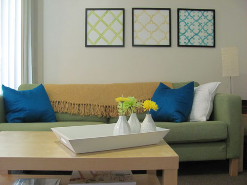
Making colorful graphic art prints at home sounds dangerously simple: open a design, hit “print,” admire masterpiece, retire as a celebrated artist. Then the printer spits out something that looks like your artwork went on a sad camping trip in a fog machine. The orange is brown. The teal is emotionally unavailable. The paper curls like a potato chip. Welcome to the thrilling, ink-scented world of home art printing.
The good news is that beautiful DIY graphic art prints are absolutely possible without renting a studio, buying a commercial press, or learning mysterious phrases whispered by print technicians in black turtlenecks. With the right file setup, paper choice, color workflow, and a few test prints, you can create bold posters, wall art, greeting cards, collage prints, nursery art, abstract designs, quote prints, and small-batch products right from your desk.
This guide explains how to design, print, troubleshoot, and finish colorful graphic art prints at home while keeping your budget, patience, and printer relationship intact.
Why Make Graphic Art Prints At Home?
Home printing gives artists and hobbyists something professional print shops cannot always offer: instant experimentation. You can test a coral background at midnight, change the typography before breakfast, and print three versions before your coffee remembers its purpose.
For creators selling small batches online, home printing also makes sense when you want control over color, paper texture, packaging, and turnaround time. You can produce limited editions, seasonal designs, personalized gifts, or wall art collections without ordering hundreds of copies upfront.
For beginners, the biggest advantage is creative freedom. You learn how colors behave on paper, how paper changes mood, and how tiny design decisions affect the final piece. A print is not just a digital image made physical. It is a collaboration between artwork, ink, paper, light, and whatever mood your printer woke up in.
Start With A Strong Design Concept
Before thinking about ink and paper, decide what your print is supposed to do. Is it cheerful kitchen art? A bold geometric poster? A calming abstract landscape? A retro typography print? A playful illustration for a kid’s room? Clear intent helps you choose color, scale, layout, and finish.
Choose A Color Palette With Purpose
Color theory is not just for people who say “visual language” at dinner parties. It is a practical shortcut for making art prints feel polished. Complementary colors, such as blue and orange, create energy. Analogous colors, such as yellow, orange, and red, feel warm and cohesive. Monochromatic palettes use one base color with lighter and darker variations, which is great when you want a clean modern look.
For colorful graphic art prints, try limiting your palette to three to six main colors. Too many colors can make a design look noisy, especially after printing. Think of your palette like a band: one lead singer, a few backup vocals, and absolutely no random kazoo unless the kazoo has earned its place.
Design At The Final Print Size
Create your file at the exact size you plan to print. If your finished print is 8 x 10 inches, build an 8 x 10 inch document. If you want an 11 x 14 poster, start there. Scaling up a small design later can soften edges, blur textures, and turn crisp graphics into suspicious pudding.
For most art prints, 300 PPI at final size is a reliable target for sharp output. Vector artwork, such as shapes, typography, icons, and line art, can scale cleanly, but raster elements like photos, textures, scanned drawings, or digital paintings need enough pixel information to print well.
Pick The Right Tools For Digital Artwork
You do not need the most expensive design software to make attractive graphic art prints. Adobe Illustrator and Photoshop are powerful choices for professional workflows. Canva, Adobe Express, Procreate, Affinity Designer, and similar tools can also work well, especially for posters, quote prints, patterns, and simple illustrations.
The key is not which software you use. The key is whether it lets you control document size, export quality, color settings, margins, and file format. A beautiful print can begin in a fancy design app or on a tablet while you are sitting on the couch pretending you are “just checking one thing.”
Use Vector Elements When Possible
Graphic art often depends on clean shapes, sharp text, and bold edges. Vector artwork is ideal for this because it is built from mathematical paths rather than fixed pixels. Logos, icons, geometric patterns, typography, and flat illustrations usually print cleaner when created as vector elements.
If your print includes hand-drawn textures or painted effects, keep those raster layers high resolution. A tiny texture stretched across a large poster can look crunchy, and not in the charming granola way.
Understand RGB, CMYK, And Why Screens Lie A Little
Your screen displays color with light, usually in RGB: red, green, and blue. Printers create color with ink or toner on paper, commonly using cyan, magenta, yellow, black, and sometimes extra ink colors. Because screens glow and paper reflects light, your print will rarely look exactly like your monitor.
Bright neon colors are the usual troublemakers. Electric blue, hot pink, and screaming green may look amazing on screen but print more muted because ink cannot reproduce every glowing digital color. This is normal. The printer is not being dramatic; it is obeying physics, which is even more annoying.
Should You Use RGB Or CMYK?
For home inkjet printing, many printer drivers and photo printers are designed to receive RGB files and handle the conversion internally through printer profiles. For commercial print shops, CMYK may be requested because presses use a CMYK workflow. Always follow the workflow recommended by your printer, software, or print provider.
A practical home rule: keep an editable master file in RGB, save a copy before major color conversions, and test print before making a batch. If your software supports soft proofing with an ICC profile for your printer and paper, use it to preview how colors may shift on paper.
Choose A Printer That Matches Your Goals
You can make colorful graphic art prints with many modern home printers, but not all printers are built for the same job. Inkjet printers are usually better for rich color art, photographs, illustrations, and textured papers. Laser printers are fast and useful for documents, simple graphics, and some craft projects, but they may not deliver the same depth, subtle gradients, or paper compatibility as a good photo inkjet.
If your goal is wall art, greeting cards, stationery, stickers, or small shop inventory, look for a printer that supports high-quality color output, borderless printing if you need it, multiple paper sizes, and thicker media. Pigment ink printers are often favored for archival fine art prints because pigment inks tend to have strong longevity when paired with suitable paper. Dye ink printers can produce brilliant color and smooth gradients, often at a lower cost, though longevity varies by ink and paper combination.
Do Not Ignore Printer Settings
Printer settings are where many beautiful designs go to become “almost right.” Always match the media type setting to the paper you are actually using. Matte paper should be printed with a matte or fine art paper setting. Glossy paper needs a glossy setting. Heavy paper may require a rear feed or specialty media path.
That setting controls how much ink is laid down, how the paper moves through the printer, and how color is interpreted. Choosing plain paper while using premium matte art paper is like asking a chef to cook steak with toaster instructions.
Select The Best Paper For Colorful Art Prints
Paper has personality. It can make the same design feel playful, luxurious, soft, crisp, modern, vintage, or “I made this during a thunderstorm and somehow it works.” The paper you choose affects color vibrancy, contrast, texture, durability, and perceived value.
Matte Paper
Matte paper has little to no shine, which makes it excellent for graphic illustrations, typography, minimalist posters, nursery art, and prints that will be framed under glass. It reduces glare and gives colors a softer, more refined look. Matte paper is forgiving, elegant, and rarely screams for attention in the wrong way.
Satin, Luster, And Semi-Gloss Paper
Satin and luster papers sit between matte and glossy. They offer more color depth and contrast than matte while avoiding the mirror-like shine of glossy paper. These finishes are excellent for bold graphic prints, photography-inspired designs, and art that needs color pop without glare drama.
Glossy Paper
Glossy paper creates rich saturation and sharp detail, making it useful for vibrant posters, pop-art styles, and high-impact designs. The downside is glare, fingerprints, and a finish that may feel less “fine art” for certain home decor pieces. Glossy paper is the extrovert of the paper family: fun at parties, but sometimes too much near a window.
Fine Art Cotton Paper
Cotton rag and fine art papers bring texture, weight, and a gallery-style feel. They are excellent for limited edition prints, painterly illustrations, soft abstract designs, and pieces meant to be handled or framed professionally. They usually cost more, so test carefully before printing a stack.
Prepare Your File For Printing
A clean file saves ink, paper, and several dramatic sighs. Before printing, check your size, margins, color mode, image resolution, spelling, layer visibility, and export settings. If your design includes text, proofread it at 100% zoom and again after printing. Typos hide until ink is involved. It is their hobby.
Use Bleed For Edge-To-Edge Prints
If your artwork runs all the way to the edge, extend the background or design beyond the final trim size. This extra area is called bleed. A common bleed amount is 1/8 inch on each side, though exact requirements vary by printer and project. Home printers cannot always print perfectly to the edge, so you may need to print on larger paper and trim down.
Export The Right File Type
For home printing, high-quality PDF, TIFF, or PNG files can work well depending on your software and printer. PDF is useful for preserving layout and text. TIFF is strong for high-quality raster artwork. PNG works for many simple graphics but may not be ideal for every print workflow. JPEG can work if saved at high quality, but repeated compression can soften details.
Keep one editable master file and export separate print files. Never flatten your only copy unless you enjoy future regret as a lifestyle choice.
Make Test Prints Before The Final Run
Test printing is not optional if you care about results. It is the difference between controlled creativity and donating half your paper pack to the recycling bin.
Print a small section of the artwork first, especially an area with important colors, gradients, skin tones, text, or fine lines. Check it in natural light and indoor light. Colors can look different under warm bulbs, cool LEDs, and daylight. If the print looks too dark, adjust the artwork or printer settings. If colors look dull, try a different paper profile, paper type, or saturation adjustment.
Create A Print Notes Sheet
Keep a simple record of what works: paper brand, paper type, printer setting, quality setting, software, color handling, and any adjustments. This turns your future self into a genius. Without notes, every reprint becomes a detective show where the suspect is always “something I clicked last time.”
Trim, Finish, And Store Your Prints
Once the print looks right, let it dry completely before trimming, stacking, framing, or packaging. Drying time depends on ink, paper coating, humidity, and print density. Heavy ink coverage on glossy or fine art paper may need more patience.
Use a sharp craft knife, rotary trimmer, or guillotine cutter for clean edges. A metal ruler and cutting mat are useful for small studio setups. Handle prints with clean, dry hands or cotton gloves if the paper is delicate. Store finished prints flat in acid-free sleeves, archival boxes, or rigid mailers.
Protect Prints For Display
If prints will be framed, use archival mats and avoid direct contact between the printed surface and glass when possible. Keep artwork away from direct sunlight, high heat, moisture, and steamy bathrooms unless your aesthetic is “tropical paper tragedy.”
Common Home Printing Problems And Easy Fixes
Colors Look Too Dark
Lower screen brightness while editing, use soft proofing if available, and test under normal room lighting. Many monitors are brighter than paper, so designs that look perfect on screen may print darker.
Colors Look Dull
Try a paper with more coating or a satin finish, choose the correct media setting, and confirm you are printing at high quality. Some matte papers intentionally soften saturation, which may be beautiful for calm art but disappointing for candy-colored posters.
Edges Are Blurry
Check image resolution, avoid enlarging low-resolution files, and use vector shapes for text and graphics when possible. Also confirm that the printer is set to high-quality output rather than draft mode.
Ink Smears Or Takes Too Long To Dry
Make sure you are printing on the correct side of the paper, using compatible paper, and selecting the right media type. Let prints dry longer before touching or stacking them.
Paper Jams Or Skews
Use the correct feed path for thicker paper, load one specialty sheet at a time, and check the printer’s paper weight limits. Your printer may be talented, but it is not a cardboard-eating goat.
Creative Ideas For Colorful Graphic Art Prints
Once your setup is working, the creative possibilities multiply fast. Try bold abstract shapes inspired by mid-century design. Make typography prints with short quotes, song-inspired phrases, or family names. Design color-blocked calendars, recipe cards, affirmation cards, or mini gallery walls. Create seasonal prints for spring, Halloween, Thanksgiving, or holiday decor.
You can also combine handmade and digital techniques. Paint textures with watercolor, scan them, recolor them digitally, and layer them behind crisp vector shapes. Cut paper collages, photograph them, and turn them into poster designs. Use your own doodles as icons. The more personal the source material, the less your print looks like something every other human downloaded before lunch.
Experience Notes: What Making Art Prints At Home Really Teaches You
The first lesson of making colorful graphic art prints at home is that printers are honest in a very rude way. Your screen may flatter your design like a supportive friend, but the printed page tells the truth. If your contrast is weak, the paper will whisper it. If your red is too aggressive, the printer will announce it. If your margins are uneven, they will suddenly be the only thing your eyes can see.
One helpful experience is to treat every new paper like a new ingredient. Matte paper may turn a bright modern print into something soft and gallery-like. Luster paper may make the same design look punchier and more commercial. Cotton rag paper can make a simple shape composition feel expensive, as if it suddenly got invited to an art opening and learned how to pronounce “hors d’oeuvres.”
Another lesson is that small tests save big disappointment. Instead of printing a full 13 x 19 inch sheet immediately, print a cropped area with your most important colors. Include a bright color, a dark color, a pale color, small text, and any gradient or texture. This tiny proof can reveal whether the yellow turns muddy, the black loses detail, or the background needs more brightness.
Home printing also teaches restraint. Beginners often push saturation because the screen rewards it. Paper is different. A print usually looks more professional when color has breathing room. White space, muted accents, and one strong focal color often beat a rainbow stampede. Colorful does not mean every hue must bring a suitcase and move in permanently.
Finally, the process teaches consistency. When you find a paper and setting combination that works, write it down. Label your test prints. Save versions of your files. Keep a folder for final exports. The more organized your workflow becomes, the easier it is to reproduce a print later for a gift, customer, or personal collection.
The best part is that home art printing makes creativity physical. You are not just looking at pixels. You are holding an object you made. You can frame it, mail it, sell it, pin it above your desk, or give it to someone who will say, “You made this?” and then you get to act casual even though your inner artist is doing cartwheels.
Conclusion
Making colorful graphic art prints at home is part design skill, part technical workflow, and part delightful trial-and-error circus. Start with a clear concept, build your file at the correct size, choose colors with intention, use the right paper, match your printer settings, and test before printing a full batch.
You do not need a professional studio to create beautiful prints. You need curiosity, good materials, careful notes, and the willingness to make a few imperfect test prints on the way to something frame-worthy. Once you learn how your printer, paper, and colors behave together, home printing becomes less mysterious and much more fun.