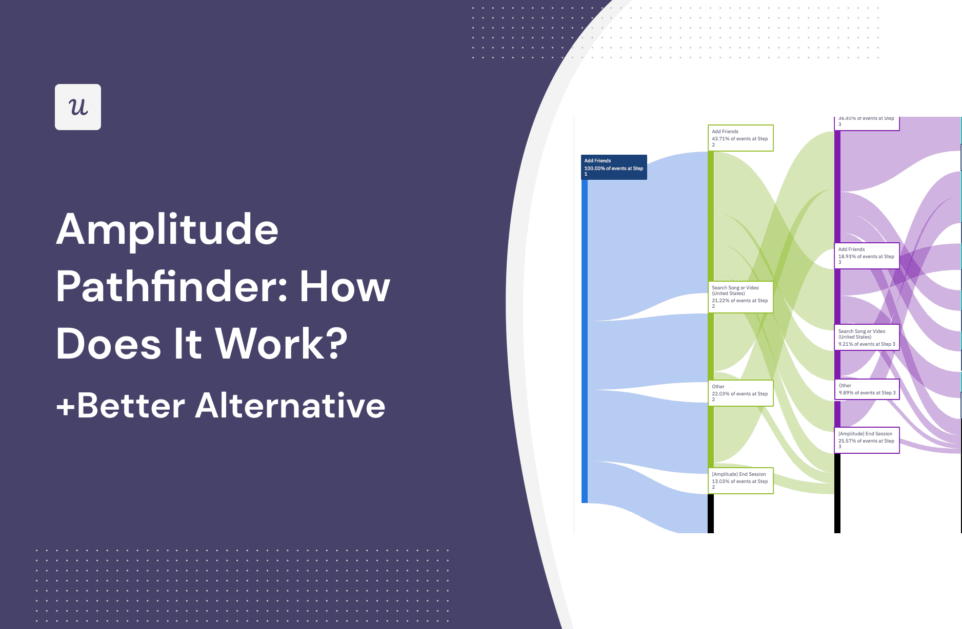
Product analytics can feel like detective work, except the footprints are events, the suspects are confused users, and the crime scene is usually your onboarding flow. Amplitude Pathfinder is one of the tools teams use to understand what users actually do before or after an important action. Instead of guessing why people sign up, convert, disappear, rage-click, or take the scenic route through your app, Pathfinder visualizes the paths users take across your product.
In plain English, Amplitude Pathfinder helps answer questions like: What do users do after they create an account? What steps usually happen before a purchase? Where do people wander off before activation? Which paths lead to conversion, and which ones look like a digital corn maze designed by a raccoon?
This guide explains how Amplitude Pathfinder works, when to use it, what its limitations are, and why a tool like Userpilot can be a better alternative for SaaS teams that want not only to analyze user journeys but also act on those insights inside the product.
What Is Amplitude Pathfinder?
Amplitude Pathfinder is a path analysis visualization inside Amplitude that shows the sequence of events users take before or after a selected event. In Amplitude’s current Journeys experience, Pathfinder is the default visualization for exploring paths that start with, end with, or move between specific events during a selected time period.
Think of it as a subway map for user behavior. Each station is an event, such as “Signed Up,” “Viewed Dashboard,” “Created Project,” “Clicked Upgrade,” or “Completed Checkout.” The lines between stations reveal how users move through your product. The thicker or more prominent a path is, the more common it usually is among the users included in the analysis.
Unlike a funnel, which asks users to follow a predefined sequence, path analysis is more open-ended. A funnel says, “Did users go from A to B to C?” Pathfinder asks, “After A happened, where did users actually go?” That difference matters because real users rarely behave like polite arrows in a product manager’s diagram. They click around, backtrack, skip steps, explore settings, open help docs, and occasionally do something so unexpected it deserves its own Slack thread.
How Amplitude Pathfinder Works
1. You Choose a Starting, Ending, or Between Event
The first step is choosing the anchor event for your analysis. You can look forward from a starting event, backward from an ending event, or analyze paths between two specific events. For example, you might start with “Account Created” and see what users do next. Or you might choose “Subscription Started” as the ending event and look backward to understand the steps that led there.
This is where Pathfinder becomes useful for activation, conversion, and retention analysis. If your SaaS product defines activation as “Created First Report,” you can examine what users do before reaching that milestone. If the path is simple, great. If the path includes five detours through billing settings, your UX may be whispering, “Help me.”
2. You Define the User Segment
Path analysis becomes far more powerful when you segment users. Instead of analyzing everyone together, you can focus on specific groups: new users, paid customers, trial users, users from a certain acquisition channel, enterprise accounts, mobile users, or users who performed a particular action.
For example, a product team may compare the path of users who convert during a free trial with those who do not. If converted users typically visit a template gallery before creating their first project, while non-converted users bounce after landing on an empty dashboard, that is not just an interesting data point. That is a product opportunity wearing a neon vest.
3. You Filter, Expand, or Exclude Events
Amplitude Pathfinder lets teams refine results by including or excluding events, filtering by event properties, expanding events by property values, and hiding noisy events. This matters because modern products generate a lot of event data. Some events are useful. Others are the analytics equivalent of a smoke alarm that goes off every time someone makes toast.
Noisy events might include repeated page views, background refreshes, notification impressions, or technical events that clutter the path. Removing or collapsing those events helps reveal the meaningful actions users take. For example, instead of seeing “Page Viewed” repeated like an overexcited parrot, you can focus on events such as “Imported Data,” “Invited Teammate,” or “Completed Setup.”
4. You Review the Visual Path
Once configured, Pathfinder displays paths as a flow diagram. Each step represents an event in the sequence. The chart shows which actions happen first, what usually comes next, and where users drop off. In Amplitude Journeys, teams can load more events, hide unnecessary actions, and drill into branches of the path to understand specific behavior patterns.
This is especially helpful when a product team suspects there is friction but does not know where it lives. A conversion funnel might show that only 38% of users move from “Started Onboarding” to “Created Workspace.” Pathfinder can reveal what the other 62% did instead. Maybe they opened account settings. Maybe they viewed help content. Maybe they clicked “Invite Team” too early and got stuck. Data has a funny way of turning vague complaints into specific problems.
5. You Turn Insights Into Follow-Up Analysis
A strong path analysis does not end with a pretty chart. The next step is usually deeper investigation. You may create a funnel from a discovered path, build a cohort of users who followed a certain route, compare paths across segments, or run an experiment to improve the experience.
For example, if Pathfinder reveals that successful users often complete “Watch Demo Video” before “Create Project,” you might test placing that video earlier in onboarding. If users who fail to activate frequently loop between “Dashboard” and “Help Center,” the product may need better empty states, clearer copy, or a guided checklist.
Amplitude Pathfinder vs. Funnel Analysis
Pathfinder and funnel analysis are related, but they solve different problems. Funnel analysis is best when you already know the steps users should take. Pathfinder is better when you want to discover the actual steps users take.
| Feature | Amplitude Pathfinder | Funnel Analysis |
|---|---|---|
| Main question | What paths do users actually take? | Do users complete a defined sequence? |
| Best for | Discovery, unexpected behavior, journey exploration | Conversion tracking, drop-off measurement, optimization |
| Setup style | Starts with or ends with key events | Requires predefined steps |
| Typical output | Flow diagram of common user paths | Step-by-step conversion rates |
A practical workflow is to start with Pathfinder when you are not sure what is happening, then build a funnel once you discover the path that matters. Pathfinder finds the trail; funnel analysis measures how many people survive the hike.
Best Use Cases for Amplitude Pathfinder
Improving User Onboarding
Onboarding is one of the best places to use path analysis. You can see what new users do after signing up, which setup steps they complete, and where they lose momentum. If activated users tend to import data, invite teammates, or use a template early, those actions may deserve more visibility in your onboarding experience.
Finding Conversion Friction
Pathfinder can reveal the actions users take before upgrading, purchasing, or completing a key event. It can also show what non-converting users do instead. For SaaS teams, this is valuable because conversion problems are rarely caused by one giant broken button. They are usually caused by a series of small frictions quietly stealing momentum like tiny UX pickpockets.
Understanding Feature Discovery
If a new feature is not getting adoption, Pathfinder can show whether users are finding it naturally. You might learn that users never reach the feature from the dashboard, or that they visit the feature page but fail to complete the first meaningful action. That insight can guide navigation changes, tooltips, in-app messages, or education content.
Analyzing Drop-Off Behavior
When users abandon a task, the obvious question is “Why?” Pathfinder helps answer what happened before the drop-off. Did they loop between two screens? Did they open documentation? Did they visit pricing? Did they click an error-prone feature? The path may not reveal the full emotional drama, but it gives you a strong place to investigate.
Limitations of Amplitude Pathfinder
Amplitude Pathfinder is powerful, but it is not magic. It depends heavily on clean event tracking, thoughtful naming conventions, and a solid analytics taxonomy. If your product events are messy, duplicated, vague, or inconsistently tracked, Pathfinder can become a beautiful visualization of chaos. It will still look official, but so does a tax form, and nobody wants to debug onboarding with one of those.
Another limitation is that path analysis can show what users did, but not always why they did it. A path may reveal that users visited the help center before dropping off, but it will not automatically tell you whether they were confused by copy, blocked by a bug, or interrupted by a dog walking across their keyboard. For that, teams often need qualitative tools such as session replay, user surveys, support tickets, interviews, or usability testing.
Amplitude can also feel complex for smaller SaaS teams or teams without dedicated analysts. The platform is excellent for advanced behavioral analytics, but getting the most from it often requires careful instrumentation, event governance, and analytical discipline. In other words, it is not the kind of tool you casually set up between lunch and a suspiciously long “quick sync.”
Better Alternative: Userpilot
Userpilot can be a better alternative to Amplitude Pathfinder for SaaS teams that want path analysis connected directly to user onboarding, in-app engagement, feedback, and session replay. While Amplitude is built for deep product analytics, Userpilot is designed to help teams track behavior and act on it inside the product experience.
The key difference is actionability. With Amplitude Pathfinder, your team may discover that users drop off after visiting a confusing setup screen. Then you need to decide how to respond, perhaps by using another tool to create an onboarding checklist, tooltip, modal, survey, or guidance flow. Userpilot brings analytics and engagement closer together, so the insight can more quickly become an in-app experience.
Why Userpilot May Be Better for SaaS Teams
- No-code event tracking: Userpilot offers auto-capture and visual event labeling, which can reduce dependence on engineering for basic behavioral tracking.
- Path, funnel, trend, and retention reports: Teams can analyze user behavior from several angles without building a heavyweight analytics stack.
- Session replay: When a path shows a drop-off, session replay helps teams see what users experienced.
- In-app engagement: Teams can use insights to trigger onboarding flows, tooltips, checklists, surveys, and targeted messages.
- Feedback loops: Surveys and user feedback can help explain the “why” behind the “what.”
Amplitude Pathfinder vs. Userpilot
| Category | Amplitude Pathfinder | Userpilot |
|---|---|---|
| Primary strength | Advanced behavioral path analysis | Product analytics plus in-app action |
| Best users | Data-heavy teams, analysts, mature product orgs | SaaS product, growth, onboarding, and customer success teams |
| Setup needs | Strong event instrumentation and governance | More no-code-friendly tracking and reporting |
| Qualitative context | Often requires connecting other research sources | Can pair analytics with session replay and surveys |
| Action after insight | Usually requires separate activation or engagement workflows | Supports targeted in-app experiences from the same ecosystem |
To be fair, Userpilot is not automatically better for every company. If your team needs highly advanced analytics, complex behavioral modeling, and enterprise-grade experimentation workflows, Amplitude may still be the stronger fit. But if your team wants to understand user paths and immediately improve onboarding, activation, retention, or feature adoption, Userpilot is often the more practical choice.
Other Amplitude Pathfinder Alternatives Worth Knowing
Userpilot is not the only alternative. The right tool depends on your product type, team structure, data maturity, and tolerance for dashboards that require three coffees to interpret.
PostHog is a strong choice for product engineering teams that want product analytics, paths, funnels, session replay, feature flags, experiments, and surveys in a developer-friendly platform. It is especially appealing to teams that like flexible tooling and more technical control.
Mixpanel Flows is a polished option for analyzing frequent paths to or from events. It is well suited for teams that want self-serve product analytics with strong segmentation, funnel, and retention reporting.
Pendo Paths works well for product teams focused on adoption, user guidance, and understanding common behavior patterns inside web and mobile apps. Pendo is particularly useful when product analytics and in-app guidance need to live close together.
Google Analytics 4 Path Exploration can be useful for website and marketing journey analysis. It is not a full replacement for dedicated product analytics in many SaaS environments, but it can help teams analyze page and event paths without buying another platform.
Heap Journeys focuses on visual journey mapping and retroactive behavioral analysis, which can be valuable for teams that want to analyze paths without manually planning every event in advance.
UXCam and Fullstory are especially useful when teams need visual context through session replay, journey maps, frustration signals, and user experience insights. They help connect behavior patterns with what users actually saw and did on the screen.
How to Get Better Results From Any Path Analysis Tool
Start With a Business Question
Do not open a path report just because it looks smart. Start with a question: What do new users do before activation? What actions happen before upgrade? Why do users abandon setup? A clear question keeps the analysis focused and prevents the team from wandering through data like tourists without a map.
Clean Your Event Taxonomy
Good path analysis depends on meaningful events. Use clear names, consistent properties, and a shared tracking plan. “Button Clicked” is not very helpful if you have 400 buttons. “Invite Teammate Clicked” is much better. Your future self will thank you. Your analyst may even stop sighing dramatically in meetings.
Compare Segments
The most useful insights often come from comparison. Look at activated versus non-activated users, retained versus churned users, paid versus free users, or high-value accounts versus low-engagement accounts. Differences between segments often reveal which behaviors matter most.
Pair Quantitative and Qualitative Data
Path analysis shows patterns, but qualitative data explains them. Combine paths with session replay, surveys, interviews, heatmaps, support conversations, or customer success notes. When the numbers and the user story point to the same issue, you have a much stronger case for change.
Turn Insights Into Experiments
A path report is not the finish line. It is the starting whistle. Use the insight to improve onboarding, simplify navigation, adjust empty states, add contextual help, test new messaging, or remove unnecessary steps. Then measure whether the new experience improves activation, conversion, or retention.
Experience Notes: What Using Pathfinder Feels Like in Real Product Work
In real product analytics work, Amplitude Pathfinder is most useful when the team already has a specific moment in mind. For example, imagine a SaaS company that wants more trial users to reach the activation event “Published First Dashboard.” The team may already know the activation rate is lower than expected, but the funnel only says where users drop off. Pathfinder can show what users do after signing up and before publishing that dashboard. That is where the interesting story usually begins.
One common experience is discovering that users are not lazy; they are lost. A team might assume users are ignoring onboarding, only to find that many users visit the data import screen, then bounce to documentation, then return to the dashboard, then leave. That pattern suggests the problem is not motivation. It may be unclear setup instructions, missing sample data, poor error handling, or an import flow that feels like assembling furniture with instructions written by a mysterious wizard.
Another practical lesson is that path analysis gets messy fast if events are not well organized. The first Pathfinder chart can look overwhelming because every page view, hover, modal impression, and background event competes for attention. The fix is not to panic. The fix is to hide noisy events, focus on meaningful actions, and analyze one business question at a time. A clean path report feels like a product conversation. A noisy one feels like reading a restaurant menu where every item is called “Food Event.”
Pathfinder also works best when teams avoid treating the biggest path as automatically the best path. The most common journey may simply be the default route, not the most successful one. Sometimes a smaller path converts better because users who take it receive better context, discover a template, invite a teammate, or complete a key setup action earlier. Smart teams compare paths by outcome, not just popularity.
In practice, the best workflow is simple: use Pathfinder to discover behavior, use funnels to measure the most important sequence, use cohorts to isolate interesting user groups, and use qualitative tools to understand the human reason behind the pattern. If the data shows users looping between billing and setup, watch sessions or ask users what happened. If activated users consistently use a template, test making templates more prominent. If new users skip a key feature, add an onboarding prompt at the right moment.
The biggest takeaway from real-world path analysis is that users rarely follow the journey you designed in a slide deck. They follow the journey your product makes obvious. Amplitude Pathfinder helps reveal that difference. Userpilot and similar action-oriented tools can help close the gap by turning the insight into a better in-app experience. That is the difference between admiring a problem on a dashboard and actually fixing it before another trial user escapes into the sunset.
Conclusion
Amplitude Pathfinder is a valuable tool for understanding how users move through a product. It helps teams discover common paths, identify unexpected behavior, analyze conversion journeys, and uncover friction points that traditional funnels may miss. For mature product organizations with clean event data and dedicated analytics resources, it can be a powerful part of the product analytics stack.
However, Pathfinder is not always the easiest or most actionable option for SaaS teams that want to move quickly from insight to improvement. If your goal is to analyze user journeys and then immediately improve onboarding, activation, feedback, or feature adoption, Userpilot may be the better alternative. It connects product analytics with session replay, in-app surveys, and engagement flows, making it easier to turn “users are stuck here” into “we fixed the experience here.”
The best tool is the one that helps your team understand users clearly and improve the product faster. A dashboard that looks impressive but never changes the user experience is just expensive wall art. Choose the platform that turns behavior data into better decisions, better onboarding, and happier users.