Word art is the easiest way to make your walls say something besides, “We just moved in and are still pretending we like beige.”
A great phrase can add personality, humor, motivation, or a little “this is my house, not a dentist waiting room” energywithout
requiring a second mortgage or an art degree.
The best part: affordable word art isn’t a single thing. It’s a whole menuprintable wall art, quote posters,
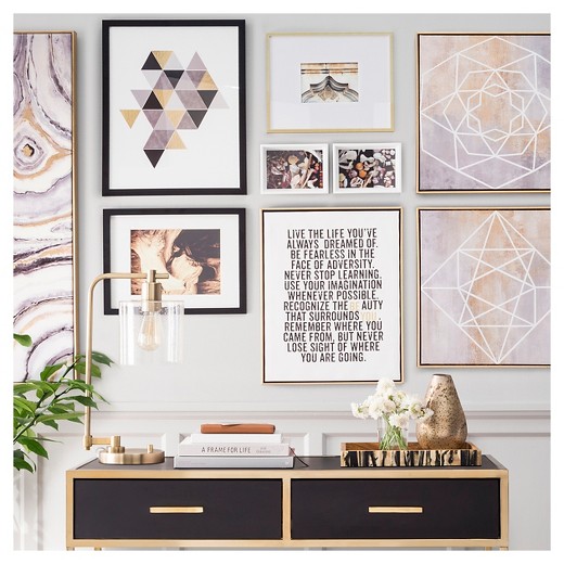
DIY lettering, vinyl wall decals, letter boards, thrifted frames, and even budget-friendly gallery walls that look curated (not chaotic).
This guide breaks down smart ways to find (or make) typography prints that feel personal, look polished, and stay friendly to your wallet.
What “Affordable” Really Means (and What It Doesn’t)
“Affordable” isn’t a price tag; it’s a strategy. For most homes, it usually lands in a few sweet spots:
- $0–$10: Free designs, public-domain text, or simple DIY prints with a thrifted frame.
- $10–$35: Digital downloads (printable quotes), small posters, or minimalist typography prints.
- $35–$100: Larger statement posters, framed sets, or small custom wood/lettering pieces.
Affordable does not have to mean flimsy paper, pixelated printing, or a quote that sounds like it was written by a motivational toaster.
The goal is: intentional words + clean design + smart finishing.
Where to Find Budget-Friendly Word Art That Doesn’t Feel Cheesy
1) Digital downloads and printable wall art
Printable word art is the reigning champion of “looks custom, costs less.” You buy (or download) the file, then print it in the size
that fits your space. This is perfect when you want a specific color palette, font vibe, or room themewithout paying for shipping,
framing markups, or “handmade” prices.
Pro tip: Pick art that comes in multiple aspect ratios (so you can print 8×10, 11×14, 16×20, etc.). That gives you flexibility if you
change frames lateror if you “accidentally” buy three frames at a thrift store because they were all $2 and you felt powerful.
2) Print-on-demand posters (when you want easy)
Print-on-demand sites let you choose size and material without worrying about printer settings. If you’re decorating a larger wall,
this can be a budget win because big prints at home can get expensive (and wrinkly, and dramatic).
3) Thrift stores, flea markets, and resale apps
Here’s the secret: the real savings often come from the frame, not the art. A sturdy, nice-looking frame can instantly
upgrade simple typography. Look for clean lines, solid backs, and glass (or acrylic) that isn’t scratched to oblivion.
Even if the existing art is… questionable, you can swap in your own word art print and suddenly it’s “vintage modern” instead of “mystery hotel lobby.”
4) DIY design tools for custom typography
If you’ve ever thought, “I like word art, but I want it to say my thing,” you’re ready to design your own. You don’t need fancy software.
Use a simple design tool, choose one or two fonts, and keep it clean. Minimalist typography prints look more expensive when there’s breathing room
(a.k.a. generous margins) and consistent alignment.
The Word Art Format Menu (Choose Your Fighter)
Different spaces and budgets call for different formats. Here are popular options that tend to stay affordableespecially when you shop smart.
Printable quote posters
Best for: renters, frequent redecorators, and people who want big impact on a small budget. Pair with a thrifted frame or a simple mat and you’re set.
Typography canvas (budget version)
Canvas can look high-end, but it can also look like it came free with a printer. If you go canvas, choose simple designs with bold lettering and avoid
tiny text that gets lost from across the room.
Wood signs and painted lettering
Best for: cozy spaces, entryways, kitchens, and anywhere you want texture. DIY stencils and craft paint can create a “hand-finished” feel without spending much.
Vinyl wall decals
Best for: nurseries, offices, temporary decor, or accent walls. Decals are the “commitment-light” version of a muralbig statement, easier exit strategy.
Letter boards
Best for: people who like changing messages, seasonal jokes, reminders, or rotating family quotes. Also great for anyone who communicates primarily through humor.
How to Make Affordable Word Art Look Expensive
Upgrade the frame, not the print
A basic black, white, or natural wood frame instantly makes typography prints feel intentional. Add a mat (even a simple white mat) and suddenly your $6 print
looks like it’s auditioning for a design magazine.
Choose a consistent palette and font “mood”
If you’re building a gallery wall, aim for a cohesive look: maybe all black-and-white quote prints, or all warm neutrals, or a consistent accent color.
Mixing too many font styles can feel chaotic fastlike your wall is arguing with itself.
Use standard sizes to save money
Standard sizes usually mean cheaper frames and easier printing. Common poster sizes include small (8.5×11, 11×17) and larger statement sizes (18×24, 24×36).
If you pick a standard size, you avoid custom framing costswhich is where budgets go to cry quietly.
Hang at a professional-looking height
The classic guideline is to hang art so the center of the piece is around eye level. Many designers reference the “57-inch rule” as a good starting
point, especially for standalone wall art and gallery arrangements. Above furniture, keep the art visually connected to the piece below it rather than floating
too high like it’s trying to escape.
A Quick Printing Cheat Sheet (So Your Letters Stay Crisp)
Resolution matters: aim for print-quality files
If you’re printing word art, start with a high-resolution file. A common design guideline is 300 DPI for sharp prints, especially for larger sizes.
This helps prevent blurry edges and “why does my ‘E’ look like it has allergies?” moments.
Pick paper that matches the vibe
- Matte heavyweight paper: clean, modern, low glare (great for typography).
- Textured art paper: adds a subtle handmade feel.
- Cardstock: sturdy and budget-friendly, especially for small prints.
Know the difference between “regular print” and “fine art print” terms
You’ll see words like “giclée” used for high-quality inkjet fine art printing. In practice, you don’t need the fanciest label to get a great result
but you do want sharp text, good paper, and inks that won’t fade quickly if the print sits in bright sunlight.
DIY Affordable Word Art Projects (Beginner to “Look What I Made”)
Project 1: The thrift-frame swap
- Buy a sturdy frame secondhand (bonus points for real wood).
- Measure the inside dimensions.
- Print or design a minimalist quote print in that exact size.
- Add a mat if the frame is slightly larger than your print.
This is the fastest way to turn “random thrift store frame” into “curated wall decor.”
Project 2: Painted stencil quote on wood
- Sand a small wood board (or use a craft store plaque).
- Paint a base color and let it dry.
- Use a stencil (or vinyl letters) for your phrase.
- Seal with a clear topcoat for durability.
Keep the phrase short for a cleaner look: think “Come In,” “Gather,” or something personal like “Shoes Off, Snacks On.”
Project 3: Vinyl wall decal placement (without the drama)
Vinyl word decals look best when aligned carefully. Use painter’s tape to mark a level guideline before you stick anything down. Start from the center and work outward,
smoothing as you go to avoid bubbles.
Renter-Friendly Word Art Ideas (No Wall-Damage Regrets)
- Picture ledges: lean framed quote prints and swap them seasonally.
- Removable hanging strips: great for lightweight frames and small canvases.
- Washi tape “poster corners”: playful, cheap, and easy to remove.
- Clip rails or binder clips: minimalist and surprisingly stylish for small prints.
If you use decals, removal is usually easier when you gently warm the adhesive (for example, with a hair dryer on moderate heat) and peel slowlyespecially on painted walls.
Always test a small corner first so you don’t end up repainting an entire wall because your decal was feeling clingy.
Avoiding Copyright Trouble (and Other “Oops” Moments)
Word art is often text-based, which makes people assume it’s automatically free to use. It isn’t. Short phrases can be tricky: some are fine, some may be protected,
and some are trademarks depending on context.
- Use your own wording whenever possible. Personal phrases are more meaningful anyway.
- Be cautious with famous quotes from modern books, films, and songs.
- Check font licensing if you’re selling prints; some fonts require commercial licenses.
- Choose public-domain or properly licensed resources when downloading designs.
The safest “always works” formula: write something original that fits your home. It’s harder for anyone to claim ownership of “Coffee First, Everything Else Later”
when that’s clearly just your personality speaking.
Conclusion: Your Walls Can TalkOn a Budget
Affordable word art is less about hunting for the cheapest thing and more about building a smart, flexible system: use standard sizes, print high-quality files,
upgrade frames, and hang pieces at a height that looks intentional. Whether you love minimalist typography, cozy wood signs, or a rotating letter board that delivers
weekly sarcasm, the right words can make a room feel finished.
Start small: one great phrase, one clean frame, one spot on the wall where it feels like it belongs. Then build from there. Decorating doesn’t have to be expensive.
It just has to be yours.
Real-World Experiences With Affordable Word Art (The Stuff People Actually Learn)
If you ask a group of regular humans (not catalog models with perfect lighting and zero clutter) how they decorate with affordable word art, you’ll notice a few patterns.
First: almost everyone starts with a big idea“I want the living room to feel cozy!”and ends up choosing a phrase that basically translates to, “I want my walls to be nicer
than my group chat.” That’s not a bad thing. In fact, it’s kind of the point: word art is a shortcut to personality.
One common experience is discovering that the frame is the glow-up. People buy a $4 printable quote, print it at home, and feel mildly underwhelmed… until they
slide it into a sturdy frame (especially with a mat). Suddenly it looks “intentional.” The same print that felt like a placeholder becomes “a design choice.” It’s the home decor
equivalent of swapping sweatpants for jeansno one thinks you changed your life, but everyone notices you tried.
Another real-world lesson: scale beats perfection. A tiny 8×10 quote floating on a huge wall can look lost, even if the design is beautiful.
People often end up reprinting the same design in a larger size (like 16×20 or 18×24) or grouping it with two or three smaller pieces to create a mini gallery wall.
That’s when everything clicks. The room doesn’t just have “a quote.” It has a focal point.
Renter-friendly setups also show up again and again. A lot of folks fall in love with the idea of a gallery wall… and then remember they don’t want to patch 27 nail holes
at move-out. So they pivot to picture ledges, leaning frames, removable strips, or a rotating “art shelf” arrangement. This ends up being a feature, not a compromise:
you can swap seasonal word art (“Hello Sunshine”) into fall (“Soup Season”) without a single new hole in the wall. It’s practical and fun, which is rarelike finding
a parking spot right in front of the store.
And yes, people absolutely learn the hard way that some phrases feel different after a week. That bold, all-caps motivational quote might hit on Monday,
but by Thursday it may feel like your wall is nagging you. The win is choosing words that feel like you: a family saying, a gentle reminder, a tiny inside joke,
or something that sets the tone of the room (“Stay Awhile” in the entryway, “Unplug” near a reading chair, “Gather” in the kitchen).
When the words match real life, they don’t get annoyingthey get comforting.
Lastly, there’s a surprisingly universal experience: once someone hangs one good piece of word art, they get brave.
They try a second print. Then a third. Then suddenly they’re debating font pairing like they’re judging a design competition.
Affordable word art works because it’s low-risk experimentation. You can test styles, moods, and layouts without spending a fortune.
And if you change your mind? You’re not stuckyou’re just “refreshing the space.” (Which is a fancy way of saying you got bored and wanted a new vibe. Very relatable.)