In Rome’s Testaccio district, Studio Strato transformed a twentieth-century family home with remarkably little demolition and a great deal of chromatic nerve. Reclaimed cement tiles, rust-red thresholds, muted blues, a flash of yellow, vintage Italian lighting, inherited furniture, and salvaged bathroom tiles turn the residence into something more compelling than a polished showroom: a living record of place, memory, and daily family life. The project shows how a Roman interior can feel contemporary without erasing its ageand how color, used with discipline, can do the architectural heavy lifting.
A Roman House That Refuses to Dress Up as a Museum
Rome has never been especially interested in choosing one century and sticking to it. Ancient walls support Renaissance palaces; modern cafés occupy old workshops; scooters zip past monuments that have watched empires, popes, tourists, and approximately eight billion questionable parking decisions. The city’s best interiors often behave the same way. They layer periods rather than separating them.
Studio Strato’s “Tuscan Red House” captures that Roman instinct beautifully. The residence sits in Testaccio, a neighborhood shaped by the city’s long relationship with trade, food, labor, and reuse. Even the district’s famous Monte Testaccio is made largely from fragments of ancient transport amphorae. In other words, creative repurposing is not a new trend here; Rome has been practicing it for millennia.
The house occupies a twentieth-century building and was redesigned for a young coupleone a freelancer, the other working in a creative fieldand their children. Rome-based architects Vincenzo Tattolo and Martino Fraschetti of Studio Strato were asked for an interior that felt fresh and modern while remaining unmistakably Roman. That sounds simple until one tries it. Too much history and the home becomes a stage set. Too little, and it could be an apartment anywhere with decent coffee.
Minimal Demolition, Maximum Change
Respecting the Original Plan
Rather than flattening the apartment into one enormous open-plan room, Studio Strato retained most of the existing layout. Only one wall was removed. This restraint matters because older urban homes often derive their character from sequence: a corridor narrows, a doorway frames a view, and one room gradually reveals the next. Eliminate every boundary and the apartment may gain openness on paper while losing its rhythm in real life.
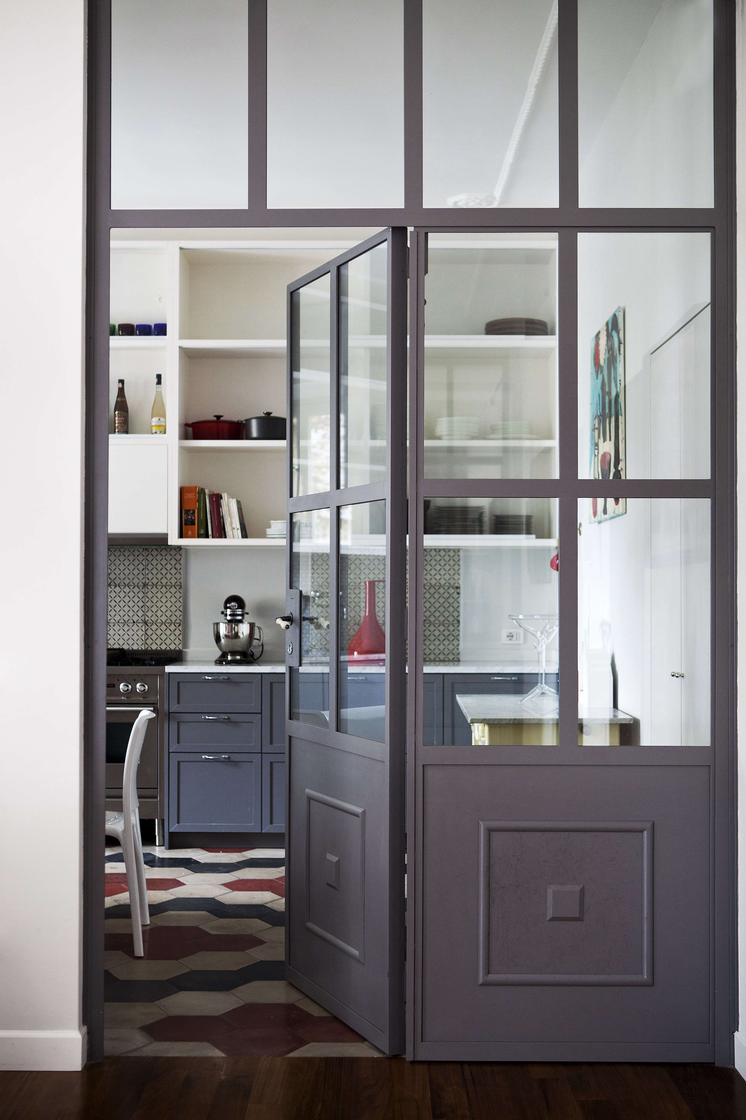
The architects improved connection without erasing separation. A custom iron-and-glass door links the kitchen with the living spaces, allowing light and sightlines to travel through while preserving the sense that the kitchen is a distinct room. It is a practical move for a family home. Cooking remains social, but a tower of breakfast dishes does not automatically become the centerpiece of the living room. Architecture, occasionally, is the art of letting people see one another without seeing absolutely everything.
Turning Thresholds Into Design Events
The most memorable interventions are not large additions but carefully painted edges. Door recesses are coated in deep Tuscan red and a soft blue-gray, turning passages into blocks of color. Seen down the hall, the openings resemble framed abstract paintings. Elsewhere, a yellow-painted passage draws the eye toward a compact work area.
This approach demonstrates a useful renovation principle: color does not have to cover an entire room to alter spatial perception. A painted reveal can make a wall seem thicker, a doorway more sculptural, or a transition more deliberate. It is a low-material intervention with a high visual returnbasically the design equivalent of adding lemon zest and suddenly pretending dinner was planned.
An Of-the-Moment Palette With Ancient Roots
Tuscan Red as the Visual Anchor
The home’s signature hue is an earthy red that recalls clay, brick, faded frescoes, iron-rich soil, and the sun-warmed facades found throughout central Italy. It appears in the kitchen floor, wall lights, armchairs, door frames, and bedroom cabinetry. Because the red is dusty rather than glossy or candy-bright, it feels substantial. It has the warmth of a historical pigment without becoming theatrical.
Red is notoriously demanding in interiors. Used everywhere, it can make a room feel as though it is shouting across a crowded restaurant. Studio Strato instead repeats it in measured doses. The eye encounters the color, loses it, and finds it again. That repetition creates continuity across separate rooms without requiring matching furniture or identical finishes.
Blue, Gray, and Yellow Keep the Red Lively
Muted blues cool the palette and prevent the earthy reds from becoming heavy. Gray provides breathing room, while yellow appears as an energetic accent in a passage and several smaller details. A turquoise pendant in the kitchen adds another note that should, on paper, be slightly unruly. In practice, it works because the shades share a softened, lived-in quality.
This is not a palette assembled from isolated paint chips. It behaves more like a Roman streetscape: terracotta beside weathered stone, oxidized metal near a painted shutter, and pale sky above a warm facade. The colors do not match in the showroom sense. They converse.
The Kitchen: Reclaimed Tile and Italian Design Confidence
The kitchen is where the house states its design thesis most clearly. A reclaimed cement-tile floor combines dusty red, blue, pale gray, and off-white in a lively geometric composition. Cement tiles naturally develop tonal variation and wear, qualities that make them especially convincing in an older home. Rather than looking damaged, the irregularities read as evidence that the material has participated in life.
The floor also performs a strategic trick: it supplies enough pattern that the rest of the room can remain relatively straightforward. Pale cabinetry, glass-fronted shelving, stainless-steel work surfaces, and simple white furniture create a calm framework. The kitchen does not need decorative accessories lined up like obedient soldiers because the surface underfoot is already doing the storytelling.
Lighting provides the comic timing. Red wall sconces made by a workshop in Trastevere echo the warm tones below, while a bright turquoise Aggregato pendant by Artemide hangs above the breakfast table. The pendant is a reminder of Italy’s twentieth-century design legacy, in which practical objects were frequently treated as opportunities for experimentation. It illuminates breakfast, certainly, but it also announces that toast need not occur beneath boring lighting.
A wall-mounted faucet and a deep professional-style sink contribute utilitarian character. These elements prevent the room from becoming overly precious. The result feels designed but not delicatea necessary distinction in a household with children, meals, school bags, and the occasional tomato sauce incident that will later be described as “textural enrichment.”
Living and Dining Rooms Built Around Memory
Old Furniture Is Allowed to Remain Important
The dining area pairs a family heirloom table with contemporary blue chairs. This combination is central to the home’s appeal. The inherited piece is not pushed aside because it fails to belong to a single design period; instead, it becomes the stable center around which newer objects gather.
In the living room, a large family-owned hutch filled with books grounds the space. Its scale gives the room gravity, while the visible collection makes the interior personal. Books, objects, and useful clutter soften the architecture and prevent the space from feeling stagedeven when it is, in fact, being photographed.
Layering Creates Comfort Without Visual Noise
The room’s rugs are deliberately layered: a blue jute runner lies over a larger gray wool carpet. The combination introduces color, texture, and a subtle change in level. Layered floor coverings can also organize space without adding walls, distinguishing a circulation route from a seating area while improving acoustic comfort.
White sculptural lamps designed by Issey Miyake for Artemide bring lightness to the darker wood and heavier furniture. Their folded forms sit somewhere between a lantern, a sculpture, and an extremely elegant piece of paper. Again, the interior succeeds because contrasts are not eliminated; they are balanced. Weight meets airiness. Inheritance meets innovation. Rust meets blue.
Bedrooms and Bathrooms Continue the Story
In the bedroom, the architects retained existing built-in wardrobes and added storage above them, using the same Tuscan red to unify old and new. Extending cabinetry to the ceiling is practical in any city apartment, but painting the upper addition boldly keeps it from pretending to be invisible. The storage becomes architecture rather than background.
Soft, relaxed linens temper the red cabinetry and reinforce the home’s preference for texture over shine. The bedroom feels calm, yet it remains connected to the rest of the apartment through color. This is a smart alternative to giving every room a different “theme,” a practice that can make a home feel less like a composition and more like a hotel corridor with commitment issues.
The bathrooms contain hand-glazed tiles salvaged from the previous owners’ house. Their presence is more meaningful than a perfectly coordinated new tile order. They act as physical fragments of an earlier domestic life, carrying memory into the renovation. Reuse here is not presented as rustic decoration or moral performance; it simply makes the new interior richer.
Why This Twentieth-Century Italian House Still Feels Current
The house remains relevant because it avoids the most disposable kind of trend: the one that depends on everything being newly purchased at the same time. Its color palette may align with contemporary affection for terracotta, rust, mineral blue, warm gray, and strategic red accents, but those tones are tied to place rather than trend forecasting.
It also reflects a broader return to rooms with identities. After years of giant undivided interiors, many homeowners are rediscovering the comfort of thresholds, partial separation, and spaces that support specific activities. The iron-and-glass kitchen door offers connection without surrendering definition. The painted passages celebrate movement from one zone to another. The apartment feels open where it needs to and enclosed where enclosure helps.
Most importantly, the project makes room for biography. Heirlooms, books, reused tiles, old cabinetry, contemporary chairs, and iconic lighting coexist because each contributes a different kind of value. The home is not artful because it resembles a gallery. It is artful because its decisions form a coherent point of view.
Design Lessons to Borrow From the Tuscan Red House
Start With What the Building Already Offers
Before removing walls, floors, doors, or cabinetry, identify what gives the home rhythm and specificity. Preservation does not mean refusing change. It means spending change where it will matter most.
Build a Palette From Place
Look beyond trend reports. Study local stone, brick, soil, vegetation, sky, and older painted surfaces. A palette rooted in its surroundings tends to age more gracefully because it has a reason to exist.
Repeat Color Instead of Matching Everything
A red doorway can speak to a chair in another room and a tile several yards away. Repetition creates unity; perfect matching can make a home feel packaged.
Let One Patterned Surface Lead
When a floor or backsplash has strong geometry, keep nearby cabinetry and furniture quieter. The goal is a conversation, not six people delivering speeches simultaneously.
Pair Inherited Objects With Contemporary Pieces
An old table often looks more alive beside a clean modern chair than beside a full suite of reproduction furniture. Contrast makes the age of each piece legible and valuable.
Use Paint Architecturally
Door reveals, window frames, ceiling bands, built-ins, and passages can carry color more effectively than a conventional accent wall. Paint can clarify depth, frame views, and turn circulation into an experience.
Experiencing the House: Daily Life With Bold Roman Color
To understand this home, imagine moving through it rather than viewing one room at a time. At the entrance, the palette does not arrive as a dramatic red wall. It appears in fragmentsa threshold, a glimpse of blue-gray, and a yellow passage further ahead. The experience is paced. Color becomes a guide, pulling the eye through the plan and making even a short hallway feel like a sequence of scenes.
In the morning, the kitchen would likely feel bright without being sterile. The patterned cement floor gives ordinary activity a generous backdrop: coffee cups, fruit bowls, children circling the table, and someone looking for a missing shoe while standing nowhere near the shoe. Because the floor already contains variation, crumbs and small signs of use do not immediately ruin the composition. Materials with visual depth are forgiving companions to real life.
The turquoise pendant changes character throughout the day. In sunlight, it acts as a colored object suspended in the room. At night, it creates a warm pool of attention above the table. This illustrates why lighting should be selected for both its illumination and its daytime presence. A pendant is furniture for the ceiling; it still has a job when switched off.
Moving into the living room, the atmosphere becomes denser and quieter. The large wooden hutch and books provide weight, while pale sculptural lamps and layered rugs soften the setting. The room seems suited to several forms of occupation at once: reading, talking, working briefly at a laptop, or sitting with the noble intention of reading before accidentally taking a nap. Its comfort comes from accumulation that has been edited, not emptiness that has been protected.
The painted thresholds would be especially noticeable in peripheral vision. A person does not have to stop and admire them for the device to work. The red and blue-gray edges mark transitions automatically, making movement through the home more memorable. This is a valuable lesson for anyone testing stronger color: begin where the body passes through space. A doorway offers impact in brief doses and can be easier to live with than four fully saturated walls.
In the bedroom, red storage may sound energizingperhaps too energizing for a space devoted to sleep. Yet the cabinetry is balanced by soft bedding, neutral wall areas, and natural light. Bold color becomes calmer when attached to a useful volume. The eye reads the wardrobes as a single architectural element, not as a collection of decorative objects competing for attention.
Recreating this experience elsewhere requires patience. Paint samples should be observed in morning, afternoon, and artificial light; earthy red can shift from clay to brown to almost pink. A muted blue may look gray on one wall and vivid beside warm wood. Begin with one threshold, one vintage or inherited object, and one modern light. Add repetition only after seeing how the first moves behave.
The deeper experience offered by the Tuscan Red House is permission. A family home can be historical without being formal, colorful without being chaotic, and carefully designed without looking afraid of fingerprints. The project does not ask residents to perform good taste. It gives their routines, possessions, and memories a strong architectural frameand then lets life provide the rest.
Conclusion: A Contemporary Roman Interior With a Long Memory
Studio Strato’s Tuscan Red House succeeds because it treats renovation as an act of interpretation rather than replacement. The architects preserved the apartment’s spatial logic, opened only what needed opening, and used color to make familiar rooms feel newly deliberate. Reclaimed cement tiles, inherited furniture, salvaged glazed pieces, Italian lighting, and carefully painted thresholds create a house that belongs equally to its twentieth-century shell, its Roman setting, and the family living there now.
Its most useful lesson is not “paint everything red.” It is to make fewer decisions with greater conviction. Keep the wall that gives the plan rhythm. Save the tile with a story. Let an old table meet a new chair. Choose colors that belong to the place, then repeat them just enough to create a thread. The result may not look exactly Romanand it should notbut it can possess the same rare quality: a present tense enriched by visible layers of the past.