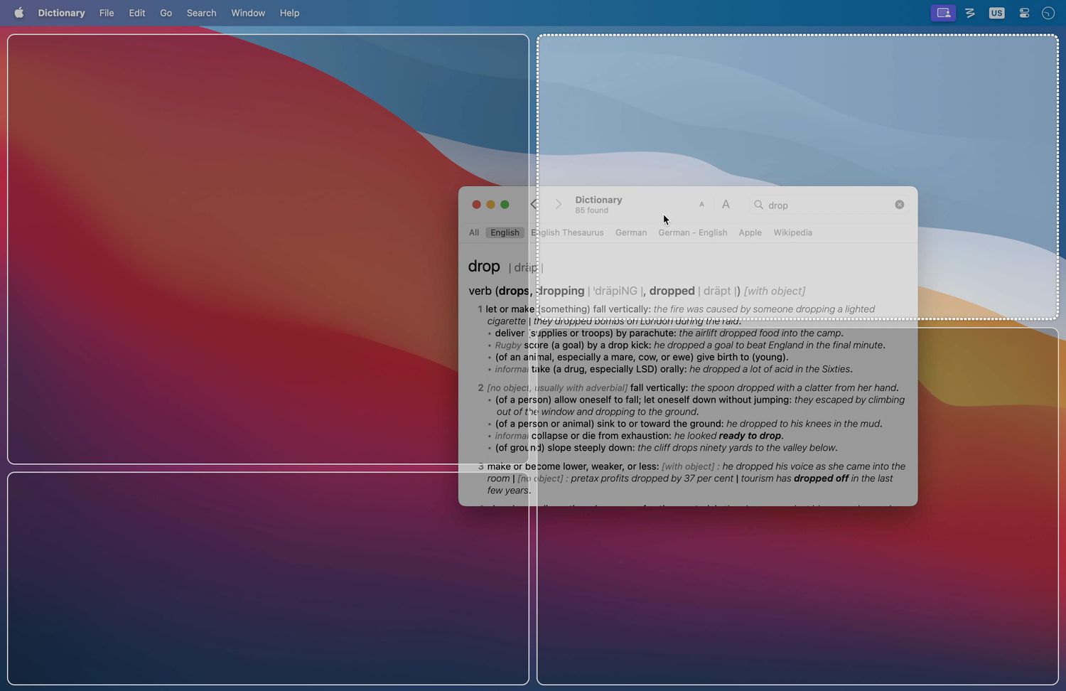
If your Mac desktop regularly looks like a yard saleSafari half covering Notes, Slack lurking behind Finder, and a Zoom window
floating around like a lost ballooncongrats: you’re a normal person who uses more than one app at a time.
The bad news is that messy windows can quietly drain your focus. The good news is that Moom exists, and it’s basically
a friendly traffic cop for your Mac’s chaos.
Moom is a long-running window management app that helps you move, resize, snap, and recall window layouts quicklywithout turning
your Mac into a “tiling-window-manager hobby project.” It’s powerful, surprisingly fun, and built for people who want their
workspace to behave the same way every time they sit down to work.
Why Mac windows get messy (even if you’re “organized”)
macOS is gorgeous, stable, and generally great at staying out of your wayuntil you open five apps and try to compare two documents
while copying a snippet from a browser and keeping an eye on messages. Suddenly you’re doing the “window shuffle,” a dance that looks
like productivity but feels like searching for your keys while holding your keys.
Apple has improved built-in window tools over time (and newer macOS versions include window tiling options through dragging and the
green window button). That helps! But native tools tend to aim for the “most people, most of the time” middle ground.
Power users often want more: custom layouts, repeatable work modes, multi-display workflows, and faster keyboard control.
What is Moom (and why people keep it installed for years)?
Moom is a dedicated Mac window manager that lets you quickly move and “zoom” (resize) windows into predefined
positionshalves, quarters, thirds, centered columns, you name it. The magic is that it doesn’t force one single style of control.
Instead, it offers multiple ways to work, so your workflow can be as mouse-driven or keyboard-driven as you want.
Moom is especially popular with people who use large monitors, multiple displays, or repeat the same “app layout” several times a day
(writing mode, meeting mode, research mode, design mode, etc.). Once you experience instant layout recall, going back to manual dragging
feels like handwriting your grocery list on a typewriter.
Moom’s “four modes” in plain English
- Palette mode: Hover over a window’s traffic-light buttons to pop up a palette of layout actions you can click.
- Hover mode: Use modifier keys while moving your pointer to move/resize windows without meticulously dragging borders.
- Snap mode: Drag windows to edges/corners (or custom zones) to snap them into place.
- Keyboard mode: Use an on-screen controller and single-key shortcuts to reposition windows fast.
On top of that, Moom lets you save window layouts and bring them back latereither for the same apps you had open, or for
your most recently used windows. That’s the difference between “I can tile windows” and “my whole workspace is ready in two seconds.”
The features that make Moom feel like a superpower
1) The palette: instant control without hunting through menus
Moom’s palette is one of its most approachable features. Hover over the traffic-light buttons and you get a compact set of actions:
move left half, right half, top-left quarter, center column, full screen-ish, and so onplus anything custom you add.
This is great when you’re switching contexts mid-thought. Example: you’re writing in a doc, then need a reference article visible.
Pop Safari to the right third, keep your document on the left two-thirds, and keep going without losing your place.
2) Snap and custom zones: “drag to edge” but smarter
If you like snapping windows by dragging them to the side of the screen, Moom can do thatand then keep going. You can configure snap
behavior, create your own snap zones, and even use drop zones (custom regions that trigger specific actions).
This matters on big displays where halves and quarters aren’t always ideal. A 34-inch ultrawide, for instance, begs for a centered
writing column with side panelssomething like 60/20/20 rather than a strict 50/50 split.
3) Hover mode: resize and move without “pixel-hunting”
Hover mode is for anyone who’s ever tried to grab the exact edge of a window and accidentally resized it into a tragic sliver.
With Moom, you can hold modifier keys and drag to move or resize more fluidly. It’s like telling your Mac,
“Please stop making me aim at a 2-pixel target. I have a life.”
4) Keyboard control: when you want your hands to stay on the keys
Keyboard mode is where Moom quietly wins over people who live in shortcuts. Instead of dragging windows around like you’re rearranging
furniture, you can use a pop-up controller and single-key commands to move, resize, center, or send a window to another display.
If your workflow includes coding, writing, spreadsheet work, research, or anything that benefits from speed, keyboard window control
can feel like upgrading from walking to a moving sidewalk.
5) Saved layouts: the “why didn’t macOS always do this?” feature
Saved layouts are what turn Moom from “nice window snapping” into “I can switch work modes instantly.”
You can create layouts like:
- Writing mode: document left, research browser right, notes bottom-right.
- Meeting mode: video call top-right, agenda/notes left, chat bottom-right.
- Editing mode: draft center, style guide right, file browser left.
- Design mode: canvas app big, assets panel side, references stacked.
Then you trigger the layout and everything snaps into place. No repeated dragging. No “wait, where did that window go?”
Just your workspace, ready on cue.
6) Multi-display friendliness
Moom is especially helpful when you dock/undock a laptop or use an external monitor. It can move windows across displays and apply
layout logic that’s aware of your screen real estate. If you’ve ever ended a day of work with half your apps stranded off-screen like
they missed their train, you’ll appreciate this.
7) Custom actions (for people who want “exactly this size”)
Moom isn’t limited to presets. You can build custom actions and include them in your palette or shortcut systemexact pixel sizes,
percentages of the screen, centered layouts, “move to other display,” and more. You can even build sequences that do multiple steps
so you can set up a workspace faster.
Moom vs. built-in macOS window tiling: do you still need it?
If you’re using a newer macOS version with tiling options, you might wonder if third-party tools are still necessary.
For many people, Apple’s built-in tiling is a big improvementespecially for simple halves/quarters layouts.
But Moom still tends to win when you want:
- Saved layouts you can recall any time (work modes you repeat daily).
- More flexible sizing than basic halves/quarters.
- Keyboard-first workflows with fast, customizable actions.
- Custom snap zones and drop zones you design to match your habits.
- Advanced control across multiple displays and different tasks.
In other words, macOS tiling is like getting a decent set of kitchen knives. Moom is like a well-stocked chef’s station with labeled
drawers, a prep list, and the ability to summon your favorite pan from thin air.
How to start using Moom without falling into the “settings rabbit hole”
Moom can do a lot, which is both the point and the potential pitfall. Here’s a sane approach:
Step 1: Pick one control style and get comfortable
- If you’re mouse-first, start with the palette and a few snap options.
- If you’re keyboard-first, set up Keyboard mode for your most common positions.
Step 2: Create 3 “daily driver” layouts
Don’t build 47 layouts on day one. Pick the three you actually repeat: writing, meeting, research, design, studywhatever fits.
Name them clearly. Use them for a week. Let reality tell you what needs tweaking.
Step 3: Add one custom action that matches your brain
Most people have a “default” window size they like (for example, a centered 70% width window for writing).
Turn that into a custom action. Put it in the palette. Give it a shortcut. Enjoy your new muscle memory.
Step 4: Remember the one permission that makes it all work
Like most window-management utilities, Moom relies on macOS Accessibility permissions to move and resize other apps’ windows reliably.
This is normal for the category, but it’s worth calling out so you’re not confused during setup.
Moom compared to other popular Mac window managers
Moom isn’t the only option. Some alternatives are simpler, cheaper, or focused on pure tiling. The “best” choice depends on what you
value most.
If you want free tiling and simple shortcuts
Tools like Rectangle are popular because they make snapping feel Windows-like with minimal setup. They’re often perfect if you just want
fast halves/quarters and don’t care about deep customization.
If you want a lightweight paid snap tool
Apps like Magnet are commonly recommended for straightforward snapping and keyboard shortcuts. Great for “just let me put this window
on the left, please,” without building saved workspaces.
If you want automation superpowers beyond window management
Some people prefer multi-tool powerhouses that include window controls among many other features. That can be amazingbut also heavier,
with more complexity. Moom’s advantage is that it stays focused on one mission: making windows behave.
Who Moom is perfect for (and who can skip it)
Moom is a great fit if you:
- Use a large monitor or multiple displays.
- Repeat the same workspace layouts every day.
- Prefer keyboard shortcuts and consistent workflows.
- Want window control that goes beyond basic tiling.
You can probably skip Moom if you:
- Mostly use one app at a time (full screen + Spaces is enough).
- Only need basic left/right snapping and already like macOS’s built-in tiling.
- Don’t care where windows land, as long as they land somewhere.
Quick, real-world examples of Moom “saving the day”
Example 1: The writer’s “research sandwich”
Put your draft on the left two-thirds. Put your browser on the right third. Snap Notes or a scratchpad to the lower-right quarter.
Now you can write, cite, and outline without burying anything. Bonus: when you’re done, hit your “Writing mode” layout again tomorrow
and everything returns like a well-trained dog.
Example 2: The student’s “lecture + notes + slides” layout
Video lecture top-left, notes bottom-left, slides or reading on the right half. You’re no longer alt-tabbing like a caffeinated hummingbird.
Example 3: The remote worker’s “meeting cockpit”
Keep the call window visible, but not dominant. Place agenda/notes where your eyes naturally go. Keep chat accessible. When the meeting ends,
switch back to your “Work mode” layout instantlyno cleanup required.
500-word experience section: Living with Moom (what it actually feels like)
The first experience most people have with Moom is a tiny moment of relief. You hover over the window buttons, see a neat little palette,
click “left half,” and your window obediently snaps into place. That’s the “oh, nice” moment.
The second experience is usually the “wait, I can do what?” momentbecause once you realize you can add custom actions,
save layouts, and assign shortcuts, you start imagining your Mac as a controllable environment instead of a windy beach where windows
blow around whenever they feel like it.
After a few days of using Moom, the biggest change is not that your windows look prettier (though they do). The change is that you stop
spending micro-bursts of attention on window housekeeping. Those micro-bursts are sneaky: five seconds to resize a browser, four seconds
to find the hidden chat window, seven seconds to drag a PDF into view. None of it is “hard,” but it interrupts your thinking.
With Moom, those actions compress into one click or one shortcut, and the mental friction drops.
One common pattern is creating “modes” for your day. Let’s say you start in a “Morning Review” layout: calendar on the left,
email on the right, notes in the corner. Then you switch to “Deep Work”: writing app centered and wide, references docked to one side,
distractions minimized. Later, “Comms Mode”: Slack, email, and a task manager arranged so you can respond quickly.
Moom makes those transitions feel like changing channels rather than rearranging furniture.
The fun part is watching your preferences evolve. At first you’ll use obvious layoutshalves and quartersbecause they’re familiar.
Then you’ll notice what you actually prefer: maybe a centered window that’s not full width because lines of text get too long; maybe
a narrow column for chat so it stays visible without stealing space; maybe a “top strip” for a music player or timer.
Moom rewards this kind of personalization because it lets you build exactly what you want and recall it instantly.
The only “gotcha” experience is that Moom can tempt you into tinkering. You’ll tell yourself you’re just creating one custom action,
then 20 minutes later you’re naming layouts like you’re organizing a sci-fi spaceship: “Bridge,” “Engineering,” and “Don’t Panic.”
The antidote is simple: set up a few essentials, use them for a week, then adjust based on real worknot imaginary perfection.
Once Moom becomes muscle memory, it’s hard to unsee how much time window mess used to cost you. You start expecting your Mac to behave:
when you open apps, they go where they belong; when you switch tasks, your workspace reshapes itself; when you’re presenting or meeting,
windows don’t randomly hide the thing you need. Moom doesn’t make you smarterbut it does stop your desktop from acting like it’s
auditioning for a slapstick comedy.
Conclusion: Your Mac deserves better than window chaos
If you’re tired of spending attention on moving rectangles around, Moom is one of the most polished ways to take control of window
management on Mac. Between palette controls, snapping, keyboard-driven actions, and saved layouts, it gives you both speed and consistency
the two ingredients most workflows are missing.
The best part: you don’t have to become a “window management person.” You can start smalljust snapping and one saved layoutand still
feel the difference immediately. And if you are a window management person? Welcome home. There are snacks in the drop zones.