Walk into a room painted soft sage green and your shoulders may drop half an inch. Step into a bright red dining room and suddenly you are making dramatic hand gestures over spaghetti. Sit under cold blue-white lighting at 11 p.m. and your brain may decide it is time to answer emails, reorganize the pantry, and question every life choice since 2014.
Color is not magic, but it is not nothing either. The colors in your home can influence mood, energy, sleep, focus, appetite, and even how safe or tense a room feels. Your walls are not prescribing therapy, but they are quietly joining the conversation your nervous system has with the world. That conversation mattersespecially when your home is where you rest, work, recover, raise kids, argue about thermostat settings, and stare into the fridge hoping dinner will reveal itself.
The relationship between home color, mood, and mental health is part psychology, part biology, part design, and part personal history. A blue bedroom may soothe one person and remind another of a freezing dentist office. A yellow kitchen may feel cheerful to one family and like living inside a highlighter to another. The trick is not memorizing a rigid color rulebook. The trick is understanding how hue, brightness, saturation, lighting, room purpose, and your own emotional associations work together.
What Is Color Psychology in the Home?
Color psychology is the study of how colors may affect feelings, behavior, perception, and decision-making. In interior design, it asks a practical question: how can a room support the way you want to feel in it?
That question is more useful than asking, “What color is best?” A bedroom, home office, kitchen, nursery, and living room all have different jobs. Your bedroom should not feel like a casino lobby. Your office should not feel like a nap cave unless your business model is accidentally sleeping through meetings. A good color plan starts with the emotional function of the room.
Researchers and designers often group colors into broad families. Warm colors, such as red, orange, and yellow, tend to feel energetic, social, stimulating, and cozy. Cool colors, such as blue, green, and soft purple, often feel calming, steady, reflective, and restful. Neutrals, such as white, cream, beige, taupe, gray, and brown, can create breathing room, balance, warmth, or sophistication depending on how they are used.
But here is the part many quick decorating guides skip: color effects are not universal commands. Saturation, shade, lighting, contrast, texture, culture, memory, and personal preference all matter. A muted terracotta can feel earthy and comforting. A neon orange wall can feel like an emergency cone joined a homeowners association. Same color family, very different emotional impact.
How Home Colors Affect Mood and Mental Health
Color Can Change the Energy Level of a Room
One of the clearest ways color affects mood is through arousal, meaning how stimulated or relaxed your body feels. Bright, highly saturated colors usually feel more activating. Soft, muted colors usually feel calmer. This is why a deep red powder room can feel glamorous and exciting, while a full red bedroom may feel like trying to sleep inside a sports car commercial.
For people dealing with stress, anxiety, burnout, or sensory overload, color intensity matters. A room full of sharp contrasts, glossy surfaces, bright whites, and high-saturation accents can feel visually noisy. That does not mean your home must become a beige monastery. It means your eyes and brain need places to rest. Calm does not require boring; it requires balance.
Color Can Support Better Sleep
Color affects sleep in two ways: through wall and decor choices, and through light color. For bedrooms, soft blues, gentle greens, warm whites, muted lavender, and cozy neutrals are popular because they tend to signal rest rather than action. These colors do not knock you unconscious like a cartoon frying pan, but they can help create a bedtime-friendly atmosphere.
Lighting is just as important as paint. Bright, cool-toned light in the evening can interfere with the body’s natural wind-down rhythm. Warmer, dimmer lighting before bed is generally better for relaxation. Think amber lamp, not interrogation room. A bedroom with soothing wall color but harsh overhead lighting is like ordering herbal tea and drinking it through a megaphone.
Color Can Influence Focus and Productivity
Home offices became much more important when many people discovered that “working from home” sometimes means “working from a chair that was not emotionally prepared for this.” Color can help define a workspace and nudge your brain toward focus.
Blues are often associated with calm concentration and mental clarity. Greens can feel balanced and restorative, especially when paired with natural materials like wood, rattan, linen, or stone. Warm neutrals create a grounded background that does not compete with your screen, notes, or creative work. If you want energy, try small accents of yellow, coral, or orange instead of painting the whole office a color that shouts motivational quotes at you.
Color Can Affect Appetite and Social Energy
Kitchens and dining rooms can handle more warmth than bedrooms. Yellow, terracotta, warm white, peach, clay, olive, and soft red accents can make food spaces feel inviting and lively. Warm colors tend to encourage conversation and energy, which is helpful when you want the kitchen to be the heart of the home rather than a silent refueling station.
Still, intensity matters. A little red can be rich and appetizing; too much can feel aggressive. Yellow can be sunny and optimistic; too bright and it becomes a visual air horn. For most homes, the most livable version of a warm palette is softened: buttery yellow instead of traffic-light yellow, brick instead of fire-engine red, apricot instead of neon orange.
The Emotional Personality of Common Home Colors
Blue: Calm, Clear, and Occasionally Too Cool
Blue is one of the most common choices for bedrooms, bathrooms, and offices because it is widely associated with calm, trust, clarity, and rest. Pale blue can make a room feel airy and peaceful. Navy can feel stable, elegant, and cocooning. Blue-green shades, such as teal or sea glass, combine calm with a little more freshness.
The caution: blue can feel cold if the room lacks natural light or warm materials. If a north-facing bedroom already feels chilly, icy blue walls may make it feel like a polite refrigerator. Add warm wood, cream bedding, woven textures, brass, or soft lighting to keep blue from becoming emotionally frosty.
Green: Balanced, Natural, and Easy to Live With
Green is the people-pleaser of home color psychology. Because green is strongly tied to nature, it often feels restful, balanced, and renewing. Sage, olive, moss, eucalyptus, and muted forest green can work beautifully in bedrooms, kitchens, living rooms, bathrooms, and home offices.
Green is especially useful when you want calm without sleepiness. It is less cool than blue and less stimulating than yellow, landing in a comfortable middle zone. Pair it with wood, stone, plants, linen, black accents, or warm whites and it tends to say, “Relax, but do not fully become furniture.”
Yellow: Cheerful, Bright, and Best Used Wisely
Yellow is associated with optimism, warmth, energy, and sunlight. In small or muted doses, it can lift a room beautifully. A creamy yellow breakfast nook can feel like Sunday morning. A mustard throw pillow can wake up a neutral sofa. A golden hallway can feel welcoming.
But yellow is powerful. Very bright yellow can become overstimulating, especially in large amounts or under strong light. If you love yellow, consider softer shades: butter, straw, ochre, honey, or muted gold. These bring warmth without making your nervous system feel like it accidentally drank three espressos.
Red: Passion, Energy, and Handle-With-Care Drama
Red is emotionally intense. It can feel passionate, powerful, cozy, dramatic, and social. It can also feel urgent, aggressive, or restless. That makes it a good candidate for accents, dining rooms, art, rugs, lamps, and small spaces where you want impact.
For mental well-being, red usually works best when it is toned down or balanced. Burgundy, rust, brick, oxblood, and clay are easier to live with than bright primary red. In a bedroom, use red carefully unless your goal is to lie awake feeling like the room has a plot twist.
Orange and Terracotta: Warm, Friendly, and Grounded
Orange can feel playful, creative, and social, but the most livable home versions are usually softened: terracotta, clay, cinnamon, peach, caramel, and burnt orange. These shades bring warmth and comfort without the intensity of pure orange.
Terracotta is especially useful because it feels earthy and human. It pairs well with cream, olive, charcoal, natural wood, woven textures, and black metal. In rooms that feel too sterile, a clay-colored accent can add instant warmth. It is basically a cozy sweater, but for your wall.
Purple and Lavender: Reflective, Creative, and Restful
Purple can swing from royal and dramatic to soft and meditative. Deep purple may feel luxurious, moody, or theatrical. Lavender, lilac, and mauve tend to feel softer, more reflective, and more relaxing. These lighter shades can work well in bedrooms, reading corners, bathrooms, or creative spaces.
If you are using purple for mental calm, choose dusty or gray-toned versions rather than candy-like saturation. A muted lavender bedroom can feel peaceful. A shiny grape-purple room may feel like a children’s TV host is about to leap from behind the curtains.
White: Clean, Open, and Sometimes Too Empty
White can make a home feel bright, clean, spacious, and simple. It is useful in small rooms, modern spaces, and homes where art, books, plants, or textiles provide the personality. Warm whites can feel soft and welcoming; cool whites can feel crisp and gallery-like.
Too much stark white, however, can feel sterile or emotionally flat, especially with cold lighting and little texture. If an all-white room feels stressful rather than peaceful, the solution may not be a new personality. It may be warmer bulbs, wood tones, rugs, art, plants, and layered fabrics.
Gray: Sophisticated, Quiet, and Mood-Dependent
Gray is flexible, but it is also sensitive to light. A warm gray can feel elegant and calm. A cool gray in a dim room can feel gloomy. Gray became popular because it is neutral and polished, but mental health-friendly design often needs more warmth than a gray-on-gray-on-gray palette provides.
If your gray room feels flat, add contrast and life: cream, camel, rust, green, navy, walnut, brass, or textured textiles. Gray can be a great background singer. It does not always need to be the lead vocalist.
Brown, Beige, and Earth Tones: Grounding and Comforting
Earth tones are having a well-deserved comeback because they feel stable, warm, and connected to nature. Beige, taupe, mushroom, caramel, cocoa, sand, and warm brown can make a room feel grounded. These colors are excellent for living rooms, bedrooms, and spaces meant for decompression.
The key is layering. A beige room with no texture can look like oatmeal with a mortgage. Add linen, wool, wood, leather, ceramic, plants, patterned pillows, and varied lighting. Suddenly beige becomes calm, not bland.
Room-by-Room Color Ideas for Mood and Mental Health
Bedroom: Design for Exhale
Choose colors that help your body slow down. Soft blue, sage green, warm white, greige, muted lavender, and gentle taupe are strong options. Keep contrast low to medium, use warm lighting at night, and avoid turning the bedroom into a command center of screens, laundry piles, and emotional support clutter.
Living Room: Design for Connection
Living rooms need emotional flexibility. They host movie nights, awkward small talk, naps, family debates, and the sacred ritual of losing the remote. Warm neutrals, greens, soft blues, earthy browns, and muted accent colors work well because they support both relaxation and conversation.
Kitchen: Design for Warmth and Energy
Kitchens can handle cheerful colors: warm white, cream, olive, sage, blue-gray, terracotta, muted yellow, or clay. If you love bold color, use it on an island, backsplash, bar stools, art, or pantry door. That way the room has personality without making breakfast feel like a pep rally.
Home Office: Design for Focus
For focus, try blue, green, warm gray, mushroom, cream, or deep grounding colors like navy or forest green. Use energetic colors as accents: yellow notebook, coral lamp, orange art, red chair. Small shots of color can wake up the mind without overwhelming the workspace.
Bathroom: Design for Reset
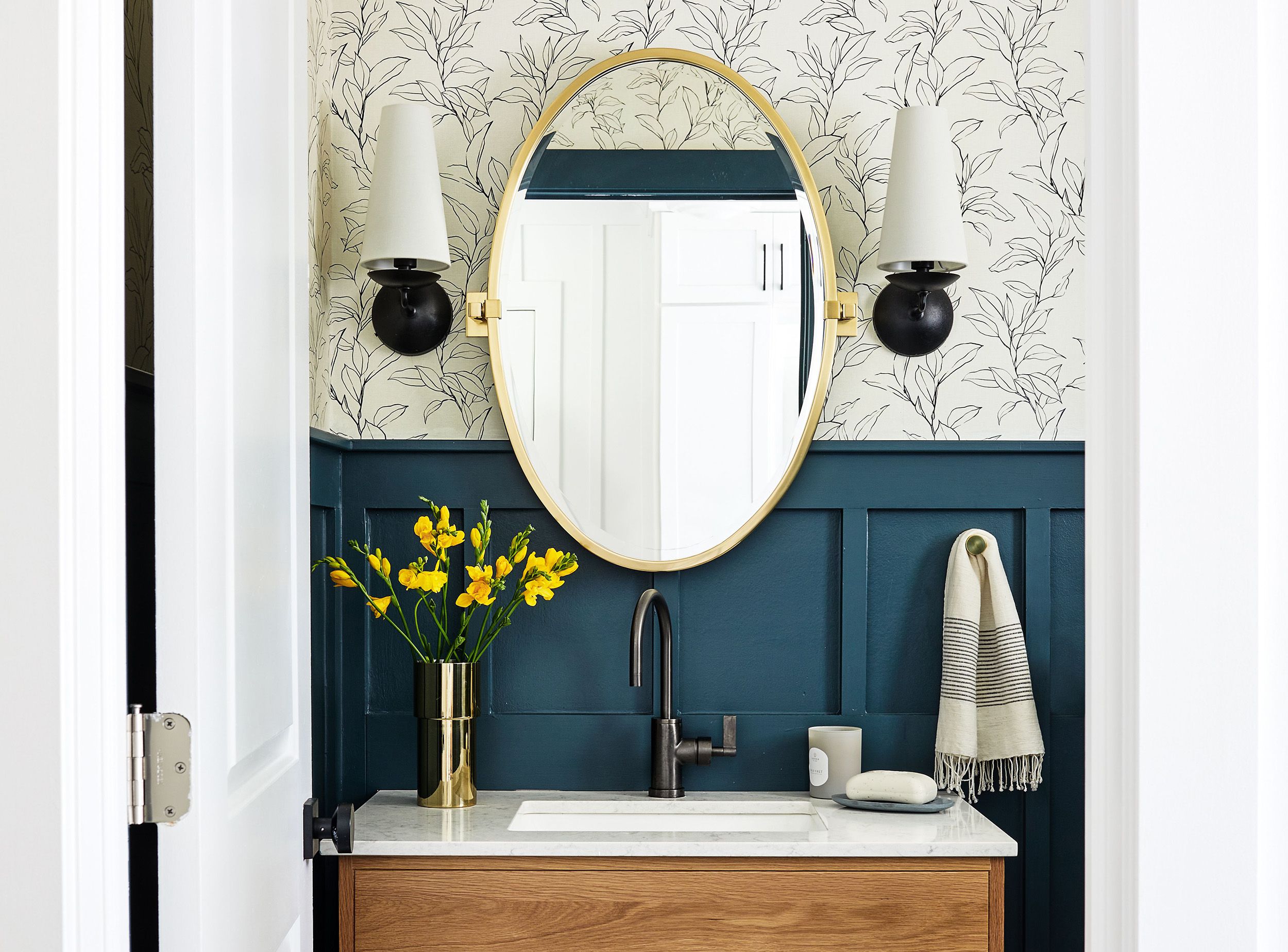
Bathrooms are perfect for spa-like colors: soft green, blue, warm white, stone, sand, charcoal, or pale pink. Good lighting is essential. A bathroom mirror with harsh cold light can make anyone question their entire existence before coffee.
Kids’ Rooms: Design for Both Play and Sleep
Children may love bright colors, and that is wonderful. The challenge is balancing playfulness with rest. Consider using brighter shades in toys, bedding, art, or a small accent wall, while keeping the main wall color softer. A child’s room can be joyful without resembling the inside of a candy wrapper.
Do Colors Actually Improve Mental Health?
Color is not a treatment for depression, anxiety, trauma, ADHD, insomnia, or any medical condition. Paint cannot replace therapy, medication, social support, sleep, movement, or professional care. If you are struggling with mental health symptoms, speak with a qualified health professional.
That said, your environment can support or strain your well-being. A home that feels chaotic, harshly lit, visually overwhelming, or emotionally disconnected from you can add low-level stress. A home that feels safe, personal, organized, and sensorially comfortable can make daily life easier. Color is one tool in that larger wellness toolbox.
Think of home color as emotional nutrition for your eyes. It will not solve everything, but it can help create conditions that support rest, focus, comfort, and connection. A calm bedroom, a cheerful kitchen, a grounding living room, and a focused office are not shallow design goals. They are ways of making your home cooperate with your nervous system instead of arguing with it all day.
How to Choose Colors That Support Your Mood
Start With the Feeling, Not the Paint Chip
Before choosing a color, ask: “What do I want this room to help me feel?” Rested? Energized? Safe? Creative? Social? Focused? Once you know the emotional goal, the palette becomes easier to narrow.
Test Colors in Real Light
Paint changes dramatically throughout the day. A perfect warm white in the store can turn yellow at home. A soft gray can become blue. A beautiful green can look muddy in low light. Always test large swatches on multiple walls and look at them morning, afternoon, evening, and under artificial light.
Use Saturation Like Seasoning
Highly saturated color is like hot sauce. Wonderful when used intentionally, regrettable when poured everywhere. If you want a calm home, use bold colors in controlled places: art, pillows, lamps, rugs, bookshelves, cabinet interiors, or one accent wall.
Balance Cool Colors With Warm Materials
Blue, green, gray, and white can become cold if the room lacks warmth. Add wood, woven textures, cream fabrics, soft lighting, leather, brass, terracotta, or natural greenery. Texture changes the emotional temperature of color.
Respect Your Personal Associations
If a color technically “should” be calming but you hate it, do not use it. Your brain does not care that a blog said sage green is peaceful if sage green reminds you of a hospital hallway. The best mental health color palette is not universal. It is personal, functional, and livable.
Personal Experiences: What Living With Color Can Teach You
One of the most surprising things about color at home is that you often do not notice its effect until you change it. A room can be quietly irritating for years. You blame the furniture, the layout, the weather, your inbox, or the fact that someone keeps putting empty cereal boxes back in the pantry. Then you repaint, change the lighting, add warmer textiles, or remove one loud accent wall, and suddenly the room stops picking a fight with you.
For example, many people discover that a bedroom they thought was “modern” was actually too stark. White walls, gray bedding, cool LED bulbs, metal furniture, and bare floors may look clean in photos, but in real life the room can feel cold and unfinished. After adding a warmer wall color, soft lamps, wood nightstands, a textured rug, and muted green or blue bedding, the same room can feel like it finally learned how to whisper. Sleep may not become perfect overnight, but the bedtime mood changes. The room starts giving the body better cues.
Another common experience happens in kitchens. A kitchen painted plain white can look bright, but it can also feel sterile if there is no warmth. Add olive cabinets, a terracotta runner, warm brass hardware, wood cutting boards, or cream walls, and the space becomes more inviting. People linger longer. Coffee tastes more intentional. Even toast feels emotionally supported. This is not because terracotta has supernatural powers. It is because warm, natural colors make the room feel human.
Home offices reveal color’s influence quickly. A dark, cluttered corner may make work feel heavier than it is. A small shiftsoft green walls, better daylight, a warm desk lamp, and one energizing accent colorcan help the brain understand, “This is where I focus.” The color does not do the work for you, unfortunately. It will not answer emails or finish the spreadsheet. Rude, but true. Still, it can reduce friction. When a workspace feels clear and intentional, starting tasks often feels less painful.
Living rooms teach the importance of balance. A completely neutral room may be calming at first, then strangely lifeless. A room full of bold color may feel exciting, then exhausting. The sweet spot is often a layered palette: a calm base, a few warm materials, plants or nature-inspired colors, and small accents that express personality. That combination gives the room emotional range. It can handle quiet mornings, loud guests, rainy afternoons, and late-night snacks eaten with the confidence of someone who refuses to dirty a plate.
The biggest lesson is that color works best when it matches real life. A magazine-perfect palette means little if it does not support your habits, climate, light, family, and mood. If you need calm, choose colors that help you exhale. If you feel low-energy, add warmth and brightness in thoughtful ways. If your home feels chaotic, simplify the palette. If it feels dull, add color in places you touch and see daily. Your home does not need to follow every trend. It needs to feel like a place where your mind can land safely.
Conclusion
The colors in your home affect mood and mental health by shaping how your spaces feel: calm or busy, warm or cold, restful or energizing, focused or scattered. Cool colors like blue and green often support relaxation and concentration. Warm colors like yellow, orange, and red can add cheer, appetite, and social energy when used carefully. Neutrals can create balance, but they need texture and warmth to avoid feeling sterile. Lighting, saturation, personal memories, and room purpose all influence the final effect.
You do not need to repaint your entire home to feel better in it. Start small. Change a lamp bulb. Add a green throw. Paint one wall. Replace a harsh white with a warm neutral. Bring in wood, plants, art, or textiles. Notice how your body responds. Your home is not just a backdrop. It is part of your daily mental environment. Choose colors that help it become a softer, smarter, more supportive place to live.
Note: This article is for general educational and home design purposes only. Color choices can support comfort and well-being, but they are not a substitute for professional mental health care when symptoms are persistent, severe, or disruptive.