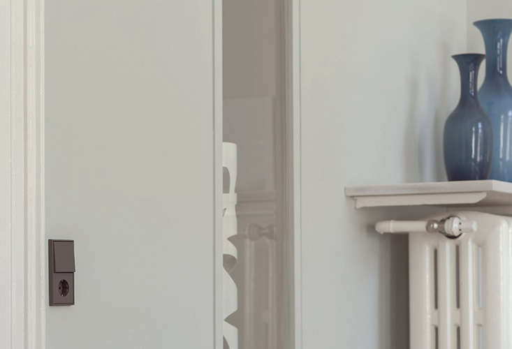
Most light switches are designed to be ignored. They arrive in white plastic, sit quietly near the door, and spend decades being poked by hands carrying groceries, laundry baskets, and occasionally a very confused cat. European light switches in Le Corbusier’s architectural colors take a different approach. They treat the switch as part of the room’s composition rather than a small electrical apology on the wall.
The best-known examples come from German manufacturer JUNG, which applies the 63 shades of Le Corbusier’s Polychromie Architecturale to minimalist switch ranges such as the LS 990, LS ZERO, and LS 1912. The result combines modernist color theory, crisp European proportions, and everyday function in one surprisingly expressive detail.
Why Le Corbusier Created an Architectural Color System
Le Corbusier is often remembered for white concrete, rational plans, ribbon windows, and buildings described as “machines for living.” That reputation can make his deep interest in color seem unexpected. In reality, he was also a painter who viewed color as an architectural tool capable of changing how people perceive volume, distance, light, and movement.
His Architectural Polychromy was developed in two major stages. The 1931 collection introduced 43 shades, while the 1959 collection added 20 more, creating a total of 63 colors. The palette includes earthy umbers, ochres, grays, muted greens, ultramarines, reds, pinks, and more intense accent colors. It was organized not as a random paint deck but as a coordinated system for composing rooms.
Color That Changes the Perception of Space
Le Corbusier believed color could make a wall appear to advance, retreat, gain weight, lose weight, or establish hierarchy. A cool blue can visually recede. A dark umber can make a surface feel grounded and substantial. A vivid red can direct attention and give rhythm to circulation. The important point is that color does not merely decorate architecture; it helps explain it.
This philosophy makes the light switch a natural candidate for color. A switch is mounted precisely where movement and decision meet. You enter, reach, press, and change the atmosphere of the room. Giving that object an intentional color turns a routine gesture into part of the architectural experience.
How European Light Switches Became Design Objects
European switch systems are often characterized by broad square or rectangular faces, modular frames, and flush installation. Their geometry can feel calmer and more architectural than a narrow toggle surrounded by a separate cover plate. Multiple functions may be arranged within matching one-gang, two-gang, or larger frames, helping switches, sockets, dimmers, data connections, and smart controls read as one family.
JUNG’s LS 990 is especially suited to Le Corbusier’s palette because its form is almost aggressively simple: a clean square frame and a large operating surface with very little visual noise. The design does not compete with color. It gives color a stage, then politely steps aside.
The Hand-Lacquered Matte Finish
The Le Corbusier versions are not ordinary molded plastic offered in approximate designer shades. JUNG uses a special hand-lacquering process to reproduce the depth of the licensed colors and create a matte surface. That finish matters. Glossy plastic can look shiny and detached from a painted wall, while a matte switch interacts more naturally with plaster, mineral paint, wood, stone, and textiles.
The switches can coordinate with products from other licensed manufacturers, including architectural paint, door hardware, furniture, flooring, and other interior components. This makes it possible to carry one color language across a project without relying on a heroic game of “close enough” played under terrible showroom lighting.
Three Ways to Use Le Corbusier Colors on Switches
1. Tone-on-Tone Integration
A tone-on-tone scheme matches the switch closely to the wall. On a wall painted in a soft gray, natural umber, muted green, or blue-gray, a corresponding switch creates visual continuity. The device remains accessible but no longer interrupts the surface with a bright white rectangle.
This approach works beautifully in minimalist interiors, galleries, bedrooms, and rooms where texture or furniture should dominate. It is also useful when several controls must sit together. A five-part frame can look surprisingly calm when its color is absorbed into the background.
2. Controlled Contrast
Contrast turns the switch into punctuation. Imagine a warm off-white wall with a switch in bleu céruléen, a muted blue associated with sky and distance. Pair a clay-toned wall with deep ultramarine, or place le jaune vif against a subdued gray. The switch becomes a small, deliberate accent rather than a random interruption.
The key is restraint. One saturated switch can feel clever. Twelve unrelated switch colors can make a hallway resemble a board game designed during a power outage. Choose a repeated rule: blue for lighting controls, red for a special scene, or one accent color used throughout the home.
3. Functional Color Coding
Color can improve orientation as well as appearance. In a hotel, office, accessible residence, or complex smart home, different switch colors can distinguish lighting, shading, temperature, or scene controls. Contrast may also make operating elements easier to locate against the wall.
Le Corbusier’s palette is useful here because the colors were created to work together. A project can use several clearly different shades without looking like the electrician received instructions from a box of crayons.
Notable Switch Ranges and Functions
JUNG LS 990
The LS 990 is the most familiar expression of this idea. Its flat, square profile suits modern apartments, renovated historic homes, boutique hotels, galleries, and commercial interiors. The range can include conventional switches, push-buttons, dimmers, sockets, motion detectors, and smart-building controls. Frames can be installed horizontally or vertically, allowing the system to follow the proportions of the wall or nearby millwork.
JUNG LS ZERO
LS ZERO takes minimalism further by allowing the controls to sit flush with the surrounding surface. In plaster, drywall, cabinetry, or furniture, the nearly seamless result can make the color feel embedded in the architecture. This is a high-detail installation, so it demands early coordination among the architect, electrician, drywall contractor, millworker, and anyone else who becomes nervous when tolerances are measured in millimeters.
JUNG LS 1912
The LS 1912 range uses a classic toggle form while supporting modern electrical and building-control functions. It brings a tactile, almost jewelry-like quality to the wall. In Le Corbusier colors, the retro silhouette can work in Art Deco apartments, traditional European buildings, hospitality projects, or eclectic homes where a plain rocker would feel too anonymous.
Smart Controls Without the Spaceship Look
Modern interiors often require more than on and off. Lighting scenes, blinds, temperature, motion detection, and networked building systems can all demand wall controls. Compatible inserts within the broader switch family allow smart functions to share the same visual language as ordinary switches and sockets. That continuity prevents a carefully designed room from being ambushed by a glowing plastic control panel that looks ready to launch a satellite.
Choosing the Right Le Corbusier Shade
The full palette is broad enough to support quiet rooms and dramatic ones. Instead of selecting a switch color from a screen, evaluate physical samples beside the actual wall finish, flooring, trim, and lighting. Color temperature changes throughout the day, and a shade that looks restrained under cool showroom LEDs may become much warmer in afternoon sun.
Earth and Neutral Tones
Umbers, ochres, warm grays, off-whites, and sandy shades are the safest starting point. They pair well with limewash, oak, walnut, travertine, brick, linen, and natural plaster. A shade such as terre d’ombre brûlée 59 can look sophisticated against pale wood or creamy walls, while soft gray switches disappear elegantly into concrete-inspired interiors.
Blues and Greens
Blue and green shades are excellent for rooms intended to feel calm, cool, or connected to the landscape. Cerulean, ultramarine, olive, and deep green can complement kitchens, studies, bathrooms, and coastal interiors. Blue also provides crisp contrast against warm terracotta, rust, and ochre.
Reds, Pinks, and Yellow Accents
Vermilion, ruby, bright pink, and vivid yellow are better used with purpose. They can mark a feature wall, energize a child’s room, reinforce a graphic interior, or identify a special control. Because the switch is small, it offers a lower-risk way to introduce a strong color. You can enjoy a flash of red without committing an entire dining room to the emotional intensity of a ripe tomato.
Planning a Cohesive Interior Around the Switches
Start with the room’s large surfaces: walls, floor, ceiling, cabinetry, and major furniture. Then decide whether the switch should blend, contrast, or repeat another element. A blue switch might echo a rug. A warm gray might relate to stone. A dark umber might connect with bronze hardware or stained wood.
Repeat colors strategically across rooms. Exact repetition creates continuity, while related shades can define zones. For example, public areas might use muted neutrals, bedrooms could shift toward blues and greens, and utility spaces could use stronger contrast for quick identification.
Also consider finish, not only hue. A matte switch beside polished marble creates a different effect from the same switch beside chalky mineral paint. The small difference in sheen can either enrich the material palette or expose an awkward mismatch.
Installation and Compatibility Considerations
European switches are designed around regional electrical systems, mounting boxes, voltages, and certification requirements. They should not be assumed to fit a North American wall box or comply with local codes simply because the dimensions look close in a product photo. A switch made for a European installation may require different back boxes, wiring methods, accessories, or approvals.
For projects in the United States or Canada, verify product listing, voltage and load ratings, box compatibility, grounding, dimmer compatibility, and acceptance by the local authority having jurisdiction. Work with a licensed electrician and the manufacturer’s regional representative before ordering. Electrical design is a poor place to improvise; sparks are an unreliable form of mood lighting.
Lead time also deserves attention. Hand-finished, made-to-order colors may take longer than standard white or metal products. Finalize quantities early, include spare units, and coordinate replacement needs. A discontinued or damaged custom component is much easier to handle when a matching spare is already labeled in the project storage cabinet.
Are These Designer Switches Worth the Cost?
They are not necessary in every project. A standard white switch turns on a lamp perfectly well and leaves more money for flooring, insulation, or a sofa that does not punish the spine. Designer switches make the most sense when the architecture depends on disciplined details, when controls are highly visible, or when a consistent color system runs through the entire interior.
The value is partly visual and partly tactile. Switches are touched every day, often more frequently than decorative objects that receive far larger budgets. Upgrading them can make a room feel resolved because the eye stops encountering small breaks in the design language.
For a limited budget, prioritize prominent locations: the entry, kitchen, living room, primary bedroom, and major circulation areas. Less visible utility spaces can use standard devices in a compatible neutral. Good design is not measured by whether the laundry closet has a handcrafted ultramarine dimmer.
Project Experience: What Living With Le Corbusier-Colored Switches Is Really Like
A realistic project experience usually begins with surprise. On a sample board, the switch looks tiny beside paint chips, stone, and wood. Once installed, however, it becomes one of the most frequently noticed details in the room. Not because it shouts, but because it finally belongs. Homeowners often realize how visually disruptive ordinary white devices were only after those devices disappear.
The most successful installations tend to use a simple rule. In one room, the switch matches the wall. In another, it repeats the color of a door or cabinet. A strong shade is reserved for a location where a small accent has meaning. The experience becomes confusing when every device is treated as an independent decorating opportunity. Architectural color works best as a system, not a collection of souvenirs.
Sample testing is another recurring lesson. Deep colors can appear almost black in dim corridors. Pale colors may show more contrast than expected against textured plaster. A blue-gray that looks cool in morning light can become gentle and greenish under warm evening lamps. Taping a physical sample to the wall for several days is far more useful than making a final decision from a laptop display.
Touch also changes the impression. A matte lacquered switch feels warmer and less industrial than glossy plastic. The large operating surface is easy to use with an elbow when both hands are occupied, which is an underrated feature until the day you enter carrying six grocery bags and an unreasonable watermelon. Toggle versions add a deliberate mechanical gesture, while flush versions create a quieter, more seamless experience.
Coordination is often the least glamorous and most important part of the project. Electricians need accurate product information. Builders need the correct mounting boxes. Designers must confirm frame orientation and the number of controls before walls are finished. Smart-home specialists need to verify inserts, loads, and system compatibility. Ordering the beautiful colored faceplates first and solving the hardware later is a reliable way to create expensive desk ornaments.
Maintenance is generally straightforward, but gentle cleaning matters. Matte finishes can reveal oily fingerprints differently from gloss, especially in very dark or vivid shades. A soft, slightly damp cloth is safer than abrasive cleaners. Spare parts should be stored with color codes and room names, because “the medium blue one near the hallway” is not a procurement specification.
Over time, the strongest benefit is coherence. The switches become part of the wall composition, like trim lines, hardware, and carefully placed artwork. Guests may not identify the brand or color code, but they often sense that the room feels considered. That is the quiet power of this approach: a small functional object helps the architecture feel complete without demanding applause every time someone turns on the lights.
Conclusion
European light switches in Le Corbusier’s architectural colors show how modern design can transform an overlooked necessity into a meaningful part of a room. The 63-color system offers enough range for subtle blending, confident contrast, and practical wayfinding, while minimalist switch forms keep the result disciplined.
The best projects do not choose a colorful switch simply because it is colorful. They connect the device to wall finishes, materials, lighting, circulation, and function. When compatibility and installation are planned correctly, the switch becomes exactly what Le Corbusier’s color theory suggests it should be: a small but active participant in shaping space.
Note: Product ranges, finishes, lead times, certifications, and regional compatibility may change. Confirm current specifications with the manufacturer, local distributor, licensed electrician, and applicable electrical authority before purchase or installation.