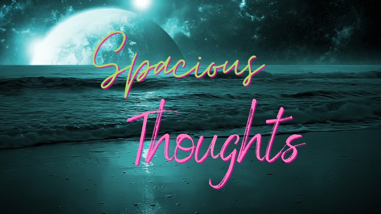
Some countryside memories arrive as complete pictures: a rust-red barn, a narrow road, and sunlight slipping through trees. Others return as fragmentsa warm color, the chirp of crickets, the rhythm of fence posts passing a car window. An abstract lo-fi production visual turns those fragments into a calm, looping world that feels familiar without illustrating any one place too literally.
The most effective result is not merely a landscape with film grain sprinkled over it like digital pepper. It is a carefully composed audiovisual atmosphere. Color, texture, sound, shape, and restrained motion work together to capture the unhurried feeling of a rural afternoonminus the mosquitoes, suspicious geese, and unreliable cell service.
What Is an Abstract Lo-Fi Production Visual?
An abstract lo-fi production visual is a stylized image or animation designed to complement mellow music. It may contain recognizable rural elementsfields, trees, clouds, roads, windows, or farm buildingsbut simplifies them into blocks of color, loose lines, geometric forms, and repeating patterns.
Abstract art does not need to reproduce visual reality accurately. It can communicate through shape, color, form, and gesture. In a lo-fi visual, a curved green band may suggest a hillside, while a pale circle becomes either the sun or moon depending on the viewer’s mood and caffeine level.
The “lo-fi” component refers to intentional imperfection. Soft focus, muted contrast, dust, grain, faded color, slight flicker, and hand-drawn irregularities give the image emotional texture. The effect should feel crafted rather than carelessly damaged. As legal and music-production research has observed, lo-fi is a stylistic choicenot simply poor technical quality.
Why abstraction fits lo-fi music
Lo-fi music often relies on loops, softened high frequencies, relaxed drums, warm chords, and environmental noise. Abstract visuals operate in a similar way. They repeat simple motifs, avoid excessive detail, and create room for the audience’s thoughts.
A literal animated story demands attention because viewers expect a beginning, conflict, and conclusion. An abstract loop offers a place to rest. It can support studying, reading, writing, or staring thoughtfully at a spreadsheet while pretending the spreadsheet has not personally offended anyone.
Why the Countryside Is Such a Strong Source of Inspiration
Rural landscapes contain natural rhythms that translate beautifully into audiovisual design. Rows of crops create repeated lines. Rolling hills produce layered curves. Telephone poles divide space into intervals. Leaves flutter, shadows stretch, and clouds move so slowly that they seem to be paid by the hour.
The countryside also has a distinctive acoustic identity. Wind, insects, birds, distant machinery, footsteps, rain, and creaking wood form a layered soundscape. The National Park Service notes that natural sounds can be associated with benefits such as improved mood, cognition, and lower stress. That helps explain why rural ambience feels so comfortable beneath relaxed beats.
Importantly, countryside inspiration does not require a postcard-perfect farm. A drainage ditch reflecting sunset, laundry moving on a line, cracked paint on a shed, or weeds growing beside a gravel lane may contain more character than a highly polished pastoral scene. Lo-fi aesthetics tend to thrive wherever perfection has politely left the building.
Developing the Visual Language
Build a memory-based color palette
Begin with an emotional memory rather than a generic request for “country colors.” Was the imagined day cool and misty, dry and golden, or green after heavy rain? Choose four to six colors that answer that question.
- Golden-hour palette: wheat, dusty peach, clay red, faded olive, and warm cream.
- Rainy-day palette: blue-gray, moss, charcoal, muted teal, and foggy white.
- Summer-evening palette: lavender, deep green, amber, faded coral, and navy.
- Early-morning palette: pale blue, sage, butter yellow, soft pink, and cool brown.
Analogous colorshues located near one another on the color wheelare especially useful for calm compositions. One dominant color should carry the atmosphere while one or two accents create focus. If every color shouts, the peaceful countryside begins to resemble a discount fireworks warehouse.
Translate objects into shapes
Reduce the landscape to its essential geometry. A barn may become a red rectangle beneath a dark triangle. A line of trees can become uneven vertical marks. A pond may be represented by a reflective oval or a horizontal band with subtle distortion.
This reduction prevents the piece from becoming a conventional landscape illustration. It also allows the music to influence the image. Rounded shapes can accompany soft chords, while narrow lines or small squares can echo hi-hats and percussion.
Use texture as atmosphere
Texture provides the visual equivalent of tape hiss or vinyl crackle. Useful treatments include paper fibers, scanned pencil shading, watercolor blooms, dusty gradients, faded print patterns, and restrained film grain.
Adobe’s guidance on grain effects recommends controlling grain differently across shadows, midtones, and highlights. That principle matters because uniform noise often looks like a filter sitting on top of the picture. Varied grain appears embedded in the image and feels more organic.
Keep texture subordinate to the composition. It should make viewers think, “This feels warm and tactile,” not, “Someone spilled oatmeal on the camera.”
Composing a Calm Countryside Scene
Even an abstract visual needs hierarchy. Color, contrast, scale, position, and spacing guide the viewer toward the most important area. Select one focal point: a glowing sun, a small house, a winding road, or a bright opening between trees.
Place supporting elements around that focus without filling every empty area. Negative space is essential to a restful lo-fi visual. A large sky, quiet field, or dark foreground gives the eye somewhere to pause.
Create depth with simple layers
A reliable composition can be divided into three planes:
- Foreground: dark grasses, fence shapes, flowers, or a window frame.
- Middle ground: a road, field, pond, house, or cluster of trees.
- Background: distant hills, clouds, sky, or a fading horizon.
Separating the scene into planes also makes animation easier. Foreground elements can move slightly faster than distant objects, creating gentle parallax and a convincing sense of depth without requiring elaborate 3D modeling.
Let imperfection remain visible
Slightly uneven lines, asymmetrical shapes, broken edges, and inconsistent shading help the piece feel human. The goal is controlled irregularity. A wobbly fence is charming; a horizon that accidentally tilts twelve degrees may suggest the farm is sliding into another dimension.
Animating the Visual Without Breaking the Mood
Lo-fi animation works best when motion is subtle enough to be discovered rather than announced. Consider drifting clouds, moving grass, changing reflections, slow light flicker, floating dust, a distant bird, or a curtain lifting in the breeze.
Design a seamless loop
A loop should return to its opening state without a visible jump. Cyclical actions are naturally suitable: a branch sways out and back, a cloud crosses a repeating sky, or a reflection rises and settles. Expressions and repeated keyframes can automate these movements in software such as After Effects.
Vary the timing of animated elements. If every leaf, cloud, and grain pattern restarts simultaneously, the scene will feel mechanical. Use different cycle lengths so the repetitions overlap less predictably.
Match movement to musical energy
The visual does not need to bounce on every beat. Instead, map different motions to broader musical qualities:
- Use slow horizontal movement for sustained chords.
- Add tiny pulses or flickers for soft percussion.
- Shift light or color during musical transitions.
- Introduce a rare bird, falling leaf, or passing vehicle as a longer-form variation.
These relationships create synchronization without turning a peaceful visual into a nervous equalizer display.
Designing the Lo-Fi Soundscape
The countryside theme becomes more convincing when the audio contains environmental detail. Begin with the musical foundation: a modest tempo, relaxed drums, warm electric piano or guitar, a rounded bass, and a short chord progression.
Next, add field-recording-inspired layers such as wind through grass, porch creaks, distant birds, light rain, or a tractor far beyond the frame. Cornell’s Macaulay Library demonstrates how rich and varied recorded natural sound can be, while the Library of Congress preserves historic field recordings documenting American music, folklore, and daily life.
Mix ambience with restraint
Environmental audio should support the music rather than compete with it. Remove harsh frequencies, reduce distracting peaks, and position sounds across the stereo field. A bird can sit quietly to one side, while wind forms a soft bed behind the beat.
A low-pass filter can soften bright frequencies, while saturation, compression, wow, flutter, and reverb can create an aged character. Apply these effects deliberately. Too much vinyl noise can make a track sound less like a treasured record and more like breakfast cereal being poured directly into the listener’s headphones.
Use original or properly licensed material
Do not assume that a short sample is automatically free to use. The U.S. Copyright Office explains that a musical composition and a sound recording are separate protected works, often requiring separate permissions. Record original ambience or use material with a license that clearly permits the intended commercial or editorial use.
A Practical Production Workflow
- Write a mood sentence. For example: “A warm evening after light rain, remembered through faded colors and slow movement.”
- Collect references. Gather photographs of fields, weathered materials, rural architecture, local plants, and natural light.
- Create thumbnails. Test several compositions with simple shapes before adding detail.
- Choose a limited palette. Assign colors to the foreground, middle ground, background, and focal accent.
- Build separate layers. Keep objects that will move independently on their own layers.
- Add restrained texture. Combine paper, grain, and painted marks at low opacity.
- Animate primary motion. Start with one movement, such as drifting clouds or swaying grass.
- Add secondary motion. Introduce light flicker, dust, reflections, or tiny environmental changes.
- Pair the visual with audio. Adjust timing and color transitions to complement the arrangement.
- Test the loop repeatedly. Look for jumps, distracting details, compression artifacts, or accidental visual chaos.
Common Creative Mistakes
Copying familiar lo-fi imagery too closely
A cozy desk, headphones, and rainy window are recognizable, but they are not the only vocabulary available. Rural settings offer porches, sheds, empty roads, ponds, orchards, windmills, silos, clotheslines, and moonlit fields. Develop a visual identity from specific observations rather than rearranging established genre symbols.
Adding too much motion
Constant camera movement, rapid particles, and aggressive beat synchronization can exhaust the viewer. Lo-fi visuals should reward long viewing. When uncertain, remove one animated element and see whether the composition breathes more easily.
Using nostalgia without personal detail
Faded colors alone do not create emotional depth. A crooked mailbox, blue enamel mug, patched screen door, or single porch light can make the setting feel lived in. Specificity is the difference between genuine atmosphere and a generic “rustic” preset wearing overalls.
Preparing the Visual for Online Publishing
For a standard widescreen video, 1920 by 1080 pixels remains a practical HD resolution. YouTube recommends progressive scan and advises creators to upload content using its native frame rate. A restrained piece commonly works well at 24 or 30 frames per second, provided the motion has been designed for that rate.
Review the finished visual on a phone, laptop, and larger display. Fine grain that looks elegant on a monitor may vanish after compression, while dark shapes may merge on smaller screens. Export a clean master before creating platform-specific versions.
Remember accessibility
Avoid flashing, aggressive zooming, or unnecessary motion. When embedding animation on a website, provide playback controls when appropriate and respect reduced-motion preferences. W3C accessibility guidance recommends suppressing nonessential animation for users who enable reduced-motion settings.
Accessibility aligns naturally with lo-fi design: calm movement, readable text, gentle contrast, and user control generally improve the experience for everyone.
Experience Journal: Turning a Slow Country Day Into a Lo-Fi Visual
The following is a composite production diary based on common field-observation and creative-workflow experiences.
The starting point was not a dramatic sunset or a majestic mountain. It was a quiet gravel road after a brief summer shower. The clouds had opened just enough to let a strip of amber light reach the wet grass. Water collected in shallow tire tracks, and every puddle held a slightly different version of the sky.
The first notes were deliberately simple: muted green, warm gray, wet brown, amber horizon, slow insects, and distant metal clatter. Recording impressions in words before drawing helped preserve the mood. A photograph would have documented the road, but the notes captured how the place felt.
Back in the production space, the landscape was reduced to five broad shapes. A dark curve became the foreground bank. Two green bands formed the fields. A narrow brown ribbon represented the road, while a pale orange rectangle suggested the opening beneath the clouds. The scene already felt recognizable, although it contained almost no conventional detail.
The first version was too clean. Every edge was perfect, the gradient was smooth, and the road looked as though it had been designed by a luxury automobile company. Scanned paper texture and dry-brush marks solved the problem. Grain was added more heavily to the darker areas and kept lighter around the horizon, allowing the glow to remain open.
Animation began with the grass. A small rotational movement created a slow sway, but duplicating the same timing across every cluster produced an alarming result: the entire field appeared to be performing synchronized aerobics. Offsetting the cycles and changing their range made the motion feel irregular and natural.
A reflection in one puddle brightened every eight seconds. A telephone wire shifted by only a few pixels. Two tiny bird shapes crossed the background once during the longer sequence. Those limited events made the world feel alive without stealing attention from the music.
The soundtrack used soft keys, brushed drums, rounded bass, and a restrained layer of outdoor ambience. The real turning point came from adding a distant gate sound near the end of every fourth musical phrase. It was barely audible, yet it created a sense of place. Suddenly the visual no longer felt like an attractive animation floating in digital space; it felt connected to a landscape beyond the frame.
Several elements were eventually removed, including animated raindrops, three additional birds, a passing truck, and a very enthusiastic butterfly. Each was appealing alone, but together they made the loop feel like a rural tourism commercial. Simplifying the sequence restored its calm.
The final visual did not reproduce the original road exactly. Instead, it preserved the useful parts of the experience: damp air, horizontal space, fading light, and the comforting sense that nothing urgent was about to happen. That is the real strength of abstract lo-fi production. It does not archive every detail. It keeps the emotional weather.
Conclusion
An abstract lo-fi production visual inspired by relaxed countryside days succeeds when it communicates atmosphere rather than merely displaying rural objects. A limited palette, simplified shapes, tactile texture, gentle animation, and carefully mixed environmental sound can transform an ordinary field or road into a contemplative audiovisual world.
The strongest creative decisions usually come from observation. Listen closely, notice imperfect surfaces, record changing light, and identify the small details that make a place memorable. Then simplify. The finished visual does not need to explain everything. Like a quiet afternoon in the country, it only needs enough structure to make staying a little longer feel like a good idea.