Paint color trends in 2024 are not whispering politely from the corner. They are walking into the room wearing linen pants, carrying a ceramic lamp, and saying, “Yes, your gray walls had a good run, but it is time for feelings.” This year’s biggest paint colors are calmer, warmer, richer, and more personal than the icy neutrals that dominated many homes for years.
After reviewing 2024 color announcements from major paint brands and design coverage across respected U.S. home publications, one thing is clear: homeowners want spaces that feel grounded, comfortable, and expressive. The big story is not one single color. It is a mood. Think breezy blues, soft blacks, honeyed neutrals, earthy terracotta, olive green, peachy warmth, and shades that make a room feel like it finally remembered how to exhale.
Below are the 12 paint color trends that will be big in 2024, plus practical ways to use each one without turning your living room into a paint sample hostage situation.
1. Airy Sky Blues Are Taking Over
Soft, uplifting blue is one of the strongest paint color trends of 2024. Sherwin-Williams selected Upward, a breezy blue with gray undertones, as its 2024 Color of the Year, and similar blue shades appeared across multiple brand forecasts. These blues are not baby-shower sweet or nautical-theme aggressive. They are quiet, fresh, and surprisingly grown-up.
Use airy blue in bedrooms, bathrooms, laundry rooms, home offices, and entryways. It works especially well with white trim, pale oak, brushed nickel, rattan, linen, and natural stone. If your room gets plenty of light, a soft blue can feel expansive. In a darker room, choose a slightly warmer blue-gray so it does not turn chilly.
2. Blue-Green Shades Feel Calm and Current
Valspar’s Renew Blue and Minwax’s Bay Blue helped put blue-green tones firmly on the 2024 map. These shades sit between water, sky, and garden foliage, which is probably why they feel so easy to live with. They bring color into a room without shouting, “I made a bold design decision and now we all have to discuss it at dinner.”
Blue-green paint is a smart choice for bathrooms, kitchens, mudrooms, cabinets, and built-ins. It pairs beautifully with warm white, taupe, brass, cream, natural wood, and woven textures. For a modern coastal look, combine blue-green walls with sandy beige and matte black accents. For a cottage-inspired look, add floral prints, vintage brass, and creamy trim.
3. Moody Blue-Violet Adds Sophistication
Benjamin Moore’s Blue Nova brought a deeper, more luxurious blue-violet shade into the spotlight. This is not a shy color. It has depth, polish, and a little “I read hardcover books” energy. Blue-violet shades work well when you want drama but do not want to go as dark as navy or charcoal.
Try this trend in dining rooms, powder rooms, libraries, bedrooms, or accent walls behind a bed. Blue-violet looks elegant with walnut furniture, velvet upholstery, antique gold frames, creamy whites, and moody floral artwork. The key is balance. Let the color be the star, then keep surrounding finishes warm and layered.
4. Soft Black Becomes the New Power Neutral
Behr’s 2024 Color of the Year, Cracked Pepper, confirmed what designers have been hinting at for a while: black paint can be warm, usable, and incredibly chic. In 2024, soft black and charcoal shades are being used not only on accent walls but also on cabinetry, doors, trim, fireplace surrounds, and even exteriors.
A soft black paint color gives a room structure. It can make inexpensive hardware look intentional, highlight architectural details, and create a cozy cocoon effect. Use it with caution in small, poorly lit rooms unless you want a moody look. For balance, pair soft black with warm wood, linen, aged brass, creamy white, and textured rugs.
5. Olive Green Gets Deeper and More Refined
Green has been trending for several years, but in 2024 it becomes darker, earthier, and more sophisticated. Dutch Boy’s Ironside, a deep olive shade, reflects this move toward grounded greens with serious design staying power. These greens feel connected to nature without looking overly rustic.
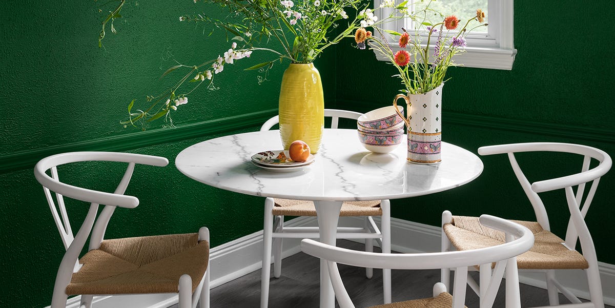
Deep olive works well in living rooms, offices, kitchens, bedrooms, and exterior accents. It is especially handsome on kitchen cabinets with marble-look counters, unlacquered brass hardware, and warm white walls. For a richer look, combine olive green with leather, dark wood, camel, rust, or cream. It is basically the paint version of a well-tailored jacket.
6. Warm Neutrals Replace Cold Gray
Cool gray is not gone forever, but in 2024 it has been politely asked to take a vacation. Warm neutrals such as honey beige, oatmeal, soft taupe, clay beige, and mushroom are becoming more desirable because they make homes feel warmer and more relaxed. Glidden and PPG’s Limitless, a honey-beige neutral, captured this shift perfectly.
Warm neutrals are ideal for whole-home color schemes because they connect spaces without feeling flat. They are also forgiving with furniture and decor. Use them in living rooms, hallways, bedrooms, kitchens, and open-concept spaces. For a modern look, pair warm beige with black accents and light wood. For a traditional look, add classic white trim and antique-inspired finishes.
7. Terracotta and Persimmon Bring Earthy Energy
HGTV Home by Sherwin-Williams named Persimmon its 2024 Color of the Year, and it fits neatly into the larger trend toward terracotta, clay, and sunbaked orange tones. These colors are warm, optimistic, and surprisingly versatile when softened with neutral undertones.
Terracotta paint can make a dining room feel intimate, a kitchen feel cheerful, or a powder room feel instantly memorable. If a full room feels too bold, use it on a front door, island base, niche, or painted furniture piece. Pair terracotta with cream, olive, dark blue, soft black, walnut, woven baskets, and handmade ceramics. It is warm without being loud, which is a rare and useful talent.
8. Peach and Apricot Become Gentle Neutrals
Pantone’s 2024 Color of the Year, Peach Fuzz, gave peach a softer and more elevated identity. The 2024 version of peach is not the shiny bathroom tile of decades past. It is muted, cozy, and quietly flattering. Think apricot cream, blush-peach, and peach-beige.
These shades are beautiful in bedrooms, nurseries, guest rooms, dressing areas, and sunrooms. They add warmth to the complexion of a space, which is a fancy way of saying people tend to look nicer in the room. Pair peach paint with ivory, warm gray, cane furniture, pale oak, dusty rose, olive green, and touches of bronze or brass.
9. Dusty Purple and Muted Plum Add Personality
Violet undertones showed up in several 2024 color conversations, especially through shades like Blue Nova and other muted purple-inspired palettes. Dusty plum, mauve, and gray-lavender are becoming more appealing for homeowners who want color with softness and complexity.
Muted purple works best when it is slightly grayed down. Too bright, and it can feel like a children’s craft aisle. Just right, and it becomes elegant, moody, and unexpected. Use dusty purple in bedrooms, powder rooms, reading corners, or dining spaces. Pair it with creamy trim, dark wood, brass, navy, taupe, or deep green for a layered look.
10. Red-Based Browns and Chocolate Tones Feel Luxurious
Brown is back, and no, it is not here to apologize. Rich browns, cocoa shades, reddish-browns, and coffee-inspired colors are part of the broader return to warm, grounding interiors. These colors make a room feel intimate and expensive, especially when paired with textured fabrics and warm lighting.
Chocolate brown works beautifully in bedrooms, dens, dining rooms, and media rooms. It can also be striking on trim or built-ins. To keep it from feeling heavy, use layered lighting, lighter upholstery, natural wood contrast, and reflective accents such as brass or glass. Brown is no longer just a background color. In 2024, it is the main character with excellent taste.
11. Color Drenching Makes Rooms Feel Designed
Color drenching means painting walls, trim, doors, built-ins, and sometimes ceilings in the same color or closely related tones. In 2024, this approach is popular because it creates a custom, immersive look. It also removes the visual chopping effect that can happen when every wall, door, and trim line is a different color.
This trend works especially well with soft black, deep green, blue-gray, warm beige, plum, and terracotta. For a subtle version, use the same color on walls and trim but change the sheen: eggshell on walls and satin on trim. For a bolder version, paint the ceiling too. Color drenching is like giving a room a tailored suit instead of random socks and a blazer.
12. Nature-Inspired Palettes Stay Strong
The most important 2024 paint color trend is the continued move toward nature-inspired palettes. Blues recall sky and water. Greens connect to gardens and forests. Terracotta and brown echo clay, earth, bark, and stone. Warm neutrals feel like sand, linen, and sunlit plaster.
This trend is not about making every home look like a cabin. It is about choosing colors that feel emotionally comfortable and visually grounded. Nature-inspired paint colors work in modern homes, traditional homes, apartments, farmhouses, and city spaces. They also pair well with the materials people already love: wood, stone, linen, wool, leather, ceramic, and metal.
How to Choose the Right 2024 Paint Color for Your Home
Start With the Room’s Purpose
Before choosing a paint color, decide how the room should feel. A bedroom may need calm, while a dining room can handle drama. A kitchen may benefit from warmth and energy, while a home office might need focus. Paint is emotional architecture. That sounds fancy, but it simply means color changes how a room behaves.
Test Paint Samples in Real Light
Never trust a paint chip alone. Paint at least two sample patches on different walls and look at them morning, afternoon, and night. Blue can turn icy. Beige can turn yellow. Green can suddenly reveal a gray undertone you did not invite to the party. Testing saves money, time, and mild personal heartbreak.
Pay Attention to Undertones
Undertones are the secret personality of paint colors. A neutral may look beige in the store but pink at home. A blue may lean green, purple, or gray. Match undertones to your fixed finishes, such as flooring, countertops, tile, and large furniture pieces. Paint should cooperate with your home, not start a tiny design argument.
Use Trend Colors Strategically
You do not have to paint your entire house in the trendiest color of the year. Sometimes the smartest move is using a bold shade on a powder room, island, front door, bookcase, or accent wall. Trends are best when they serve your style, not when they hold your home hostage with a roller brush.
Room-by-Room Ideas for 2024 Paint Color Trends
Living Room
For a living room, warm neutrals, olive green, soft blue, and chocolate brown are strong choices. A warm beige wall color with olive or blue accents creates a welcoming space that still feels updated. If your living room has built-ins, consider painting them soft black, deep green, or blue-violet for a designer-level focal point.
Kitchen
Kitchen cabinets are perfect for 2024 color trends. Try blue-green lower cabinets, olive green built-ins, warm mushroom walls, or a terracotta island. If you prefer a safer approach, paint the walls a creamy neutral and bring trend colors through cabinet hardware, stools, art, and window treatments.
Bedroom
Bedrooms benefit from softer shades such as airy blue, muted plum, peach-beige, warm taupe, and blue-green. For a cozy retreat, use a deeper color behind the bed and keep bedding light. For a calm look, color drench the room in a soft neutral or gray-blue.
Bathroom
Bathrooms are great spaces for experimenting because they are usually smaller and easier to repaint. Renewed blue-green, soft black vanities, peachy walls, or deep olive accents can make a bathroom feel fresh without a full renovation. Add warm bulbs and textured towels so the color feels intentional.
Exterior and Front Door
For exteriors, soft black, deep olive, blue-gray, and terracotta accents are especially strong in 2024. A front door painted in persimmon, charcoal, muted blue, or olive green can refresh curb appeal quickly. Just make sure the color works with your roof, stone, brick, siding, and landscape.
Personal Experience: What These 2024 Paint Color Trends Teach Us
One of the biggest lessons from the 2024 paint color trends is that people are no longer decorating only for resale value or online approval. They are decorating for comfort, identity, and daily life. That matters. A home is not a showroom where everyone whispers and avoids the sofa. It is where shoes pile up, coffee gets reheated three times, and someone eventually asks where the scissors went. Paint colors should support that real life.
In my experience reviewing home design trends, the colors that last are usually the ones with flexibility. Airy blue works because it can look coastal, traditional, modern, or cottage-inspired depending on the furniture around it. Warm beige works because it plays nicely with almost everything. Olive green works because it feels both classic and fresh. Soft black works because it adds contrast without needing a dramatic personality transplant from the homeowner.
The trick is not to chase every trend. The trick is to understand why a trend is happening. In 2024, people want calm, but not boredom. They want color, but not chaos. They want rooms that feel designed, but not stiff. That is why blue-green, terracotta, warm neutral, peach, olive, and soft black are resonating. These colors have emotional range. They are expressive without being exhausting.
Another practical experience: lighting can make or break every single one of these trends. A paint color that looks dreamy in a brand photo may look completely different under cool LED bulbs or in a north-facing room. Warm neutrals can look muddy in weak light. Soft black can look elegant in a room with layered lamps but flat in a space with one lonely ceiling fixture. Blue can feel peaceful in sunlight and chilly under the wrong bulb. Before committing, test large samples and view them beside your flooring, trim, furniture, and curtains.
It is also helpful to think in palettes rather than single colors. For example, a 2024-friendly palette might include warm white walls, olive green cabinets, brass hardware, and a clay-colored rug. Another could combine airy blue walls, walnut furniture, cream upholstery, and black picture frames. A bolder palette might use blue-violet in a dining room with warm wood, ivory trim, and plum-toned artwork. When colors are part of a relationship, they behave better. Paint colors, apparently, also need friends.
If you are nervous about bold colors, start small. Paint a powder room, a bookcase, a door, or a piece of furniture. If you love the result after a few weeks, expand the color into a larger space. If you do not love it, congratulations: you have learned something without repainting your entire downstairs. That is not failure. That is research with a roller.
Ultimately, the best 2024 paint color trend is the one that makes your home feel more like yours. If that means a serene blue bedroom, wonderful. If it means a dramatic soft black office, excellent. If it means terracotta in the kitchen because you want your morning coffee to feel like it has a passport, go for it. Trends are useful guides, but your home gets the final vote.
Conclusion
The 12 paint color trends that will be big in 2024 show a clear shift toward warmth, depth, nature, and personality. Blues are softer and more livable. Greens are deeper and more elegant. Neutrals are warmer and more human. Dark colors are being used with confidence, while peach, terracotta, and plum bring a fresh sense of character.
Whether you repaint one door or redesign an entire room, 2024 is a great year to move beyond safe-but-sleepy walls. Choose colors that match your light, your finishes, and your lifestyle. Most importantly, choose shades that make you happy to walk into the room. That is the trend with the longest shelf life.
Note: This article is written as original, web-ready content based on real 2024 paint color announcements, major brand forecasts, and U.S. home design trend coverage.