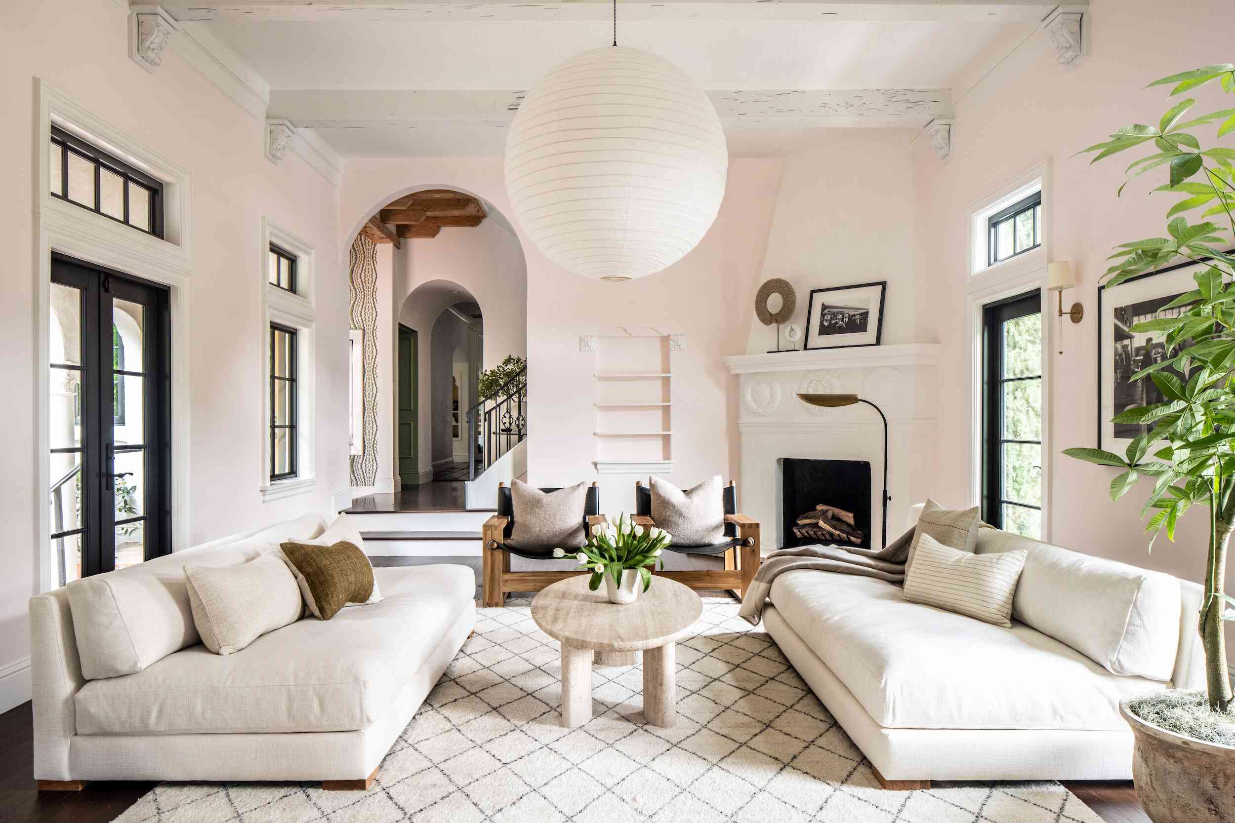
Light pink is one of those sneaky genius colors that looks sweet at first glance and then casually turns into a style powerhouse once you start decorating with it. It can feel airy, romantic, modern, cozy, playful, polished, or even a little dramatic depending on what you pair it with. In other words, light pink is not just “pretty.” It is flexible, surprisingly grown-up, and way more useful than people give it credit for.
If you have ever stood in front of a paint swatch wall wondering whether blush belongs with gray, green, blue, or something bolder, welcome to the club. The good news is that light pink works beautifully with a wide range of shades, from easy neutrals to deep statement colors. The trick is to pay attention to undertones. Warm light pinks pair beautifully with earthy tones and creamy neutrals, while cooler pinks look especially fresh with blue-grays, sage, and crisp white.
Below, you will find 21 colors that go with light pink for a stylish, balanced, and totally livable palette. Whether you are decorating a bedroom, upgrading a living room, refreshing a kitchen, or choosing an outfit, these light pink color combinations can help you build a look that feels intentional instead of accidental. And yes, accidental pink is definitely a thing.
Why Light Pink Works So Well
Before we jump into the pairings, it helps to understand why decorating with light pink is so easy. Light pink sits in a sweet spot between color and neutral. It adds warmth without shouting, softness without looking weak, and personality without taking over the room. That makes it incredibly useful for interiors, fashion, wedding palettes, and graphic design alike.
Another reason light pink is so versatile is that it plays well with contrast. Pair it with dark tones, and it feels sophisticated. Pair it with airy neutrals, and it feels calm and elegant. Pair it with warm shades, and suddenly the whole palette feels sunny and welcoming. Light pink is basically the friend who gets along with everyone at the party.
21 Best Colors That Go With Light Pink
1. White
White and light pink create one of the cleanest and most timeless combinations around. This duo feels fresh, bright, and slightly romantic without becoming too sugary. Use crisp white for a modern look or a softer off-white for something gentler. In bedrooms, nurseries, and bathrooms, white keeps light pink from feeling overly decorative while letting it stay soft and cheerful.
2. Cream
If white feels a little too sharp, cream is your best friend. Cream adds warmth and makes light pink feel more relaxed and inviting. This is a lovely choice for cozy living rooms, bedding, or vintage-inspired spaces where you want softness without losing depth.
3. Beige
Beige gives light pink a grounded, sophisticated base. Together, they create a palette that feels warm, modern, and easy to live with. Beige works especially well when your light pink has peachy or rosy undertones. Think blush walls, beige curtains, natural wood, and a room that basically whispers, “I have my life together.”
4. Taupe
Taupe is a slightly moodier neutral that makes light pink look more polished. This combo is ideal when you want a feminine color palette that does not feel too delicate. Taupe upholstery, rugs, or accent walls can add maturity to pink and give the whole space a designer feel.
5. Gray
Gray and light pink are a classic pairing for a reason. Soft gray adds balance and keeps pink from feeling too sweet. The result is calm, chic, and modern. Cooler pinks work especially well with blue-based grays, while warmer blush shades pair nicely with greige and warmer gray tones.
6. Black
Want to toughen up light pink a little? Add black. This high-contrast combo feels graphic, stylish, and surprisingly elegant. Black lighting fixtures, frames, hardware, or chairs can make a light pink room feel sharper and more contemporary. In fashion, black and light pink always look confident and intentional.
7. Brown
Chocolate brown, walnut, caramel, and espresso all bring richness to light pink. This pairing has become especially popular because it feels warm, layered, and a little nostalgic in the best way. Pink and brown can look sweet, yes, but they can also look incredibly sophisticated when used with texture and depth.
8. Gold
Gold instantly elevates light pink. Together, they create a polished, glamorous look that works well in bedrooms, bathrooms, event decor, and branding. Brushed gold feels softer and more modern than shiny yellow gold, but both can be beautiful depending on the style you want.
9. Silver
If gold is warm and luxe, silver is cool and sleek. Light pink with silver feels crisp, elegant, and slightly futuristic. This pairing works especially well with cooler shades of pink in modern spaces, holiday decor, or fashion looks that need a little shimmer without going full sparkle explosion.
10. Sage Green
Sage green is one of the absolute best colors that go with light pink. The soft green tones balance pink naturally and create a palette that feels fresh, organic, and calming. It is a favorite for bedrooms, kitchens, floral arrangements, and wedding color schemes because it looks effortless and refined.
11. Forest Green
For more contrast and drama, pair light pink with forest green. The deep green anchors pink and makes it feel richer and more mature. This combination looks stunning in upholstery, accent walls, tablescapes, and holiday styling. It is romantic without being fragile.
12. Olive Green
Olive green gives light pink an earthy, grounded feel. It is a great option when you want something softer than forest green but more complex than sage. Olive and light pink work well with brass, natural wood, linen, and woven textures for a relaxed but curated look.
13. Navy Blue
Navy brings instant structure to light pink. This pairing feels classic, balanced, and slightly preppy in a very good way. Use navy when you want light pink to feel less whimsical and more tailored. In home decor, navy furniture or textiles can make blush walls or accessories look crisp and intentional.
14. Sky Blue
Sky blue and light pink create a gentle, airy palette that feels peaceful and optimistic. This combination works beautifully in nurseries, bedrooms, spring decor, and branding with a soft, dreamy vibe. If you want a room that feels like a deep breath, this is a strong contender.
15. Teal
Teal and light pink deliver stronger contrast with more personality. Teal adds depth, energy, and a little jewel-toned magic. If your pink is pale and subtle, teal can keep the palette from fading into the background. This combo looks especially striking in velvet, ceramics, or accent furniture.
16. Lavender
Lavender and light pink are soft cousins on the color wheel, so they naturally blend well. The result is romantic, whimsical, and soothing. To keep the palette from feeling too sugary, add white, gray, or metallic accents. This is a lovely option for bedrooms, events, or beauty-inspired branding.
17. Burgundy
Burgundy adds seriousness and depth to light pink. This pairing feels rich, layered, and a little luxurious. If pale pink seems too delicate on its own, burgundy gives it backbone. Use this combo in dining rooms, fashion palettes, floral design, or any space that wants warmth with a dramatic twist.
18. Red
Yes, pink and red absolutely work together. In fact, the pairing can look bold, playful, and fashion-forward. Light pink softens the intensity of red, while red sharpens pink’s sweetness. This is not a shy combo, but when done well, it feels energetic and full of personality.
19. Peach
Peach and light pink create a tonal palette that feels warm, sunny, and cheerful. These shades work particularly well when you want a soft color story with very little visual tension. Add cream or natural wood to keep the look grounded and not too dessert-themed.
20. Terracotta
Terracotta gives light pink a warm, earthy contrast that feels current and inviting. The clay-like depth of terracotta keeps pink from floating away into sweetness. This is a standout combination for boho, Mediterranean, or relaxed modern interiors where texture matters just as much as color.
21. Mustard Yellow
Mustard yellow adds energy and surprise to light pink. It is not the most obvious pairing, which is exactly why it works. The golden warmth of mustard brings boldness, while light pink keeps the palette approachable. Use it in pillows, art, stationery, or fashion when you want something playful but still stylish.
How to Choose the Right Light Pink Color Combination
Not every pink works with every color in the same way, so it helps to think in terms of mood. If you want a calm, airy palette, stick with white, cream, gray, sage, and sky blue. If you want something richer and more grown-up, lean toward taupe, brown, burgundy, navy, and forest green. If you want warmth and energy, peach, terracotta, mustard, and red will wake things right up.
Texture also matters. Light pink with linen, oak, rattan, and matte finishes feels organic and relaxed. Light pink with velvet, brass, lacquer, or marble feels more glamorous. Even the same color pairing can look completely different depending on the materials around it. That is why a pink-and-brown room can feel rustic, retro, or luxurious depending on the details.
Specific Examples for Decorating With Light Pink
In a bedroom, try light pink walls with white bedding, taupe curtains, and brass lamps for a soft hotel-like look. In a living room, a blush sofa can look stunning with forest green pillows, walnut tables, and a cream rug. In a kitchen, light pink cabinetry becomes more sophisticated when paired with black hardware and warm white walls. For a bathroom, light pink tile with gray stone or brushed gold fixtures feels clean and elevated.
In fashion, light pink pants look polished with a navy blazer, effortless with a white shirt, and more trend-forward with brown accessories. For weddings or event styling, light pink flowers pair beautifully with sage greenery, ivory linens, burgundy accents, or even terracotta candles for a more modern palette.
Experience: What Light Pink Pairings Feel Like in Real Life
One of the most interesting things about light pink is how different it feels once you actually live with it. On paper, it can seem delicate or overly pretty, but in real rooms and everyday settings, it often behaves more like a warm neutral. People who try it for the first time are usually surprised by how calming it feels in the morning and how flattering it looks in natural light throughout the day. That soft glow effect is real, and it can make a room feel more welcoming almost instantly.
A common experience with light pink is that it changes personality depending on the colors around it. Pair it with white and cream, and the room feels airy, gentle, and almost spa-like. Pair the same pink with black or navy, and suddenly it looks sharper and more refined. Add brown wood tones, and it becomes cozy and grounded. This is why light pink is so easy to keep around for years. You can update the mood of the space without repainting everything. Sometimes all it takes is swapping a few pillows, curtains, or accessories.
Another real-world advantage is that light pink tends to soften hard finishes. In homes with a lot of metal, stone, tile, or modern lines, pink can take the edge off without making the space look childish. It works especially well in bedrooms, powder rooms, and reading corners where people want a relaxed, comforting feeling. Even people who claim they are “not pink people” often end up liking a muted blush because it reads as warm and inviting rather than loud.
There is also a practical side to the color. Light pink often makes skin tones look healthier and spaces look brighter, especially in rooms that do not get harsh direct sunlight. In fashion, people tend to notice that light pink is easier to wear than brighter shades because it pairs well with basics like denim, white, camel, gray, and black. In decor, it can do the same job. It blends beautifully with everyday materials like oak, linen, marble, brass, and woven textures.
The biggest lesson people learn from using light pink is that balance matters more than stereotypes. If a room feels too sweet, it usually needs contrast, not a complete color panic. A darker green, a stronger black accent, a deeper wood tone, or a structured navy piece can fix the issue fast. On the other hand, if the space feels flat, adding cream, gold, peach, or mustard can bring it back to life. Light pink is flexible that way. It does not demand perfection. It just asks for the right company.
Conclusion
If you have been wondering what colors go with light pink, the answer is delightfully broad. From quiet neutrals like white, cream, beige, and taupe to richer shades like navy, burgundy, forest green, and brown, light pink can anchor more palettes than most people expect. It can look soft and serene, bold and modern, warm and earthy, or polished and luxurious depending on what you pair it with.
The best light pink color combinations are the ones that match the mood you want to create. Keep it airy with white and sage, dramatic with black and burgundy, cozy with brown and terracotta, or playful with mustard and red. However you use it, light pink proves that sometimes the gentlest color in the room is secretly doing the heaviest lifting.