Kitchen color trends are having a delicious little glow-up. For years, the safe recipe was simple: white cabinets, gray backsplash, stainless steel appliances, and maybe one brave navy island if the homeowner felt emotionally prepared. But right now, kitchens are getting warmer, richer, earthier, and a lot more personal. In other words, the kitchen has stopped dressing like a hotel bathroom and started dressing like the most interesting room in the house.
The biggest shift is not just about one “it” color. It is about mood. Homeowners want kitchens that feel calm in the morning, cozy at dinner, stylish during a party, and forgiving when someone leaves a spoon in the sink “to soak” for three days. Current kitchen paint colors are leaning into nature, comfort, texture, and personality: soft greens, mushroom neutrals, smoky blues, burgundy cabinets, clay walls, butter yellow accents, and espresso-brown drama.
Below are 12 kitchen color trends that are hot right now, along with practical ways to use them without making your kitchen look like it lost a bet with a paint fan deck.
1. Warm White Instead of Stark White
White kitchens are not gone, but the chilly, blue-toned version is taking a polite step back. The updated look is warm white: creamy, soft, slightly sunlit, and much easier to live with. Think vanilla bean, warm ivory, fresh cream, and linen instead of hospital hallway white.
Warm white works beautifully on cabinets, walls, trim, and even backsplashes because it gives the kitchen brightness without feeling sterile. It also plays nicely with natural wood, brass hardware, beige stone, and handmade tile. If your kitchen is small or does not get much natural light, this trend is especially helpful because it keeps the room open while still adding warmth.
How to use it
Pair warm white cabinets with oak shelves, unlacquered brass pulls, creamy quartz, or zellige-style tile. Avoid pairing warm white with icy gray flooring, which can make the palette look confused, like it got dressed in two different climates.
2. Mushroom, Taupe, and Putty Neutrals
Mushroom is the cool-girl neutral of kitchen color trends right now. It sits somewhere between beige, gray, brown, and taupe, which sounds indecisive but looks incredibly sophisticated. These warm neutrals are replacing flat gray because they feel more natural, softer, and easier to layer.
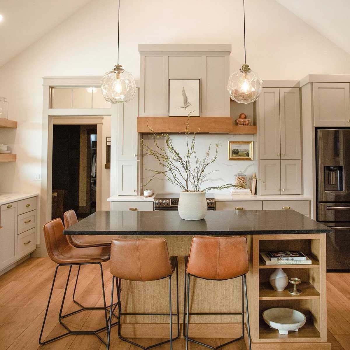
Mushroom cabinets can make a kitchen feel custom without screaming for attention. Putty-colored walls give white countertops a warmer base. Taupe islands can bridge the gap between light upper cabinets and darker wood floors. This family of shades is also wonderfully practical because it hides fingerprints better than white and feels less heavy than dark brown.
Best pairings
Try mushroom cabinets with cream walls, antique brass, honed marble, or Taj Mahal-style quartzite. For a modern look, add black accents in small doses, such as a faucet, sconce, or cabinet latch.
3. Sage Green That Feels Like a Deep Breath
Sage green remains one of the most popular kitchen cabinet colors because it offers color without chaos. It is gentle, botanical, and calming, making it perfect for a room where people gather, cook, snack, talk, and occasionally pretend they are going to meal prep.
The current version of sage is warmer and more muted than the minty greens of the past. It looks beautiful with stone, oak, walnut, terracotta floors, creamy walls, and brushed brass. It also works in both traditional and modern kitchens, which explains why designers keep reaching for it.
Where it shines
Use sage on lower cabinets, a pantry wall, a breakfast nook, or a full cabinet run. In small kitchens, pair sage with warm white uppers to keep the space light and balanced.
4. Deep Forest Green for Moody Luxury
If sage green is a calm walk in the garden, forest green is dinner by candlelight in a very expensive restaurant. Deep green kitchens are dramatic, elegant, and grounded. They bring the outdoors in, but in a tailored way rather than a “lost in the woods with a spatula” way.
Forest green is especially strong on cabinets and islands. It gives a kitchen depth and richness, particularly when combined with marble, soapstone, walnut, aged brass, or creamy walls. The trick is balance. In a low-light kitchen, deep green can become too heavy if used everywhere, so consider limiting it to lower cabinets or a statement island.
Designer-style tip
Add texture around forest green: woven shades, wood cutting boards, natural stone, and warm metal finishes. The color looks best when it has other natural materials to talk to.
5. Smoky Blue-Green and Jade Tones
One of the freshest kitchen color trends is smoky blue-green: a moody mix of teal, jade, and deep sea glass. It feels more unexpected than sage and softer than navy. This color family is showing up in paint palettes because it offers personality while still feeling grounded and livable.
Smoky jade works well for homeowners who want a colorful kitchen but are not ready for tomato red cabinets or a mustard ceiling. It is refined, slightly vintage, and gorgeous with warm woods. It can also make a kitchen feel connected to nature without going full farmhouse.
How to style it
Use smoky blue-green on an island, built-in hutch, lower cabinets, or wet bar. Pair it with creamy counters, walnut shelves, aged brass, warm white walls, and simple handmade tile.
6. Charcoal Blue and Slate Blue
Navy kitchens had their big moment, and they are not disappearing. But the newer blue trend is softer, dustier, and more complex. Charcoal blue and slate blue bring depth without feeling as formal as classic navy. These shades are moody but not gloomy, sophisticated but not stiff.
Slate blue is a strong choice for Shaker cabinets, islands, and built-in storage. It looks beautiful with warm white walls, pale stone, brushed nickel, and natural wood. Charcoal blue can also work as an alternative to black for people who want contrast but not a kitchen that looks like it joined a secret society.
Small kitchen warning
Dark blue can absorb light, so use it carefully in tight spaces. If your kitchen has limited natural light, try slate blue on lower cabinets only, then keep the uppers, walls, and backsplash lighter.
7. Butter Yellow and Soft Lemon Accents
Yellow is back, but thankfully not the aggressive neon banana shade that makes everyone squint before breakfast. The trend is soft butter yellow, pale lemon, and gentle golden cream. These tones bring optimism and warmth without overwhelming the room.
Butter yellow works especially well in cottage kitchens, vintage-inspired spaces, and kitchens with lots of natural wood. It can brighten a north-facing room and make a breakfast nook feel cheerful. Used thoughtfully, yellow adds charm. Used recklessly, it can make your kitchen feel like a highlighter with plumbing.
Best ways to try it
Paint a pantry door, island base, breakfast nook, or ceiling in soft yellow. Pair it with cream, white oak, terracotta, sage, or deep green for a palette that feels sunny rather than sugary.
8. Clay, Terracotta, and Earthy Red
Clay and terracotta are bringing warmth back to kitchens in a big way. These earthy reds feel natural, historic, and comforting. They are inspired by sunbaked tile, pottery, brick, and desert landscapes, which makes them especially appealing in kitchens with natural materials.
Terracotta can be used on walls, tile, floors, or even cabinetry if you want a strong statement. Brick red and muted clay also work beautifully as accents with warm neutrals, olive green, and creamy stone. The result feels collected and soulful, as if the kitchen has stories to tell and possibly a very good soup recipe.
Use it with restraint
Clay tones are warm and social, but they can dominate a room. Try them on a backsplash, island, range hood, or accent wall before committing to every cabinet.
9. Burgundy, Oxblood, and Plum Cabinets
Burgundy is one of the boldest kitchen cabinet color trends right now. It is rich, dramatic, and unexpectedly elegant. Oxblood, wine, aubergine, and plum shades are appearing more often because homeowners want kitchens with character instead of another safe neutral box.
These colors can look luxurious when paired with marble, dark wood, brass, and creamy walls. They can also feel cozy and old-world, especially in traditional kitchens with inset cabinets or vintage-style hardware. The key is choosing a shade with depth rather than a flat primary red.
Where to apply it
A burgundy island is a smart first step. For a bolder design, use burgundy on lower cabinets and balance it with warm white uppers, natural stone, and soft lighting.
10. Espresso Brown and Chocolate Cabinets
Brown is back, and it did not come quietly. Espresso, chocolate, coffee, and walnut-inspired tones are replacing flat black as the dramatic kitchen choice. These shades feel rich, tailored, and warm, especially when they have subtle charcoal or umber undertones.
Deep brown cabinets can make a kitchen feel expensive when paired with lighter stone and simple hardware. They are also more forgiving than black because they have warmth and variation. In open kitchens, espresso brown can anchor the room and make the space feel more intentional.
Keep it from feeling heavy
Use deep brown with cream walls, light countertops, warm metal finishes, and good lighting. If the kitchen is small, reserve espresso for an island or lower cabinets.
11. Natural Wood as a Color Trend
Not every kitchen color trend comes from a paint can. Natural wood is acting as a major “color” in today’s kitchens, especially white oak, walnut, and medium-toned stains. Wood brings warmth, grain, movement, and a sense of calm that painted cabinets cannot always match.
White oak feels fresh and airy, while walnut adds richness and contrast. Both pair beautifully with warm whites, mushroom neutrals, deep greens, blue-grays, and stone counters. The best wood kitchens avoid orange or overly glossy finishes. The current look is matte, natural, and quietly elegant.
Modern wood combinations
Try white oak cabinets with creamy walls and sage tile, or walnut lower cabinets with warm white uppers and brass hardware. Wood also works well in two-tone kitchens because it softens stronger paint colors.
12. Two-Tone Color Pairings With Real Personality
Two-tone kitchens are still hot, but the combinations are more thoughtful now. Instead of simply pairing white uppers with navy lowers, homeowners are mixing warm neutrals, soft greens, wood, burgundy, clay, and blue-gray in layered ways.
A two-tone palette can solve several design problems at once. It can make a small kitchen feel lighter, help a large kitchen feel less flat, and let you use a bold color without committing to every cabinet. It also gives the room a custom look, even if the layout is simple.
Fresh combinations to try
Consider cream and walnut, taupe and sage, warm white and forest green, mushroom and charcoal blue, or off-white with burgundy. For a softer look, keep both colors muted. For drama, let one shade be deep and the other warm and pale.
How to Choose the Right Kitchen Color for Your Home
Trends are useful, but your kitchen still has to live in your actual house. Before choosing a paint color, look at the room’s natural light, flooring, countertops, backsplash, appliance finishes, and adjoining spaces. A color that looks gorgeous in a sunny showroom can turn muddy in a shaded kitchen. A deep green that feels luxurious online may feel heavy if your space has one tiny window and a ceiling light from 1998.
Always test large paint samples in the kitchen at different times of day. Morning light, afternoon light, and evening artificial light can change a color dramatically. Also consider finish. Cabinets usually need a durable enamel or cabinet-grade coating, while walls often look best in washable matte, eggshell, or satin finishes depending on traffic.
of Real-Life Experience: What These Kitchen Color Trends Actually Feel Like
The interesting thing about kitchen color is that it never lives alone. A paint chip may look perfect in your hand, but the moment it meets your countertops, floor, cabinet hardware, and that one small appliance you refuse to replace, the relationship gets complicated. That is why the best kitchen color decisions usually happen slowly. The most successful projects begin with observation, not panic scrolling at midnight while whispering, “Maybe burgundy cabinets will fix my life.”
In real homes, warm neutrals tend to be the safest long-term winners. Mushroom, taupe, putty, and warm white are popular because they do not fight with existing finishes. They can calm down busy granite, soften stainless steel, and make older cabinets feel more current. If a homeowner wants a refresh without a full remodel, painting cabinets in a warm neutral often creates the biggest visual upgrade for the least emotional risk.
Greens are also extremely livable. Sage green, olive, and smoky eucalyptus tones feel fresh in spring, cozy in fall, and surprisingly neutral year-round. They work especially well in kitchens that open to a garden, backyard, or breakfast area with plants. The only caution is undertone. Some greens turn gray in low light, while others become minty or yellow. Testing samples is not optional; it is the difference between “designer kitchen” and “accidental toothpaste commercial.”
Dark colors require more confidence and better lighting. Forest green, charcoal blue, espresso brown, and burgundy can be stunning, but they need support. Under-cabinet lighting, warm bulbs, reflective surfaces, light counters, and natural materials help keep these colors from feeling heavy. In many kitchens, the smartest move is to use a dramatic shade on the island or lower cabinets, then let the upper half of the room breathe.
Yellow, clay, and terracotta are more emotional colors. They change the energy of a kitchen quickly. Soft yellow makes mornings feel brighter, especially in breakfast nooks and family kitchens. Clay and terracotta create warmth and appetite-friendly comfort, making them great for people who cook often and entertain casually. These colors pair beautifully with imperfect textures: handmade tile, rustic pottery, wood bowls, linen shades, and stone counters.
The biggest lesson is this: the best kitchen color trend is the one that improves how the room feels every day. A trendy color that annoys you before coffee is not a trend; it is a daily argument. Choose colors that support the way you live. If your kitchen is busy, go calm. If it is bland, add depth. If it is dark, warm it up. If it already has good bones, use color to make those bones look like they joined a gym and hired a stylist.
Conclusion
The hottest kitchen color trends right now are warm, personal, and deeply connected to nature. Stark white and cold gray are giving way to creamy whites, mushroom neutrals, sage green, forest green, smoky jade, slate blue, butter yellow, clay, burgundy, espresso brown, natural wood, and layered two-tone palettes.
The beauty of these trends is that they offer options for every comfort level. You can make a subtle update with warm white walls, go bolder with a forest green island, or create a full design moment with burgundy cabinets and marble counters. The goal is not to chase every trend. The goal is to choose a kitchen color palette that feels current, functional, and genuinely enjoyable to live with. After all, the kitchen is where life happens: breakfast, homework, coffee, leftovers, holiday chaos, and the occasional dramatic search for the missing lid.