Blank walls have a special talent for making a room feel unfinished. Fortunately, you do not need an art degree, a private studio, or the ability to paint a perfectly proportioned bowl of fruit to fix them. DIY paint pour art turns fluid acrylic paint, gravity, and a little controlled chaos into one-of-a-kind wall decor.
Also known as acrylic pouring or fluid art, this technique involves pouring prepared acrylic colors onto a canvas or wood panel and moving them without traditional brushwork. The paint flows into ribbons, waves, marbled patterns, and organic cells that would be nearly impossible to reproduce with a brush. Best of all, every pour is unique. Even when you repeat the same colors and method, gravity cheerfully ignores your plans and invents something new.
This guide explains how to choose supplies, prepare your workspace, mix paint, create several popular effects, avoid beginner mistakes, finish the artwork, and hang it attractively on your wall.
Why Acrylic Paint Pouring Works So Well for Wall Art
Paint pouring is especially suitable for DIY wall decor because it creates bold visual movement without requiring advanced drawing skills. Instead of carefully outlining shapes, you work with color relationships, paint consistency, and motion.
The finished artwork can complement nearly any decorating style. A black, white, gray, and metallic-gold pour can look sophisticated in a modern living room. Ocean blues and sandy neutrals suit coastal decor. Terracotta, cream, olive, and charcoal can warm up a bohemian bedroom. For a child’s room, brighter colors can create playful patterns without looking like a preschool finger-painting incident.
You can also create one large statement piece, a coordinated pair, or a three-panel arrangement. Because the paintings are made together, their colors naturally connect even when their patterns differ.
Supplies You Will Need
Acrylic pouring is approachable, but the correct materials make the process far more predictable. Gathering everything before you begin is important because fluid paint does not pause politely while you search the garage for another cup.
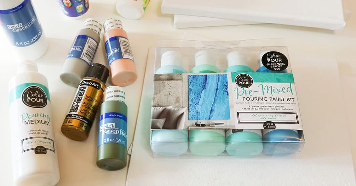
Basic Paint-Pouring Materials
- Stretched canvas, canvas board, or a cradled wood panel
- Acrylic paint in three to five coordinated colors
- Acrylic pouring medium
- Disposable or reusable mixing cups
- Wooden craft sticks or palette knives
- Disposable gloves
- A plastic table covering, drop cloth, or flattened cardboard box
- Small cups, pushpins, or blocks for raising the canvas
- A bubble level
- Paper towels and damp cleaning cloths
Optional Tools
- A squeeze bottle for controlled lines
- A drinking straw or air blower for moving paint
- A small balloon for balloon-dip effects
- A palette knife or plastic scraper for swipe pours
- Metallic or iridescent acrylic paint
- Varnish for a protective finish
- D-rings, picture wire, or sawtooth hangers
Pre-mixed pouring paints are convenient for beginners because they are already formulated to flow. Standard craft or artist acrylics can also work, but they usually need pouring medium. Avoid thinning thick acrylic paint with large amounts of water alone. Too much water can weaken the paint film, reduce color intensity, and produce uneven results.
Choose a Surface That Will Stay Flat
Stretched canvas is lightweight and easy to hang, making it a popular choice for DIY acrylic pour wall art. However, a low-quality canvas can sag under the weight of wet paint. A cradled wood panel is more rigid and offers a smooth surface, although it is heavier and may need stronger hanging hardware.
Beginners often find an 8-by-10-inch or 12-by-12-inch surface easier to control than a giant canvas. Large pours require considerably more paint, faster decision-making, and enough workspace to rotate the piece without redecorating the dog.
Before pouring, check that the canvas is clean, dry, and properly primed. Most store-bought art canvases are already coated with gesso. If you are using unfinished wood, apply an acrylic-compatible primer or gesso and let it dry according to the product directions.
Plan a Color Palette Before Opening the Paint
A strong color palette is often the difference between sophisticated fluid art and a puddle that resembles the rinse cup from an elementary-school art class.
Start With Three to Five Colors
Choose one dominant color, one or two supporting colors, a light neutral, and an optional accent. White is commonly used to create contrast and space between colors. Black can add drama, but it quickly overwhelms lighter shades, so use it sparingly.
For a calm bedroom piece, try navy, muted teal, white, pale gray, and a small amount of silver. For warmer living-room decor, combine burnt orange, cream, deep brown, dusty rose, and metallic gold.
Avoid Accidental Mud
Colors located opposite one another on the color wheel can create brown or gray when blended heavily. Blue and orange, red and green, or yellow and purple may look excellent next to one another, but aggressive mixing can turn them into a color best described as “municipal sidewalk.”
Use white, black, metallic paint, or a related intermediate color to separate strong complementary colors. You can also place potentially muddy combinations in different parts of the cup instead of pouring them directly on top of one another.
Prepare a Level, Paint-Safe Workspace
Cover more space than you think you need. Acrylic paint has ambition. Protect the table, nearby flooring, and anything within tilting distance.
Raise the canvas on four equal-height cups or blocks so excess paint can drip from the edges. Insert pushpins into the back corners of a stretched canvas if you want small, built-in feet. Confirm that the surface is level in both directions. A slightly tilted table may cause the entire composition to migrate toward one corner while it dries.
Keep children and pets away from the drying area. A curious cat crossing wet acrylic paint can create an exciting mixed-media piece, but it is rarely the effect the artist requested.
How to Mix Paint for Acrylic Pouring
There is no single mixing ratio that works with every paint and medium. Acrylic brands vary in thickness and pigment concentration, so the manufacturer’s label should be your starting point. Some systems use roughly equal quantities of paint and pouring medium, while highly concentrated soft-body colors may require far more medium.
Aim for a Warm-Honey Consistency
Place each color in a separate cup. Add pouring medium and stir slowly, scraping the sides and bottom. The mixture should flow from the craft stick in a smooth, continuous ribbon. It should be thinner than ordinary acrylic paint but not as watery as milk.
If one color is much thicker than the others, it may sink beneath them or resist moving across the canvas. Adjust each mixture until all colors flow at approximately the same speed.
Mix Slowly to Reduce Bubbles
Rapid stirring traps air in the paint. Stir gently and allow the cups to rest for several minutes when possible. Small surface bubbles often disappear during the pour, but excessive foam can leave pinholes or uneven spots after drying.
Four Easy Paint Pour Techniques for Beginners
1. The Puddle Pour
The puddle pour gives you relatively good control over color placement. Pour a small pool of your base color near the center of the canvas. Add a second color directly inside it, followed by the remaining colors. Repeat the sequence in several areas.
Lift the canvas and tilt it slowly, allowing the paint to travel toward each corner. Return the canvas toward level before too much paint runs off one side. This method creates broad rings, flowing bands, and stone-like patterns.
2. The Dirty Pour
For a dirty pour, layer prepared colors in one cup without stirring them together. Pour each color gently down the side of the cup to preserve separation. You can then pour the mixture across the canvas in a circular, ribbon, or wandering motion.
Tilt the surface until the paint covers the top and flows over the edges. The layered cup produces unpredictable marbling and is an excellent choice when you want a lively abstract design.
3. The Flip-Cup Pour
Layer the colors in a cup as you would for a dirty pour. Place the canvas face down over the cup, hold both together, and flip them in one confident motion. Set the canvas on the supports and wait several seconds before lifting the cup.
Remove the cup slowly and let the paint spread. Tilt the canvas to expand the design. A flip cup often creates dramatic color pockets, lacing, and cells. It also creates suspense, because the cup briefly contains either a masterpiece or an extremely colorful surprise.
4. The Dutch Pour
Cover the canvas with a thin layer of base color, usually white or black. Add narrow puddles or lines of contrasting paint, then use gentle air to push the colors outward. A straw, manual air blower, or hair dryer on a cool, low setting can be used carefully.
Move the air source continuously rather than blasting one area. The goal is to stretch the paint into soft petals and wispy ribbons, not launch it across the room. Dutch pours work especially well with a limited palette and plenty of negative space.
How to Tilt the Canvas Without Losing the Design
Hold the canvas firmly from underneath and tilt it toward one corner at a time. Watch the leading edge of the paint rather than the center. Once the flow reaches a corner, tilt back toward the middle before moving to the next side.
Do not keep every attractive section. A pour usually improves when enough paint leaves the surface to create movement and prevent an excessively thick layer. If you try to preserve every swirl, the final painting may become crowded and slow to dry.
Use a craft stick or gloved finger to add paint to uncovered corners. Run excess paint over all four sides for a gallery-style finish, or wipe the edges clean if you plan to frame the artwork.
Let the Painting Dry Without Disturbing It
Place the finished artwork in a clean, level, dust-protected area. A large cardboard box positioned over the painting can help keep out dust and curious fingers, provided it does not touch the wet surface.
Drying time depends on humidity, temperature, paint thickness, surface type, and the amount of medium used. The top may feel dry before the deeper layers have cured. Leave the painting flat and undisturbed for several days, and allow additional time before applying varnish.
Do not move the canvas to a slanted shelf because the surface appears dry. A heavy layer can still shift underneath, creating cracks, wrinkles, or a slow-motion landslide.
Common Acrylic Pouring Problems and Fixes
The Colors Turned Muddy
You may have used too many colors, chosen several complementary hues, or tilted the canvas repeatedly. Limit the next pour to three or four colors and stop moving the paint once the composition looks balanced.
The Paint Will Not Move
The mixtures are probably too thick or the canvas may not contain enough paint. Adjust the consistency with the recommended medium rather than dumping in water. Confirm that all color mixtures have a similar flow.
The Design Became Too Thin and Faded
Too much paint may have run off the canvas, or the mixtures may have been over-diluted. Tilt more slowly and return the artwork toward level after reaching each edge.
The Painting Cracked While Drying
Cracking can result from a very thick paint layer, an unstable surface, extreme temperature changes, or incompatible mixtures. Use enough paint to cover the surface, but allow the excess to drain away. Dry the piece in a stable indoor environment.
The Surface Has Tiny Bubbles
Stir more slowly and let prepared paint rest before pouring. Avoid repeatedly agitating the mixtures. Small bubbles can sometimes be popped carefully with a clean toothpick while the paint is wet.
Seal and Finish Your Paint Pour Art
A protective finish can even out the sheen and help guard the surface against dust and minor handling. Before sealing, make sure the paint is thoroughly dry. Thick pours may need substantially longer than thinly painted acrylics.
Choose a varnish intended for acrylic artwork and follow its application instructions. Gloss varnish intensifies color and creates a reflective finish. Satin produces a softer sheen, while matte reduces reflections but may slightly mute very dark or metallic colors.
When brushing varnish, place the painting flat and apply several thin coats rather than one heavy layer. Use a clean, soft varnishing brush and avoid repeatedly brushing an area that has started to set. If you prefer spray varnish, work in a properly ventilated location and follow all safety directions on the label.
Epoxy resin can create a deep, glass-like coating, but it requires precise measuring, suitable protective equipment, careful bubble removal, and a dust-free curing area. It is an optional advanced finish rather than a requirement for attractive wall art.
How to Hang Your Finished Artwork
Attach hanging hardware that matches the artwork’s size and weight. A small, lightweight canvas may use a sawtooth hanger, while larger pieces are usually more secure with two D-rings and picture wire. Heavy wood panels may require stronger wall anchors or a French cleat.
A commonly used decorating guideline places the center of a single artwork approximately 57 inches above the floor. When hanging art above a sofa, console, or headboard, leave a visually comfortable gap and make sure the piece relates to the width of the furniture rather than floating above it like a lonely postage stamp.
For a gallery arrangement, trace each canvas onto paper and tape the templates to the wall before making holes. Keep spacing consistent and use a level. Always select hooks, screws, or anchors rated for the artwork’s weight and appropriate for the wall material.
Design Ideas for Coordinated DIY Wall Art
Create a Three-Panel Ocean Set
Prepare navy, turquoise, pale blue, white, and a touch of metallic gold. Pour all three canvases during the same session so the palette remains consistent. Use a Dutch pour on one panel and puddle pours on the others for variety without losing cohesion.
Make Minimalist Black-and-White Art
Use a white base with black, charcoal, and a small amount of warm beige. Leave generous areas of negative space. This restrained palette can look surprisingly expensive, particularly on large square canvases.
Match Existing Room Colors
Photograph your rug, curtains, or throw pillows in natural light and choose two colors from the room. Add white or cream plus one contrasting accent. Matching every color exactly can look overly coordinated; repeating only a few shades usually produces a more natural result.
Use Metallic Paint Selectively
Metallic gold, copper, or silver can catch light beautifully, but too much may dominate the composition. Treat metallic paint like seasoning: enough to make the piece interesting, not enough to make it resemble a trophy.
Experience-Based Lessons That Make the Next Pour Better
The following observations reflect common patterns reported across beginner projects, workshops, and established acrylic-pouring methods. They are the practical details people tend to discover after the first few canvasesusually while wearing paint on at least one sleeve.
The First Pour Is Usually About Learning Consistency
Beginners often spend most of their attention selecting colors, yet paint consistency has a greater influence on how the pour behaves. During an early attempt, one mixture may flow beautifully while another sits in a stubborn lump. The result is not necessarily ruined, but it teaches an important lesson: every color should be tested before it reaches the canvas.
A useful habit is to lift each stirring stick and watch the paint fall back into its cup. If one color drops in heavy blobs while another streams like water, adjust them before pouring. This ten-second test can prevent ten minutes of increasingly desperate tilting.
More Tilting Does Not Always Mean More Beauty
There is a moment in many paint pours when the design looks excellentand then the artist keeps going. One more tilt stretches a delicate ribbon. Another sends the best section over the edge. A third blends the remaining colors into a murky patch.
Photographing the piece during the process can help identify this tendency. Over time, you learn to recognize when the composition has enough movement. Stopping earlier often produces stronger contrast, clearer color separation, and more interesting negative space.
Small Test Panels Save Large Canvases
A color combination that looks elegant in separate bottles may behave very differently when mixed. Testing the palette on a small canvas board, ceramic tile, or sealed wood scrap reveals whether the colors remain distinct, whether a metallic shade disappears, and whether the base color overwhelms everything else.
Tests also provide useful samples for comparing dried color with wet color. Acrylic paint commonly darkens or changes slightly as it dries, and metallic pigments may become more noticeable under directional light.
Workspace Preparation Matters More Than Expected
Many disappointing pours are not caused by artistic decisions. They are caused by a table that is slightly uneven, a drying cover that touches the surface, a piece of dust, or the sudden discovery that there is nowhere safe to place a dripping cup.
Experienced makers arrange the workspace in zones: clean supplies on one side, active paint in the center, and used cups and tools in a designated discard area. A damp cloth remains within reach. The drying location is prepared before the pour begins. This organization does not remove the fun; it keeps the fun from spreading onto the floor.
Coordinated Sets Need Connection, Not Identical Patterns
When creating multiple canvases for one wall, trying to reproduce the same design usually leads to frustration. Fluid art is naturally unpredictable. A better approach is to repeat the palette, base color, finish, and general direction of movement.
For example, three canvases can share white, indigo, teal, and gold while each uses a different arrangement. One may feature a broad diagonal flow, another a central bloom, and the third a lighter sweep with more negative space. Together, they look intentionally related without appearing mass-produced.
The Wall Changes How the Painting Looks
Acrylic pour art should be evaluated from a distance and in the room where it will hang. A pattern that seems overly simple on the worktable may look balanced above a sofa. A subtle metallic line may become much more visible near a window or lamp.
Before installing hardware, temporarily hold or prop the artwork in several locations. View it during daylight and at night. Rotate square or abstract canvases to test different orientations. Because there is no fixed “top” in many fluid paintings, a 90-degree turn can transform an ordinary composition into the strongest version of the piece.
Keeping Notes Speeds Up Improvement
Record the paint brands, colors, approximate ratios, surface size, technique, and drying conditions for each project. A quick phone note is enough. Without a record, recreating a successful palette becomes a guessing game involving several nearly identical shades of blue.
Documenting unsuccessful pours is equally useful. A muddy result can reveal incompatible colors. Cracking may suggest an excessively thick layer. Weak coverage can point to insufficient paint. Each canvas becomes a practical experiment rather than a pass-or-fail test.
The Best Result Is Often the One You Did Not Plan
Fluid art rewards preparation, but it also rewards flexibility. A pour may develop a striking corner, unusual line, or unexpected burst of color that was never part of the original idea. Instead of forcing it back toward the plan, respond to what appears.
That balance between control and surprise is what makes DIY paint pour art so satisfying. You choose the materials, colors, and movement, but the paint contributes its own personality. Occasionally, it is a difficult personality. More often, it creates something that feels energetic, personal, and impossible to duplicate.
Final Thoughts
Making beautiful DIY paint pour art for your walls is less about mastering traditional painting and more about understanding color, consistency, gravity, and timing. Start with a small surface, use a limited palette, prepare the workspace carefully, and resist the temptation to keep tilting after the design already looks good.
Your first piece may not match the image in your head, but it will teach you how the materials move. Each pour becomes easier to control, and every finished canvas is genuinely original. That is considerably more satisfying than buying generic wall decorand only slightly messier than assembling flat-pack furniture.