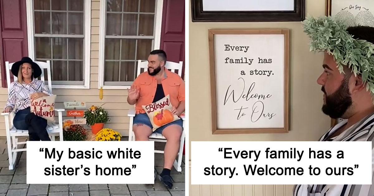
Some homes whisper. Some homes sing. And then there are homes that gently grab you by the shoulders, point toward a distressed wooden sign, and remind you to Live, Laugh, Love before you have even taken off your shoes. That is the glorious, beige-toned universe behind the viral “basic white sister’s house” series, where makeup artist and internet personality John Michael Baker tours his sister’s home and discovers, with documentary-level seriousness, that every wall, shelf, basket, mug, and decorative plank is participating in the same inspirational group project.
The joke works because almost everyone recognizes the aesthetic. You may not own a “Gather” sign, a Rae Dunn-style mug, a farmhouse wreath, or a pillow that says “Blessed,” but you have seen them. They are in HomeGoods aisles, suburban kitchens, rental living rooms, Pinterest boards, family photo backdrops, and every entryway that wants visitors to know this is not merely a house. This is a home. Preferably in cursive. Preferably on reclaimed-looking wood.
But the funny thing about this trend is that it is not only about mocking décor. It is about how mass taste becomes a meme, how comfort turns into a checklist, and how an entire generation of home styling got flattened into signs, neutral colors, faux greenery, black hardware, shiplap, and motivational typography. The “basic white sister” house is hilarious because it is specific, but it also reflects a much bigger story about American home décor, internet humor, and the way we perform coziness online.
Why the “Basic White Sister’s House” Went Viral
The original viral appeal comes from contrast. Baker walks through the house with theatrical awe, treating everyday décor as if he has uncovered artifacts from an ancient civilization called Suburban Magnolia. A wreath becomes a crown. A wall sign becomes a thesis statement. A kitchen canister labeled “Sugar” becomes evidence that, yes, sugar is still sugar, and the home refuses to let anyone forget it.
That is the engine of the joke: the items are ordinary, but the presentation makes them absurd. By documenting them one after another, the series turns a familiar design language into a checklist. Do we have a sign about family? Check. A soft gray palette? Check. A cozy blanket ladder? Probably check. A phrase telling us to worry less, love more, or gather somewhere near a charcuterie board? Check, check, and please pass the brie.
The series also arrived at a perfect cultural moment. Bo Burnham’s “White Woman’s Instagram” had already made audiences laugh at the visual grammar of curated online femininity: soft lighting, coffee, flowers, emotional quotes, and lifestyle sameness. The “basic white sister’s house” expands that idea into physical space. Instead of an Instagram grid, it is a whole house arranged like a mood board that escaped the internet and found a coupon.
What Makes a Home “Live Laugh Love”?
The phrase “Live, Laugh, Love” became popular in home décor in the late 2000s and early 2010s, but its real power is symbolic. It represents a broader category of word art: signs that tell you what room you are in, what emotion you should feel, or what lifestyle value you should embrace. Kitchens say “Eat.” Laundry rooms say “Laundry.” Bathrooms say “Relax,” which is optimistic considering most bathrooms also contain a scale and a plunger.
In the “basic white sister” aesthetic, words are not accessories. They are management. The house is constantly giving gentle instructions. Be grateful. Choose joy. Gather. Bless this mess. Love grows here. Sip happens. It is interior design as a motivational seminar, except the seminar smells faintly like vanilla pumpkin and has a decorative tray.
Designers and lifestyle writers have increasingly called out word décor as overused because it can make a room feel less personal. A framed family photo, a painting from a local artist, or a weird little ceramic frog from a road trip says something specific about the people who live there. A mass-produced “Home Sweet Home” sign says someone had a 20% off coupon and a dream.
The Essential Checkmarks of the “Basic White Sister” House
1. The Inspirational Sign Wall
No “Live Laugh Love” house is complete without wall text. It may be painted, printed, carved, stenciled, or aggressively distressed to look older than it is. These signs often arrive in clusters, creating a gallery wall of encouragement. One sign says “Family.” Another says “Faith.” A third says “Coffee,” because the kitchen is not taking any chances.
2. Neutral Everything
The palette usually lives somewhere between oatmeal, fog, greige, and “the inside of a latte.” Millennial gray became a dominant home color because it felt clean, modern, and safe after decades of beige walls and honey oak cabinets. But over time, all-gray interiors started to feel a little too safe, like the room was afraid of making eye contact with a color wheel.
3. Farmhouse Touches
Modern farmhouse décor helped shape the look: white shiplap, black metal accents, rustic wood, open shelving, baskets, lantern lights, farmhouse sinks, and signs that appear to have been rescued from a very polite barn. The style became huge because it promised warmth without clutter and nostalgia without actual farm chores. You got the vibe of fresh eggs without having to negotiate with a rooster.
4. Seasonal Décor That Arrives Like a Weather System
Fall is not merely a season in this kind of house. It is an invasion. Pumpkins appear on shelves, porches, tiered trays, mugs, soap dispensers, and throw pillows. By September, every flat surface is one cinnamon-scented object away from applying for a harvest festival permit. Winter brings buffalo plaid, tiny trees, “Merry” signs, and enough faux snow to confuse a meteorologist.
5. Labeled Containers
One of the funniest features of the aesthetic is the labeled container. Flour, sugar, coffee, tea, dog treats, cotton balls, and sometimes even “stuff” get their own typography. The look is charming in moderation, but when overdone, the pantry starts to feel like it has subtitles. There is something deeply American about buying a jar, filling it with cookies, and then making sure the jar says “Cookies,” in case guests mistake them for emotional support coasters.
Why We Laugh: The Internet Loves a Recognizable Pattern
Internet humor thrives on pattern recognition. A joke becomes shareable when people can say, “I know exactly what that is.” The “basic white sister’s house” works because it exaggerates a real design formula many people have encountered. The humor does not require a complicated setup. You see a “Gather” sign, a wreath, and a neutral sofa, and your brain fills in the rest: vanilla candle, oversized mug, throw blanket, and a kitchen island that has seen many dips.
The laughter is also affectionate. Yes, the joke pokes fun at sameness, but it rarely feels cruel when handled well. These homes are usually clean, cozy, welcoming, and loved. The issue is not that the décor is evil. It is that the style became so common that it turned into a visual punchline. Once a trend is everywhere, the internet starts roasting it the way siblings roast each other: sharply, repeatedly, and with alarming accuracy.
Is “Basic” Always Bad?
No. And honestly, this is where the conversation gets more interesting. Calling something “basic” often means it is popular, accessible, and easy to understand. There is nothing wrong with wanting a comfortable house, a cute coffee bar, a clean color palette, or a sign that reminds you to breathe after opening your electric bill. Popular things become popular for a reason.
The problem comes when a home looks copied instead of lived in. A room can follow trends and still feel personal, but it needs evidence of real life: books people actually read, art they genuinely like, family objects with stories, colors that make them happy, and furniture chosen for more than algorithmic approval. The best homes do not simply announce “Blessed.” They show it through warmth, memory, function, and personality.
From Modern Farmhouse to Personality-First Design
Home décor trends are now moving away from overly coordinated looks. Designers have been encouraging more color, natural materials, vintage pieces, layered textures, and handcrafted objects. Shiplap is not automatically outdated, but rooms that rely only on white planks, black fixtures, and word signs can feel stuck in a very specific 2016 mood.
The next wave of interiors is less about one perfect theme and more about personal mix. A modern home might combine an antique table, a contemporary lamp, colorful art, a vintage rug, and a sentimental object that makes absolutely no sense to anyone except the owner. That weirdness is the point. A house feels alive when it contains decisions, not just purchases.
This does not mean everyone has to throw away their signs and repaint the living room in paprika red. It means the most current version of good design is thoughtful rather than automatic. Keep the cozy throw blanket. Keep the coffee station. Keep the seasonal pumpkins if they bring joy. But maybe retire the seventh sign explaining that the kitchen is where people gather. The kitchen knows. We all know.
How to Keep the Cozy Without Becoming a Meme
Choose Fewer Words
If every room has a command, the house starts to feel like a cheerful airport. Pick one meaningful phrase if you truly love it, then let art, photos, textiles, and objects do the rest of the talking.
Add Something Unexpected
A single oddball item can rescue a room from showroom sameness. Try a bold lamp, vintage painting, colorful chair, sculptural vase, or framed photo that is not filtered into beige submission.
Use Warmth Beyond Neutrals
Neutral rooms can be beautiful, but they need contrast. Add wood tones, woven textures, deep greens, soft blues, terracotta, brass, or patterned textiles. A room should feel calm, not sedated.
Mix Old and New
The strongest farmhouse-inspired spaces use real texture and history, not only faux-aged finishes. Estate sale finds, handmade pottery, vintage mirrors, and inherited furniture can make a home feel collected instead of assembled in one heroic Saturday shopping trip.
Decorate for Real Life
A house should support how people actually live. If you cook, let the kitchen work hard. If you host, make seating comfortable. If you have pets, children, or chaotic relatives, choose materials that forgive. A home that functions beautifully will always beat a home that only photographs well.
The Deeper Meaning Behind the Joke
The “basic white sister’s house” is funny because it captures a design moment with perfect accuracy, but it also says something about how people search for identity through objects. Home décor is never just décor. It is aspiration. It is comfort. It is class signaling. It is gender performance. It is nostalgia. It is a way of saying, “This is who I am,” or sometimes, “This is who Pinterest told me I might become.”
The Live Laugh Love era promised emotional safety through visual order. Neutral colors lowered the volume. Baskets hid the mess. Signs provided values. Farmhouse textures made new builds feel older and warmer. The style gave people an easy recipe for coziness during a time when many wanted their homes to feel like retreats from stress.
That is why it deserves a little kindness along with the jokes. A “basic” home may be full of clichés, but it is also full of effort. Someone chose those signs. Someone arranged those pumpkins. Someone wanted guests to feel welcome. The internet can laugh at the checklist while still respecting the desire behind it: to make a space feel safe, sweet, and shareable.
Experience Section: What It Feels Like to Enter a Full “Live Laugh Love” House
Walking into a full “Live Laugh Love” house is an experience that begins before the door opens. There is usually a porch sign involved, possibly vertical, probably saying “Welcome,” because subtlety has left to pick up a pumpkin spice latte. A seasonal wreath hangs on the door with the confidence of a small-town mayor. You ring the bell, and before anyone answers, you already know this house has at least three throw blankets and a candle named something like “Autumn Blessings.”
Inside, the entryway sets the tone. There may be a bench that no one sits on, a basket of decorative pillows that seem to have no legal sleeping purpose, and a sign reminding you that family is everything. Shoes go somewhere charming. Keys go in a tiny tray. Mail disappears into a rustic organizer labeled “Mail,” because chaos is not invited here unless it comes in buffalo plaid.
The living room is soft, neutral, and aggressively cozy. The sofa has enough pillows to require negotiation. You do not sit down so much as enter a fabric-based obstacle course. Somewhere nearby, a blanket ladder leans against the wall, performing the important job of holding blankets vertically. On the coffee table, a wooden tray contains a candle, beads, a tiny plant, and possibly a book no one has opened because its real job is to be beige.
The kitchen is the spiritual headquarters. Canisters say “Flour,” “Sugar,” and “Coffee.” A mug says “Mom Fuel.” Another mug says “But First, Coffee.” A third mug says nothing because it is shy and probably not invited to the tiered tray. The refrigerator may contain normal groceries, but the counter contains a lifestyle. There is a cutting board displayed like fine art and a sign encouraging everyone to gather, even if everyone is already standing there blocking the dishwasher.
The bathroom offers a smaller but equally committed version of the theme. A sign says “Relax,” which is bold advice for a room where people discover they are out of toilet paper. There may be faux eucalyptus, rolled towels, and a soap dispenser that looks like it belongs in a boutique hotel for emotionally available farmers.
The overall feeling is funny, familiar, and oddly comforting. You may roll your eyes at the word art, but you will probably accept the coffee. You may tease the pumpkin display, but you will admire the commitment. That is the charm of the “basic white sister” house: it is easy to mock because it is so recognizable, but it is also hard to hate because the whole place is trying, with every distressed wooden fiber of its being, to make you feel at home.
Conclusion
John Michael Baker’s viral tour of his “basic white sister’s” house hits because it turns a familiar American decorating style into comedy gold. The “Live Laugh Love” lifestyle is not just about signs on walls; it is about the rise of modern farmhouse, neutral interiors, word art, seasonal décor, and the internet’s love of lovingly roasting anything that becomes too recognizable. While designers are moving toward more personal, colorful, and collected homes, the appeal of this cozy aesthetic is easy to understand. It is warm, accessible, organized, and deeply committed to telling you exactly where the coffee is.
In the end, the best lesson is not “never buy word art.” It is this: decorate with intention. Keep what makes you happy, edit what feels generic, and give your home enough personality that it could not be mistaken for an aisle at HomeGoods. And if you still love your “Live Laugh Love” sign, keep it. Just know the internet may arrive wearing a wreath and filming a tour.
Note: This article is written as original editorial content based on publicly available reporting, lifestyle coverage, and interior design commentary about the viral “basic white sister” home series, Live Laugh Love décor, modern farmhouse style, word art, millennial gray, and changing American home décor trends.